Interview number four is with all around awesome lady Evie Cahir.
IMAGE/EVIE CAHIR
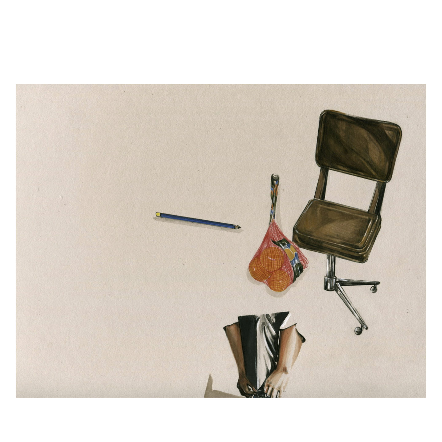
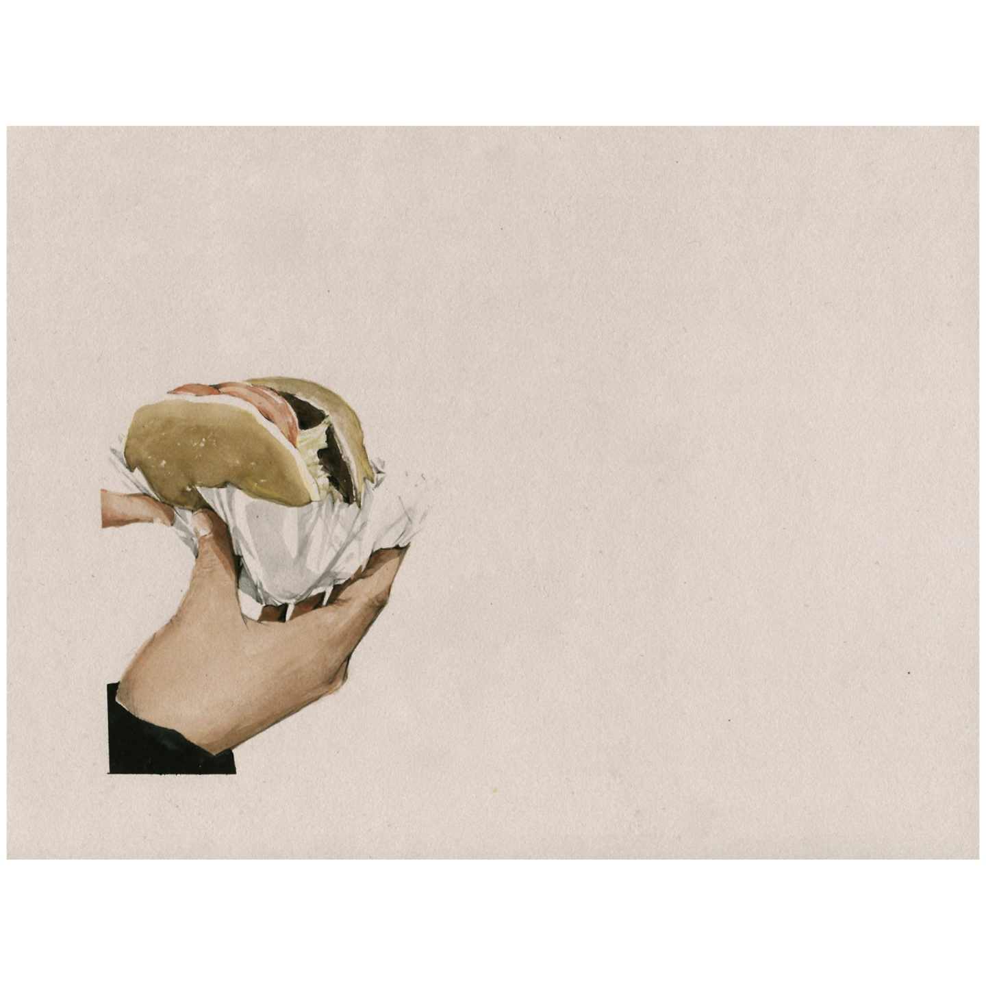
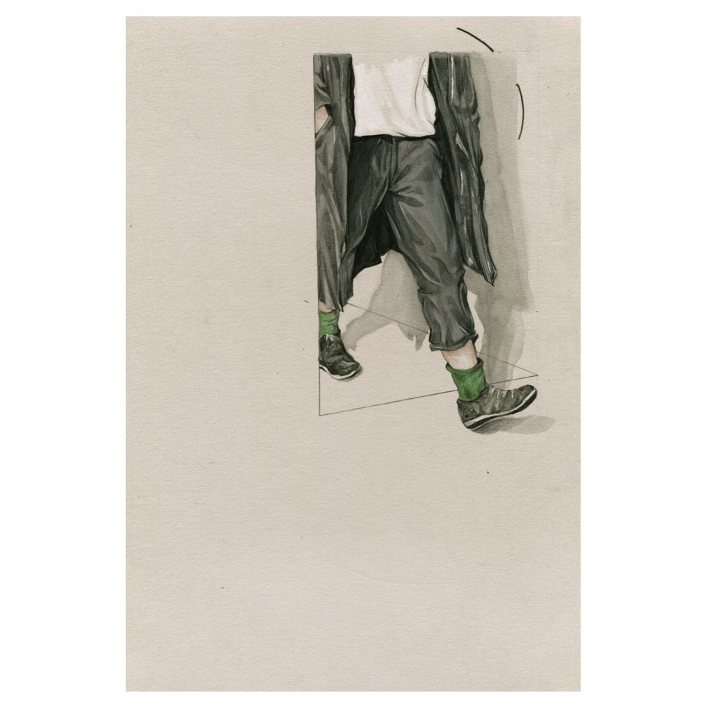
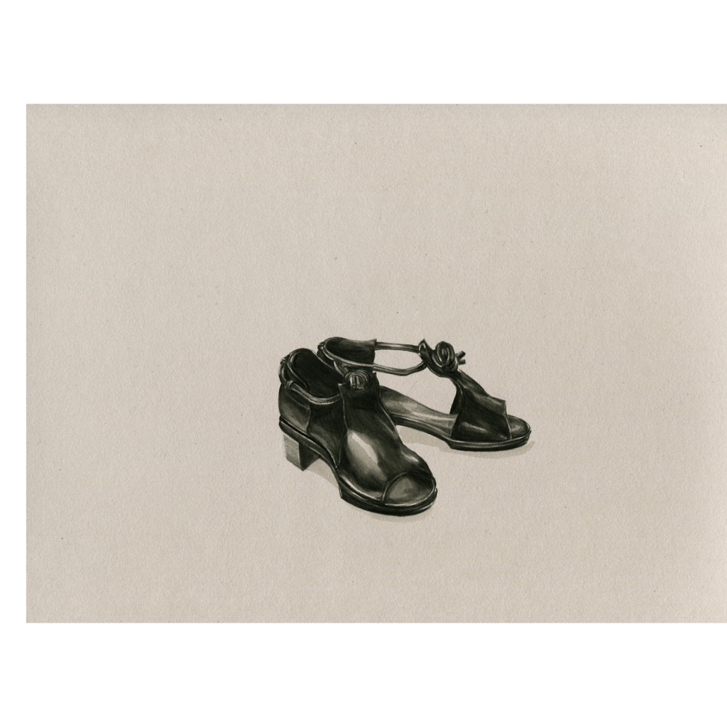
Melbourne based artist Evie Cahir’s watercolour illustrations depict the little moments in life. Each fragment is carefully detailed and archived, then left to stand alone in a frame of negative space, which just begs you pay attention to what’s at its focus. That focus is what’s most interesting about Evie’s work, because she zeroes in on the everyday and makes it poignant.
“I try not to consider why I draw the things, I think its more interesting to let others do the work.”
Her works have included everything from burgers to houseplants, cartoon bunnies to hareem pants. Mapping Melbourne, a recent series of work which was turned into a zine, took inspiration form the sights Evie had passed on public transport. In fixing the transient scenes, Evie presents her life from a perspective that wouldn’t necessarily otherwise see. Her style reflects that alteration of point of view, with slight shifts in perspective that remind you that, whilst her work is primarily realistic, you are seeing the world through Evie’s eyes.
“I have learned that the internet works in mysterious ways”
And the world through Evie’s eyes has proven to be a very popular sight, with a highly frequented blog and a shop where originals and zines seem to fly off the virtual shelves. It’s understandable why her blog is so popular and hard to imagine a work that fits the medium any better; it’s personal, it tells a story, it offers an original outlook, it’s relatable, and best of all it’s so good to look at.
“The compromise in creating editorial work is real.”
IMAGE/EVIE CAHIR
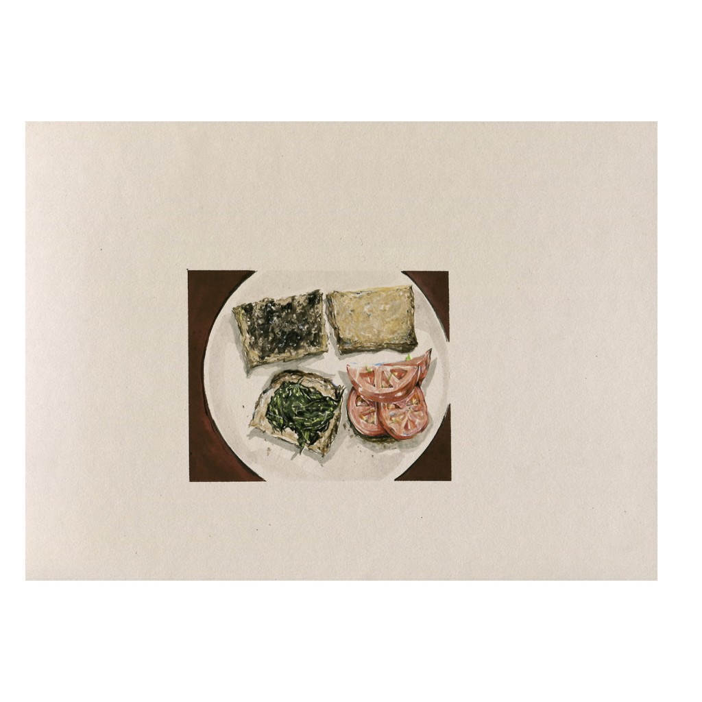
As well as pursuing her own whims and collating them into zines and comics, Evie has created editorial work for the likes of Vice and Neon magazine.
IMAGE/EVIE CAHIR
You’re on facebook, instagram, tumblr (where I first saw your work), you have a big cartel, you have a big online presence across a number of social media outlets. How important do you feel social media is to your work and sharing it, and do you have a preference between those outlets for sharing different things?
The internet and all the social-media outlets that follow are vital when it comes to sharing my work. Without it I would still be leaving little zines in toilets or pubs, slipping them between train seats and posting them to pen-pals, which is all I ever did before creating a Tumblr or sharing my work online. My online-outlet preference depends on what I am doing —
Tumblr for an online documentation of all the work I create and Instagram to post select work to with the aim of generating a strong aesthetic/online persona and to ‘network’, organize art-swaps and obviously to track other artists work.
How has having a fairly large following (100+ notes on almost everything you post to tumblr) affected you and/or your work?
I used to spend quite a lot of thought trying to analyze why certain work instantly hits it off with Tumblr and rakes in 72,378 notes and other work that I value more clocks in just 31 notes over the weekend. There is no answer to this, I have learned that the internet works in mysterious ways.
It has affected my output as posting work becomes a personal challenge — to post more regularly and with higher quality work. Gotta give the people what they want!
When posting works are you conscious of how they will be received/reacted to by your audience?
I am definitely conscious of reception, I regularly second-guess myself when it comes to sharing work — Not because I am wary of sharing provocative work, just of generating work that is not unique in its message, subject matter or theme. Along with the initial reaction, I am conscious of constantly creating fresh work while ensuring that it complements the rest of my work aesthetically.
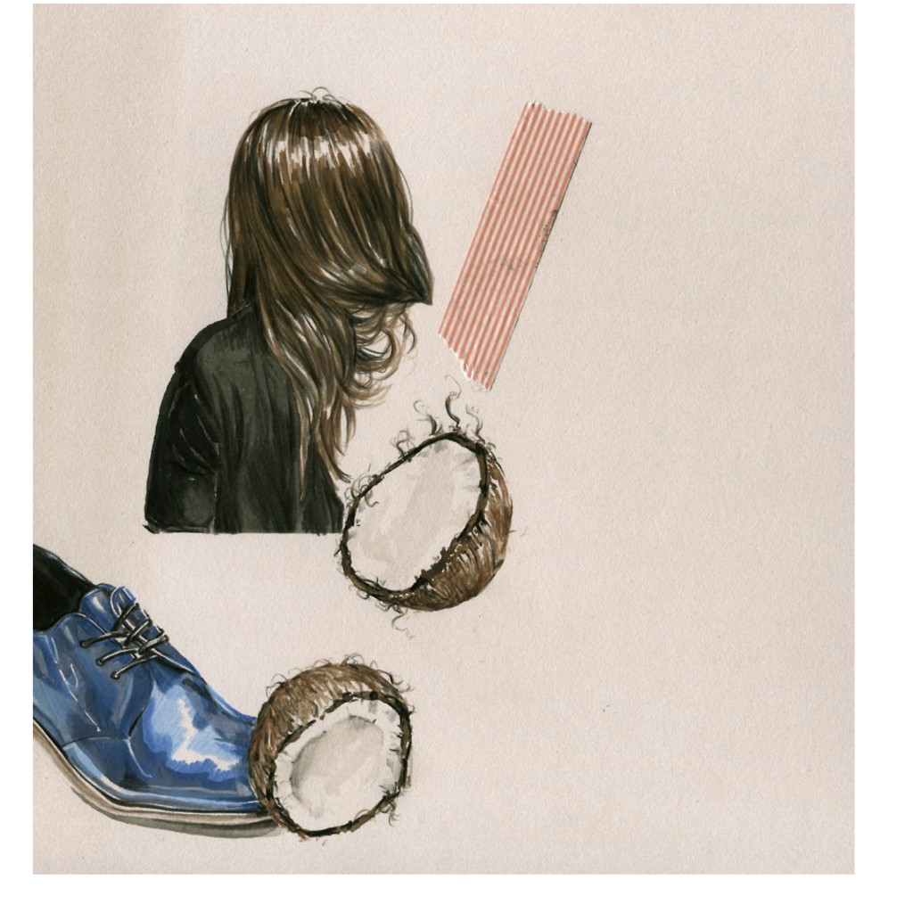
Basically, I have a very discerning inner-monologue that critiques work in a way I expect the audience to, e.g. “Evie drew an avocado and headless torso again, how ‘ground breaking’”
IMAGE/EVIE CAHIR
Do you ever look back over your online archive to see how your work has changed, and if so how do you feel about the earlier stuff?
Looking back over work that is over a month old is painful, I have a back-log of almost four years on Tumblr of work to avoid looking at! Going through older work is like re-drawing it and being reminded of your short-comings (poor painting skills and pencil-prowess) On the few occasions I have looked through the archives (on Tumblr, giant folders in my wardrobe and little sketchbooks hidden around my room) I found that I could easily discern what drawing-stages and life-changes were happening as I looked through it all, majority of which (87%) was not good!
Your works isolate moments and objects that may otherwise be overlooked and frame them in space, could you explain a little bit your thoughts behind this practice?
Simply put, this practice of creating work that revolves around capturing over-looked details, objects and moments is an extension of personal thoughts and experiences. For me, drawing and painting little scenes stems from the need to document and record a feeling I have felt.
I try not to consider why I draw the things, I think it’s more interesting to let others do the work.
You said your work is about “personal thoughts and experiences”, from a technical stand point, does that mean you work from life for inspiration or do you use photo references as well?
Predominantly photographic reference when it comes to creating a final work, though for initial sketches I will work from life. These preliminary drawings act as a record of scenarios and settings to draw inspiration from, as I fill small moleskin’s with details such as: train platforms, lists of items to reference in future work, the hair of a certain commuter, an old man’s dog or books being read on the tram.
With the personal element to your work, do you find it a struggle to do editorial pieces or commissions seeing as they wouldn’t have come from your own experience?Definitely, creating editorial illustrations for clients is usually a challenge I relish, in that I get to draw objects or scenarios I would not regularly draw. Though when it comes to contracts and on-going themed editorial work (For example, a yearlong contract to create monthly comics about one-night stands) it has been a struggle to create work that fulfils the brief but also is work that I am not embarrassed to put my name to or have printed. The compromise in creating editorial work is real.
IMAGE/EVIE CAHIR
In a similar vein, do you look to other artists, or blogs etc., for inspiration? If so who?
Definitely, I wonder if I spend too long looking at other peoples work!
Whenever I’m not drawing I’m looking through the work of:
Lauren Spencer King. Stanislava Pinchuk (Miso) Greg Eason. Aidan Koch. Moebius. Dane Lovett. Henri Matisse. Claes Oldenburg. Sam Alden. Jonathan Zwada. Vija Celmens. Michael Borremans. Brian Ferry. Elsworth Kelly. Ill Studio. Hannah Hoch, this list goes on…
That’s quite a long list of inspiration (definitely a good one though!), how do you take references or inspiration from those works and use them to influence your own?
The referencing of influential figures is most apparent in techniques picked up and a sense of aesthetics and layout applied.
For example, the most recent references cropping up in my work is the use of washes of watercolor to slowly build up a certain texture and off-centered composition of isolated objects/items.
What would you say the “trending themes” you’ve seen or picked up on are at the minute?
Trending themes I have noticed floating around on the sites, Tumblrs, Instagrams I visit regularly include but are not limited to: the glamorizing of depression/sadness via comics, drinks in glass jars, food photography taken from birds-eye-view, Photoshopping yourself into a Drizzy photo-montage, food, high-contrast/saturated light in photographs, food, ‘still life’ themed photographs, Minimal Bauhaus-inspired graphic design layout for book covers, Tapestry, taking photographs of your own hand holding something small, photographs of backs of heads. The list goes on…
IMAGE/EVIE CAHIR
It seems as if your work has become a little bit of a journal, do you ever feel uncomfortable sharing your work publicly? Especially if you know that other people will be looking through your archives?
Not particularly, I feel like the shame associated with going through past work is just a personal hang-up, though I know of other artists that feel similarly about their own archives. I have only ever felt uncomfortable or self-conscious about sharing work when I’ve been asked if I am referencing personal experiences in my work, especially my comics/narrative work
(“Did you draw yourself crying that last one you posted, Evie?…” etc.).
Within your concern of creating “fresh work” are you ever conscious of not falling into trends, or starting to look like other work that’s popular?
Of course. I struggle with overcoming the fear of creating stale work almost every time I draw.
Whilst it’s healthy to be aware of trending themes, subject matter or style amongst others it’s even more imperative that I work to improve my own technique. I try to reconcile this perpetual drawing-fear by telling myself that if my drawing method is below average or rusty then creating fresh work is the least of my problems!
If you perceive your drawing method as being below average, or rusty, then creating fresh work is the least of your problems: what are the greatest challenges you face?
Drawing challenges are always shifting from one issue to another, last week it was feeling uninspired and expecting others to inspire me and today it is the consumption of too many coffees for me to concentrate.
The most challenging and reoccurring issue when it comes to drawing would be not being able to ‘develop my own style’, ‘visual language’ and overall aesthetic. This over-analysis of my own work usually stems from too much time on the internet, as I compare myself to competent and confident illustrators (please refer to list of inspirational artists)
I find this Identity Crisis can be alleviated by getting back to basics and refining drawing skills and spending less time on the internet!
Where do you think your work is going next? Or where would you like to see it going next, in terms of content, aesthetics, platform or just the next show you’re doing?
I would love to see attainable future plans and long-term goals converge — these plans revolve around self-published books, residencies, collaborations with drawing-heroes, setting up a studio space, steady editorial work and solo exhibitions.

Wow, such beautiful work. I particularly like the deconstructed sandwich. Referencing personal experiences within a work can certainly be uncomfortable but it opens up a dialogue. Cool interview. :]
// ▲ itsCarmen.com ▲
Her work is so gorgeous, glad you enjoyed the interview!