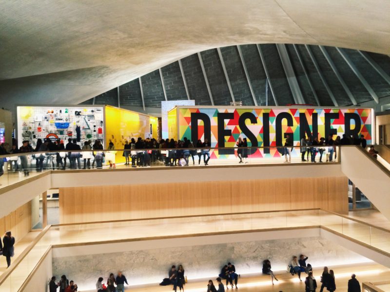
224-238 Kensington High St. couldn’t be a more fitting home for the new, reinvigorated, Design Museum. Its structural sweeping roof, its glowing yellow signage, its wide staircase that acts as an impromptu seating area, all come together to form a space that feels at once carefully planned and open to play.
When I went a couple of weekends ago it was absolutely packed – I’d avoid Saturday afternoons for a bit. While it was bad for me as someone who hates crowds, it’s a great sign for the museum. It wasn’t just design folk either, the new £83mil building was filled with a whole spectrum of Londonners and tourists.
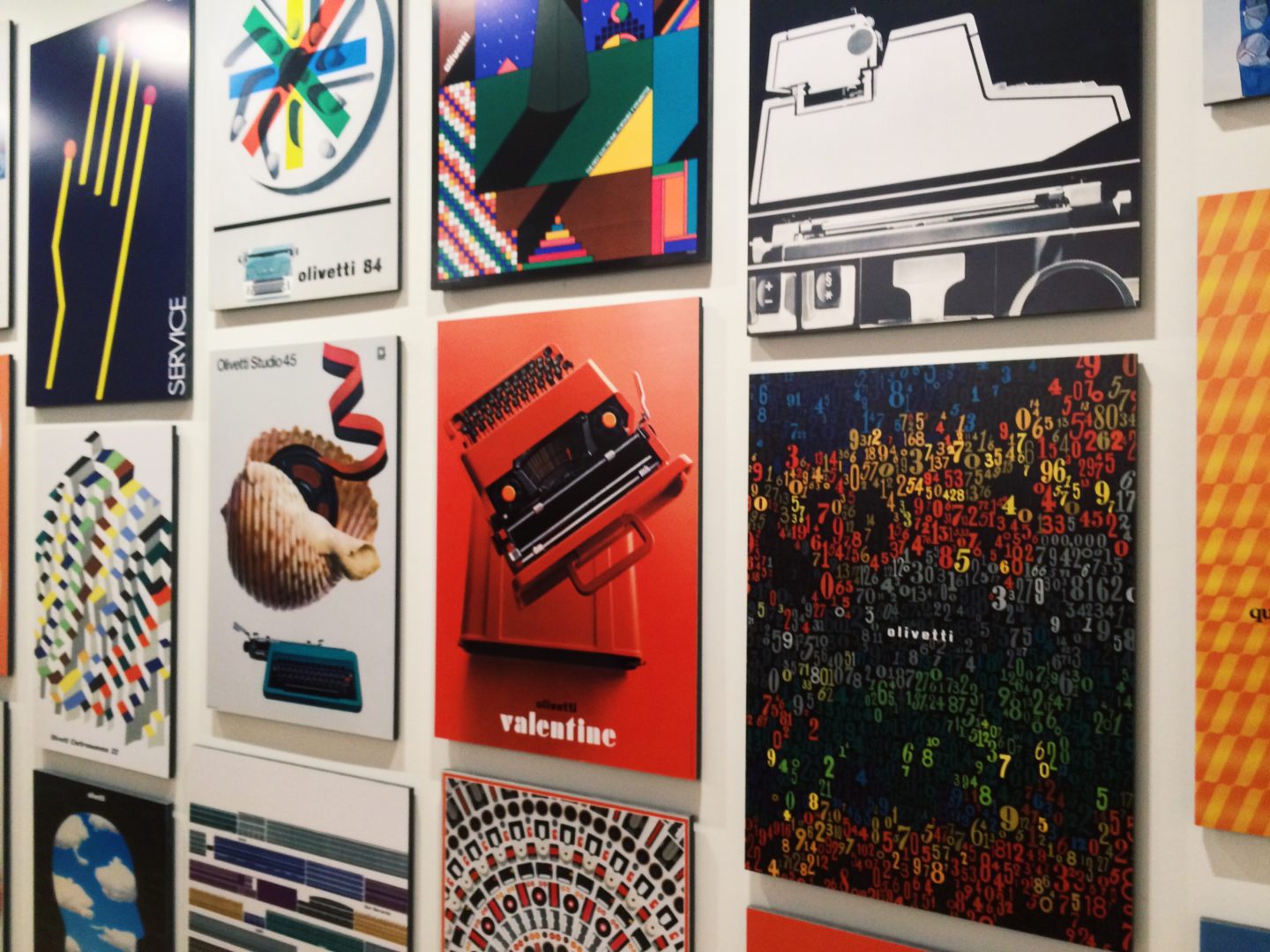
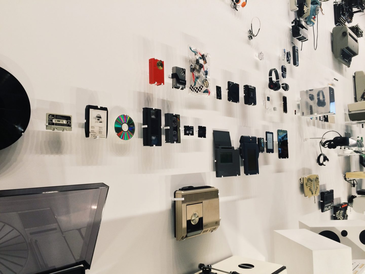
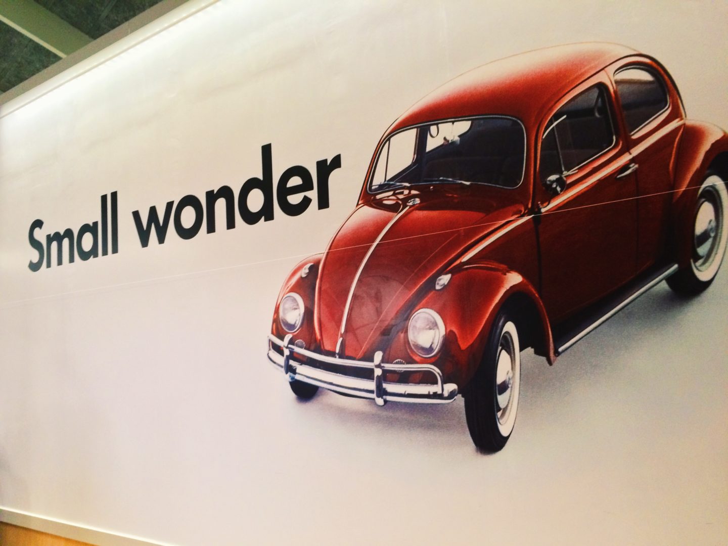
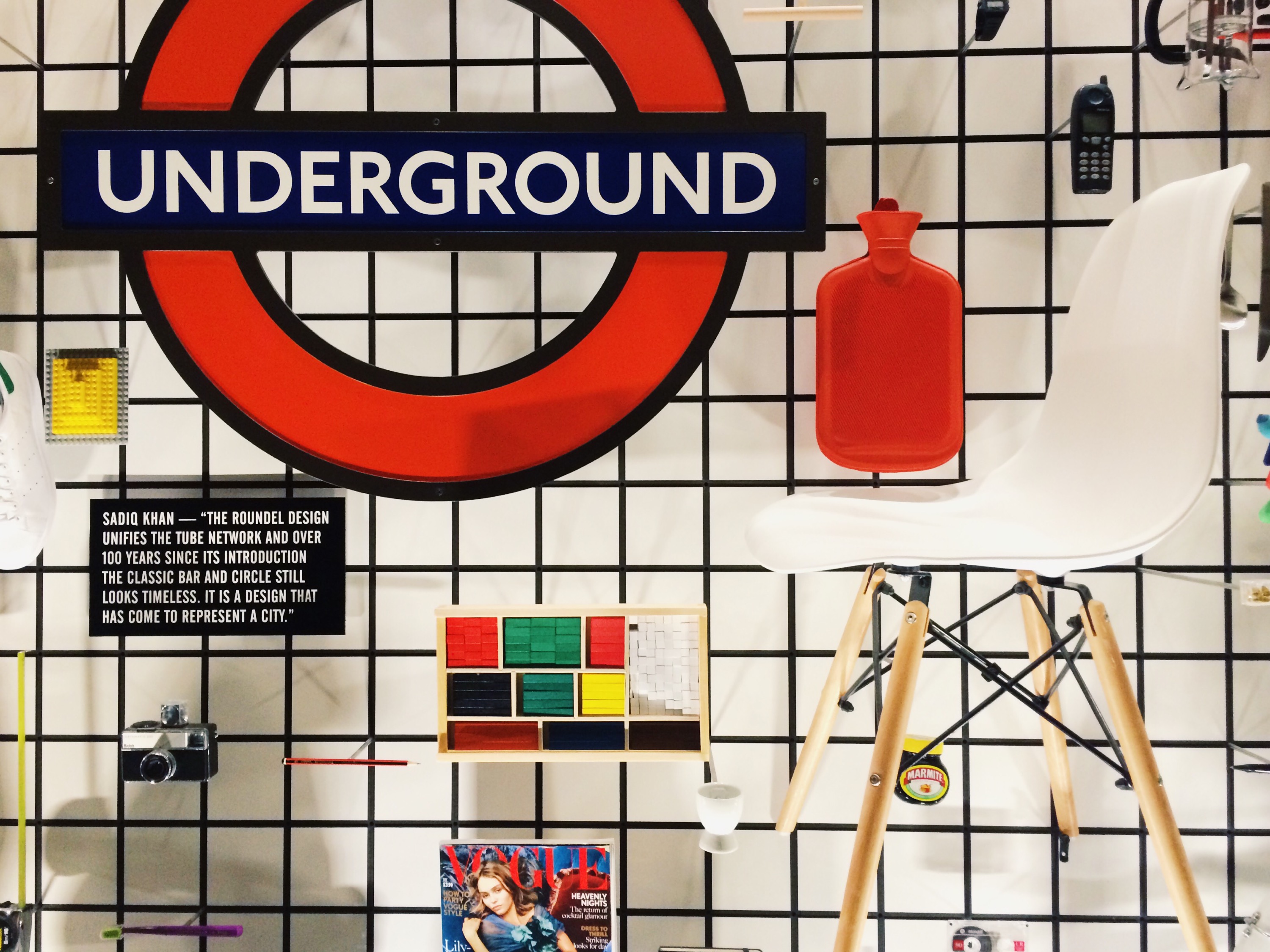
Undoubtedly the highlight of the shows they have on currently is their permanent collection, something they didn’t have the room for in their last home. Designer-Maker-User examines how the world around us has been shaped by design, and how design has been shaped by designers, makers, and users. What could have been an overly broad and theoretical piece on the nature of design, their use of brands and objects everyone will recognise makes the exhibition relevant and engaging.
After you’ve seen Designer-Maker-User make sure you check out the Beazley Designs of the Year, to see design thinking in practice. The diverse collection of designs, from ambitious architectural projects to an electric bike and a pair of trainers made from waste plastic, are organised into themes to help you navigate the space and understand how design impacts real lives. On the topic of understanding, you can tell the museum has put a lot of effort into helping people understand why each piece has been selected. No matter how weird or wacky every design has been given its own write up, and there’s an introductory statement about the criteria for nominations. These little touches give the exhibit a real sense of value rather than just being a collection of oddities. Hopefully, they’ll also lead to some interesting results from the public vote for winners too.
The Design Museum is also hosting works from their artists in residence around the theme of openness, and a show called Fear & Love which is 11 pieces that look to solve problems created by design. Both of which are thought provoking and really interesting to wander round.
I will say that I’m looking forward to them using the atrium space more effectively. In it’s current, empty, form, the heart of the space feels a bit lacking and without focus.
That said, the new Design Museum is full of promise and suggests a confidence in the industry that it really deserves. Design isn’t just a buzz word. It isn’t just making things that are pretty. It’s about improving the world around you for real people. That’s the calling card of this museum. You can just feel that there is so much more to come from this corner of Kensington.
Have you been out to the new space? What did you think?

I’d never thought to visit until I read this, now I’m planning a trip for next week! Thanks for the inspiration!
http://taradaniella.com/
Hope you have an amazing time Tara! It’s definitely worth the trip
This place looks amazing! I’m definitely going to check it out next time I’m in London!
|Georgia Megan|
It is so so good! Fingers crossed you get to see it soon Georgia