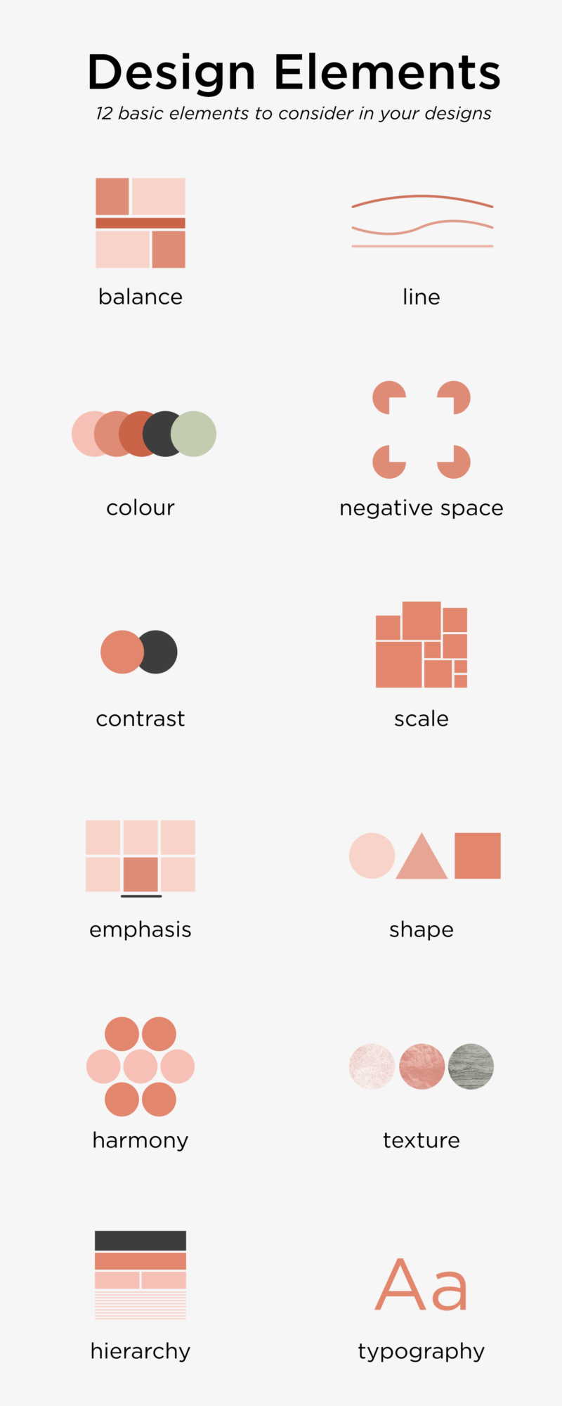
I was reminiscing about GCSE Graphics, the last time I formally studied graphic design, the other day and I decided to redo a piece I did all those years ago, using the skills I have now. So, this the updated version of the 12 Elements of Graphic Design poster I did when I was 16, now as a set of shareable graphics.
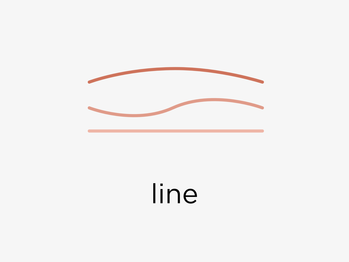
LINE
Use lines to divide spaces, direct the eye, suggest movement, or create emphasis.
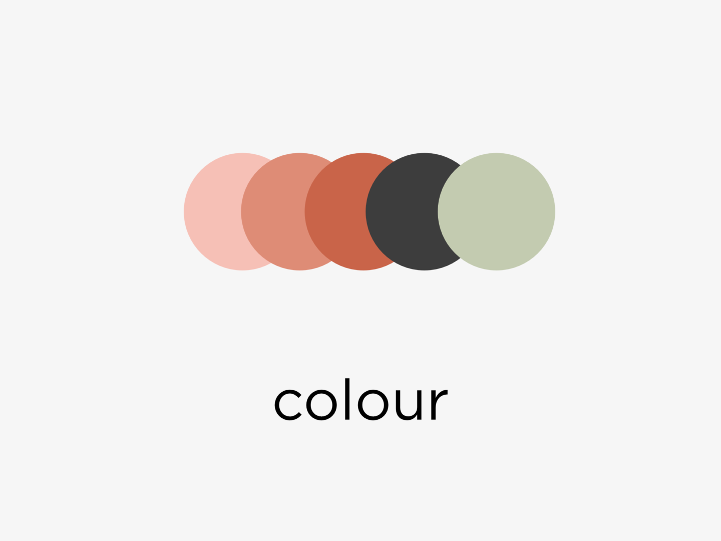
COLOUR
Using distinct colour palettes consistently brings continuity to your work.
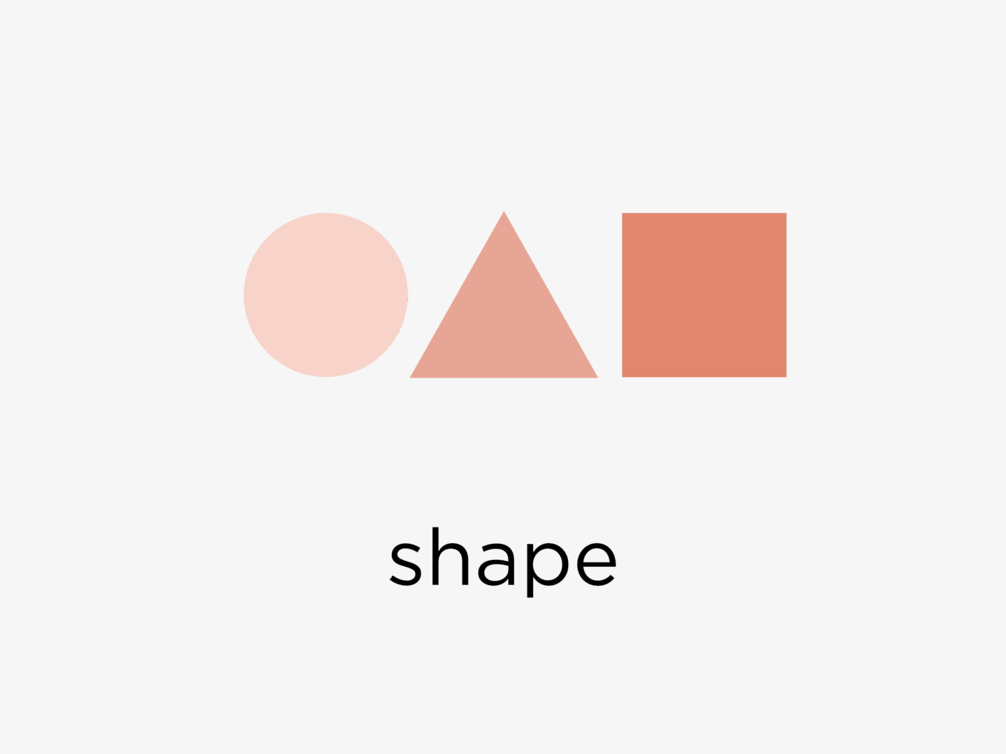
SHAPE
You should think about shape not just when drawing but when composing your piece to create an underlying structure.
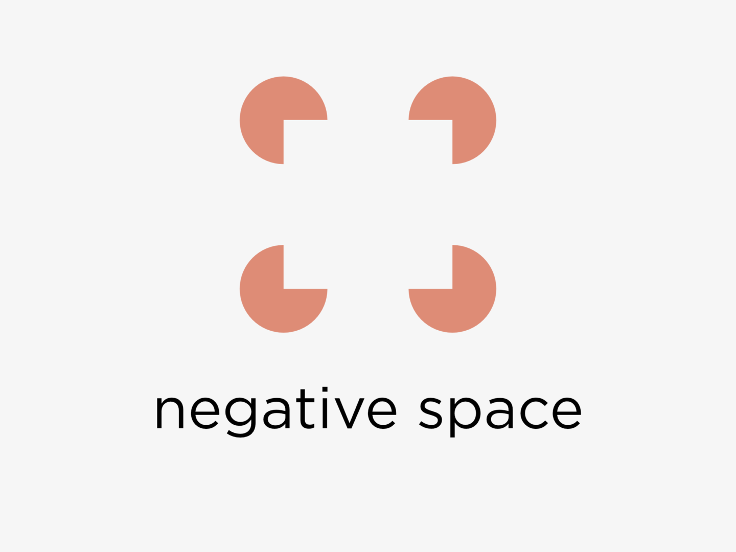
NEGATIVE SPACE
The space between elements can be just as important as the elements themselves. Use negative space to order and balance the objects in your design, or to create an image of their own.
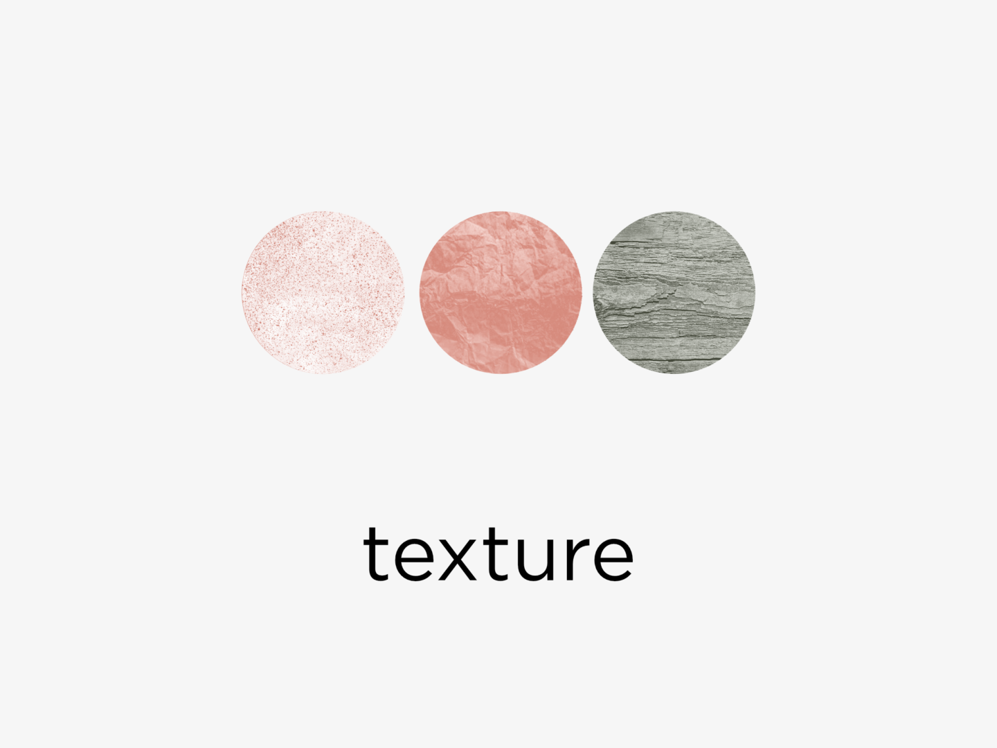
TEXTURE
Texture can give tactility and depth to designs, but use it sparingly.
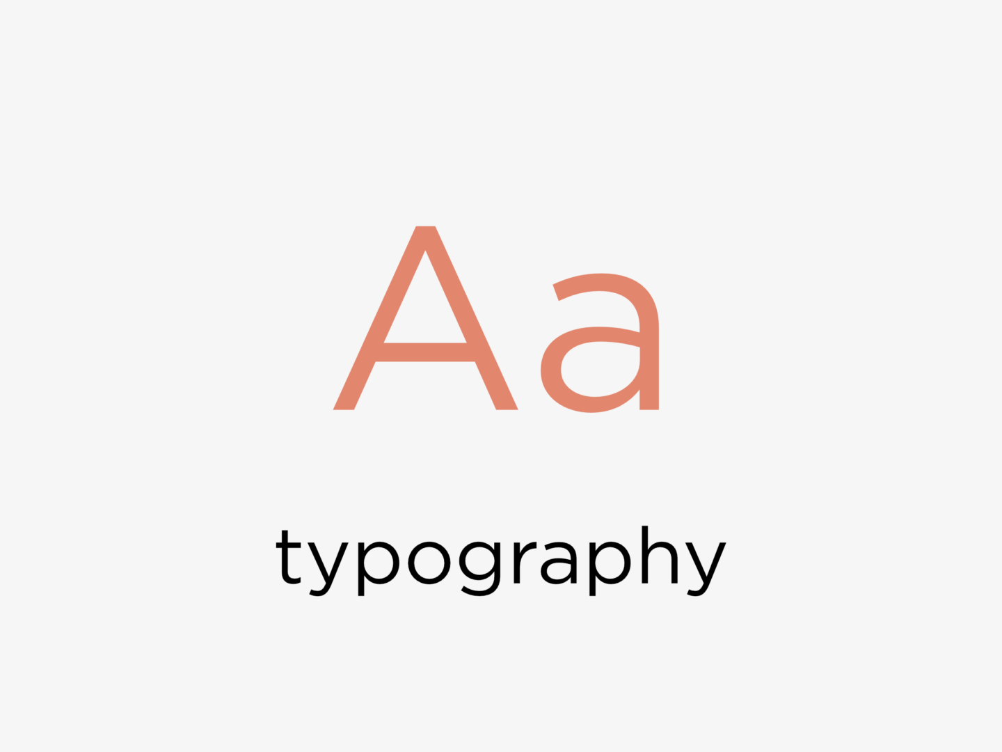
TYPOGRAPHY
The typeface you choose can affect the how people interpret your text, and the overall tone of your piece: sans serif fonts are easier to read online, and serif fonts work better in large blocks of print. When you’re varying font-types, try to pick ones with similar proportions.
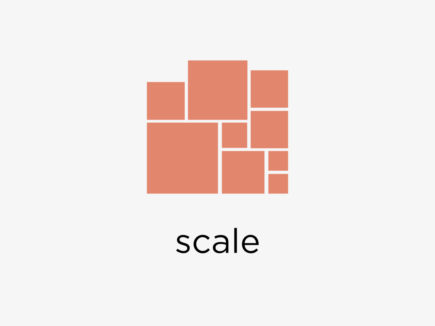
SCALE
Vairy scale to give weight to certain elements and add interest to a page.
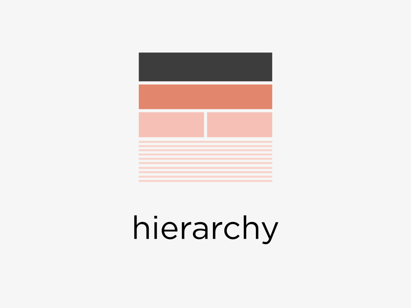
HIERARCHY
Creating a hierarchy in your piece, especially when it’s informational helps viewers navigate your design by signalling importance or narrative.
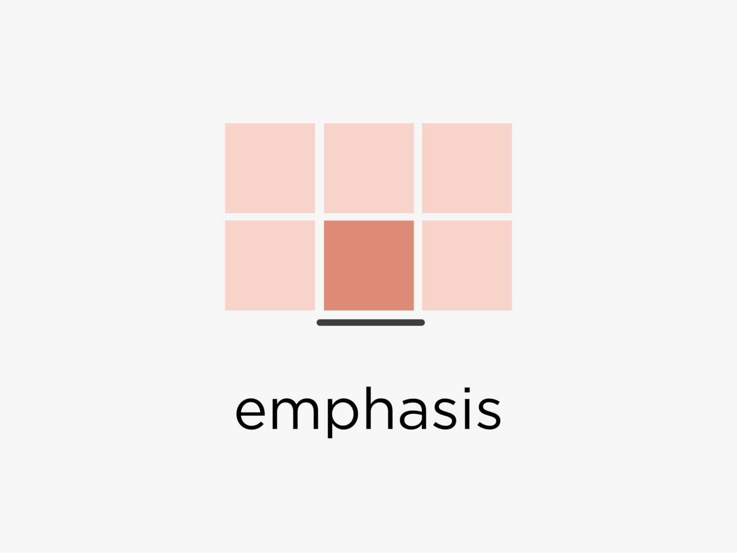
EMPHASIS
Emphasise elements by varying colour, shape, texture, scale or framing them, but don’t overdo it. If you have too many focal points on a page, it will end up doing the opposite of the desired effect.
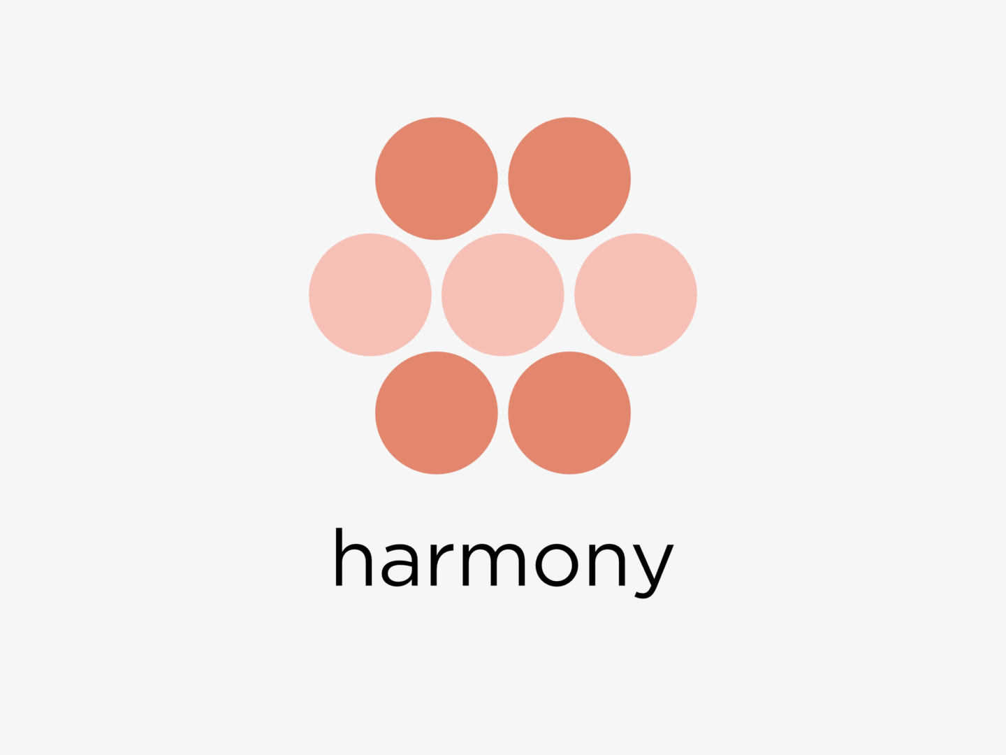
HARMONY
Create harmony in a piece by co-ordinating the proximity, similarity, or continuation of elements, or by using repetition.
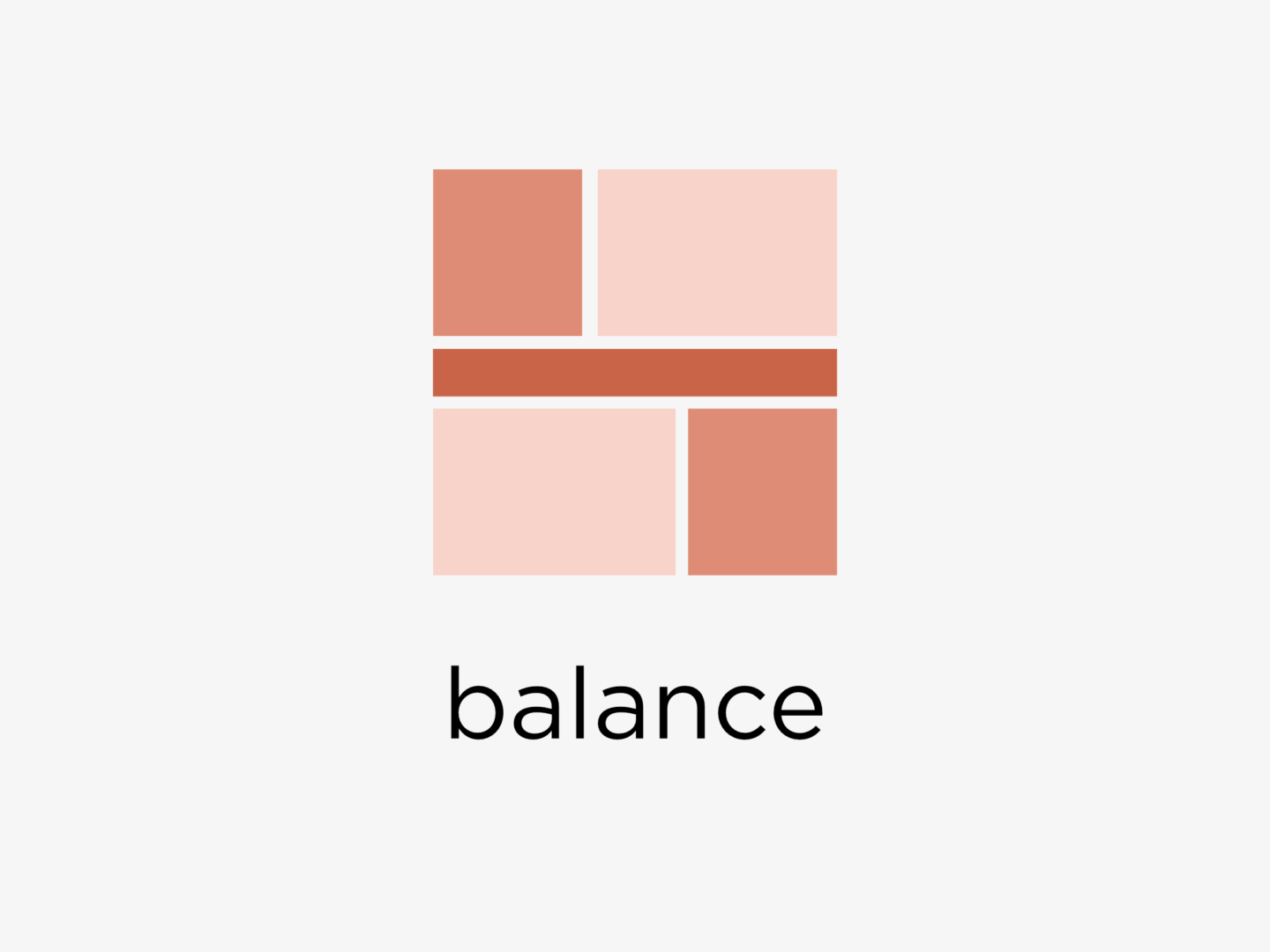
BALANCE
While asymmetry can sometimes create emphasis or an unsettling composition, most designs aim for balance by using varying levels of symmetry (it doesn’t have to look like a butterfly) and structured composition styles such as a radial composition.
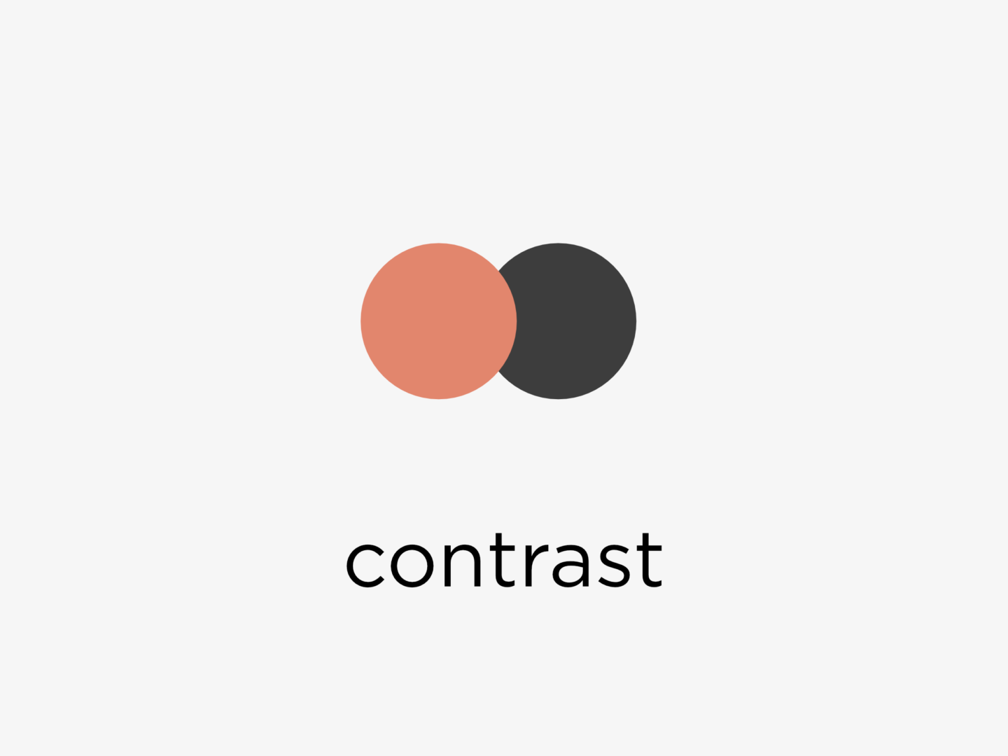
CONTRAST
Create contrast to bring dynamics to your work through the use of light and dark, complimentary colours, or varying line or textures.
I put all of these images into a little poster which you can see here too!

Really interesting! I’ve never thought that much about design, until I took a digital media class that covered some of the basics this year. I find it really interesting, and relevant for blogging. Thanks for the cool graphics!
Julia || juliainbluhm.com
It’s so interesting when you start exploring it, if you’re interested in learning some more about cool design things that are all around if highly recommend the 99% invisible podcast!