The tale of the QWERTY keyboard is one that has been surrounded by myth and legend. It has always seemed strange to me that an object we all use literally every day can have such a clouded history, so after seeing a few new papers on the topic of QWERTY’s history I thought I’d spend a bit of time investigating how QWERTY came to be the only keyboard we really use today.
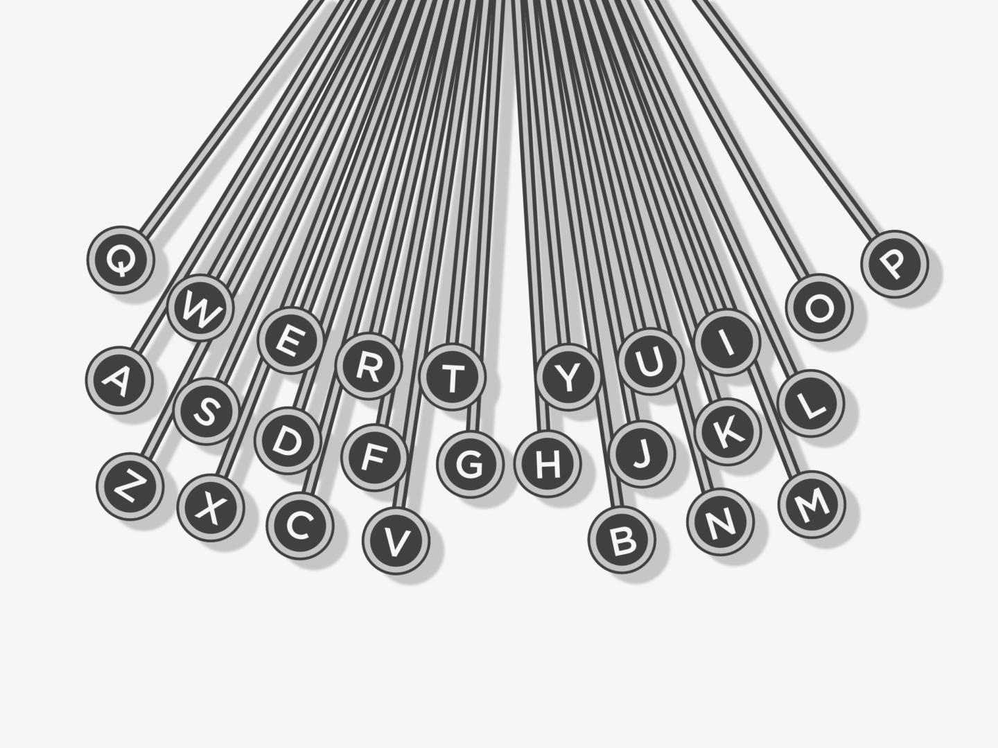
For many years, the story of why the letters on a keyboard are arranged the way they are would be answered with “to stop typists going to fast”. It was believed that Christopher Scholes developed the QWERTY system in 1868 to stop typewriters jamming. When typists went too fast keys that were close to one another would catch on each other and the machine would break. So, it was said that Scholes moved commonly used letters away from each other to slow down their typing and to stop the jamming problem. Common pairings like T and H, and E and R, then should be set as far apart from each other as possible. But they’re not. T and H are diagonally adjacent, and E and R are right next to each other.
So, if Scholes wasn’t trying to slow typists down why did he arrange the letters in the way that he did? According to Koichi Yasuoka and Motoko Yasuoka, it was all about telegraphs. In their paper on QWERTY’s design history, they posit that Scholes’ QWERTY typewriter was derived from the Hughes-Phelps Printing Telegraph, and was developed for Morse receivers, with the arrangement of letters being easy for Morse code readers and senders to use. However, QWERTY might not have been the ideal system for telegraph operators, or indeed typists. The system reigned supreme not because of its innate efficiency but because of a compromise between inventors and producers, and to escape patent infringements. There are also some people who believe that the QWERTY arrangement was a tactic to sell more typewriters, as it allowed a salesman to handily, and impressively, type out the product’s name “typewriter” because all the letters were placed in one row. Whichever story you believe, there is little doubt that QWERTY’s design story has been a messy one at best.

But after a chaotic creation, QWERTY has stuck. I remember the sense of delight the first time I had a phone with a QWERTY keyboard because it was familiar and so much easier to type on. QWERTY’s persistence has been, in part, orchestrated by E. Remington & Sons the firearms manufacturing company who bought and marketed the Scholes and Glidden typewriter in 1873. As well as selling typewriters, they also sold courses for typists on touch typing. This meant that when companies hired typists, they had to buy Remington’s QWERTY typewriters as well to ensure that they got the most out of their employees. This sales tactic began a long history of people learning to use QWERTY and then being tied to it due to familiarity.
This development, where design is constantly tied to a previous innovation because people become stuck in their ways, is called ‘path dependency’. QWERTY is now fundamental to how people in the US, UK and Japan work. It is used on laptops, tablets and phones even though there is no design reason, other than it’s what people are used to. I doubt many people are using their iPhone’s QWERTY keyboard to tap out morse code.
Despite the prevailing power of QWERTY designers are still trying to improve on Scholes’ layout. Particularly interesting alternatives include Dvorak, MALTRON, and KALQ. Dvorak is probably QWERTY’s oldest major challenger. Its design is technically more efficient, with studies showing that 70% of strokes on a Dvorak keyboard occur in the home row (the one your fingers hover over) compared to 32% in the QWERTY keyboard. The Dvorak keyboard also accounts for the fact that the majority of people are right-handed, placing more frequently used keys on the right-hand side. When you first see a MALTRON keyboard you would be forgiven for thinking it might control a space ship. The letter keys are divided into two halves with the numbers together between them, and 2 sets of 2 keys set diagonally underneath the letter panels. But if you hold your hands over the design you can see how well it reflects how our fingers and thumbs are naturally positioned. KALQ has been specially designed for typing with your thumbs on a tablet or phone. The keys are divided into two halves which makes a lot of sense.
Whether or not one of these alternative keyboards, or some more innovative none key based system, will prevail is yet to be decided. I don’t know what kind of shift would be needed to tear our hands away from the familiar pattern of QWERTY now so many generations have learnt to type, to code, to work using it. Perhaps it will take a generation being given something different, for their muscle memory to respond to something new, for their frustration to come out as something that doesn’t look like asjkl.
NB: This post was written on a QWERTY keyboard.
Now we’re a little ways into this series, is there anything else you’d like to be featured in a design story post? Previous design stories include Dr Martens, the Swiss Railway clock and Mondaine watches, the Kanken backpack, and the London Underground font.
Key Sources:
- Fact or Fiction: The Legend of the QWERTY Keyboard, Smithsonian Magazine
- On the Prehistory of QWERTY, Koichi Yasuoka and Motoko Yasuoka
- 6 Non-QWERTY Keyboards, Mental Floss
- The QWERTY Keyboard was Invented by a 19th Century Hustler, Quartz


I’ve also heard that the current keyboard system exists because of the slowness.
However, whether it’s faster or slower than what’s possible, I have no problem typing effectively!
And, my goodness, and I grateful for keyboards- remember the days that you had to press letters over and over again to get desired letters. Glad that’s gone!
Steph
http://www.socialspying.com
There is another origin story in the Smithsonian that the QWERTY keyboard was made for telegraph operators and has this layout to make it easy for the telegraph operator to work.