I am a very cautious road crosser. I’m not sure I would get anywhere without the assistance of the green man if I’m honest with you. So, as I was crossing the road the other day I realised I had no idea why pedestrian crossings are designed the way they are. They seem completely natural now, but they had to be designed and thought out at some point, right? Well, it turns out that the crossings we know now were a long time in the making and came about in the least organised way you could imagine.

The story of the pedestrian crossing begins in 1934, when, then Minister for Transport, Leslie Hore-Belisha instated range beacons on top of striped poles at crossing points in London to signal to drivers that they should slow down. A year later those orange lights were rolled out across the country under the title of ‘Belisha Beacons’.
It wasn’t until almost 20 years later that those crossings would become the zebra crossings we know now. In 1951, the Ministry for Transport were forced to add markings on the road to make the crossings clearer after several complaints that the beacons alone weren’t visible enough to motorists. These markings came in the form of thick white stripes, that matched the striped poles of the Belisha Beacons. This decision would pave the way for 2 trends you’ll see in the development of the pedestrian crossing, development only coming after complaints and the naming of crossings after animals.
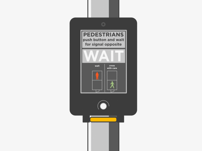
Over the next decade there were a series of signalled crossings, including a renegade set of lights in Leeds, but nothing official until 1962 when the need for something more robust than the Zebra crossing became urgent. The government came into this next phase with a long list of requirements which centred on the idea of a signalled crossing that wouldn’t hold traffic up for too long. By all purposes, the design they were given as a solution ticked all the boxes. It featured a button for pedestrians to press to cross, and lights opposite them that read ‘Wait’ and ‘Go’, which any modern user would recognise. The Panda crossing, seemingly named for no other reason than it was the first black and white animal someone could think of, was opened in London in April.
Even though the Panda crossing seemed to check all the boxes and was opened by a very cute toy panda bear, it was far too complicated to use. Motorists were bombarded by an intricate pattern of flashing lights that didn’t seem to have a clear signal of when they could proceed. Perhaps the best summation of the scheme comes from an old lady interviewed by the BBC at the time who declared “that man Marples [the Minister for Transport] is up to too many tricks. It’s a hairbrained scheme and most dangerous!” They made the most critical of design errors, they forgot the user.
Unsurprisingly, the Panda crossing was replaced. In its place came the X-Way. The X-Way took the same principles of the signalled crossing but simplified the lights for motorists. Instead of the complex flashing light system of the Panda crossing, the X-Way had just 3 lights that functioned like normal traffic lights. The only difference being that the green light was replaced with a white X light, which is where the crossing got its name, and the amber light flashed when the crossing period was almost over. The X-Way also saw the birth of the green man (and his red counterpart).

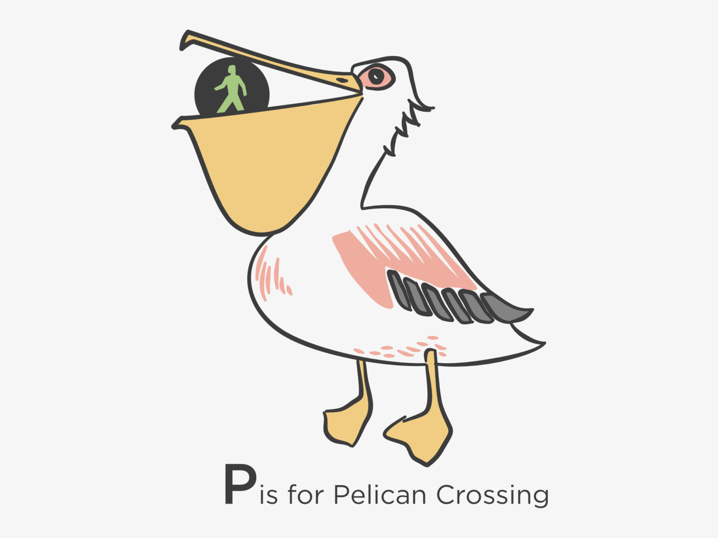
They were really close with the X-Way, the only issue was that an X is generally used to signal a stop rather than go. So, in 1969 the white X was finally replaced with a green light and the Pelican crossing was born, a system we still use today. Interestingly, the name Pelican wasn’t just chosen because it was another monochrome animal, instead it came from the abbreviation of PEdestrian LIght CONtrolled crossing.
The most recent incarnation of the pedestrian crossing is the Puffin. The major difference between the Pelican and the Puffin crossings is that the Puffin crossing sees the lights on the same side as the user rather than opposite. Puffin crossings also have sensors, either in the ground or the traffic lights above, that can detect when there is a pedestrian waiting to cross or crossing the road. This means that the traffic lights shouldn’t change if there is someone in the middle of the road. Despite some initial concerns, the Puffin crossing has been proven to be safer than its predecessor.
Other modern animal crossings include the Toucan for pedestrians and cyclists and the Pegasus (which is also in Peru) for horses.
As you can see, the design process of the modern pedestrian crossing was a long and complex one that involved iterations on iterations. If you found this interesting, I would highly recommend having a read of the story of Ampelmann who is the German green man and is the coolest little fella.
Are there any more design stories you’d like to hear about?
Key Sources
- CRBD, Pedestrian Crossings
- Riggots, The History of the Zebra Crossing
- The National Archives, Pedestrian Crossing
- The Economist, The Curious Demise of the Zebra Crossing


Have you ever noticed the small protruding black knob on the underside of the Pelican Crossing display box? My son came home from junior school some years ago and told me about it. The next time we were out in town, he showed (sceptical) me what he was talking about and, lo and behold, there it was. When the green man symbol shows, the knob rotates to signal to blind/partially sighted pedestrians when it is safe to cross – a very pragmatic and effective piece of design. I am now addicted to using this feature, just because it’s there…. Was I the only person not to know about this feature, or is it a relative secret?
I have! They used to fascinate us when we were in secondary school. I feel like they’re something you know about if you have to know about them if that makes sense. You’re right it is such a simple but useful piece of design, that really takes into account a wider range of people who have to use road crossings. Thanks so much for reminding me of it