This post is a bit of a rip off of a piece I really loved from Austin Kleon, about how he puts his newsletter together. I’d highly recommend giving it a read. I mean I loved it so much I wanted to write my own version, to give you a behind the scenes look at how I put together some of my favourite weekly content – and how you can sign up right at the bottom of this page.
I’m a big fan of newsletters. They’ve probably overtaken blogs in my heart when it comes to reading content from creators (and even some brands) I love. Anne T. Donahue’s is a standout example amongst those, and is a big reason I started my own.

Pulling together my newsletter is also one of my favourite things I do associated with this blog. I think I enjoy it more than writing new posts, even though it’s probably read by fewer people. I love pulling out the best of the web, doing slightly looser illustrations and having the opportunity to be a little bit more personal.
I realise if you’re not subscribed to my newsletter, you’ve got no idea what I’m going on about right about now. So here’s a link to one of my past newsletters.
As you can see my weekly update is split into three key sections each with their own little image. Here’s how they all come together:
The Intro Section
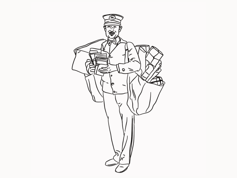
This is where I like to share something of a more personal update. I like to reflect on the week and some of the things I’ve learned or give a bit of a nod to some of the things I’m working on this week. I generally sit down to write something on a Friday evening, no plan, no structure, then give it a bit of a tidy up when it comes to scheduling my email in MailChimp on the Saturday. I try to pick a fitting image from my vast stocks of instagram illustrations or things from past blog posts in part to save time and in part to tie my rambles to work people might know.
The Two Articles
Then I move onto sharing two of my favourite articles from the internet for the week. The internet is a big old place, and it’s full of gems but they can be hard to find so I like to share a couple of recommendations. They’re normally arts/creativity/design based but the main criteria is 1) did I enjoy reading it? 2) do I think other people will enjoy reading it? That’s it. To accompany those articles I like to put together some animated illustrations. These usually include the title of the article handwritten out plus either some images from the article or an illustration of one of the key ideas. I draw frame by frame which is why they’re usually quite simple, then animate using an online gifmaker.
The Social Share
The final section of my newsletter is all about sharing some of my favourite people on instagram. I like to see it as my way of fighting back against the algorithm and helping my readers find some incredible artists they might not have discovered otherwise. Because of that, I generally try to highlight smaller artists on the platform, but there’s no hard rule. I just add interesting accounts to my collection through the week and then pick out one I like on a Friday or Saturday. I also take reader suggestions, so if you have an idea of someone who should be included please do let me know! Along with a small intro to their work, I show a few examples of their recent, or my favourite, posts so you can get a flavour of their work.
If you like the sound of it, you can sign up to receive my newsletter below:
(In signing up to this newsletter you are consenting to receive a weekly email from me. All data is held and managed by MailChimp, you can read more about their privacy policies here)


It has actually been a great newsletter, and I think you could plug that old post about the newsletters you follow in here? 😀
Thanks so much Shannelle!! I think you know my content better than I do – I’ll have to throw a link in there later