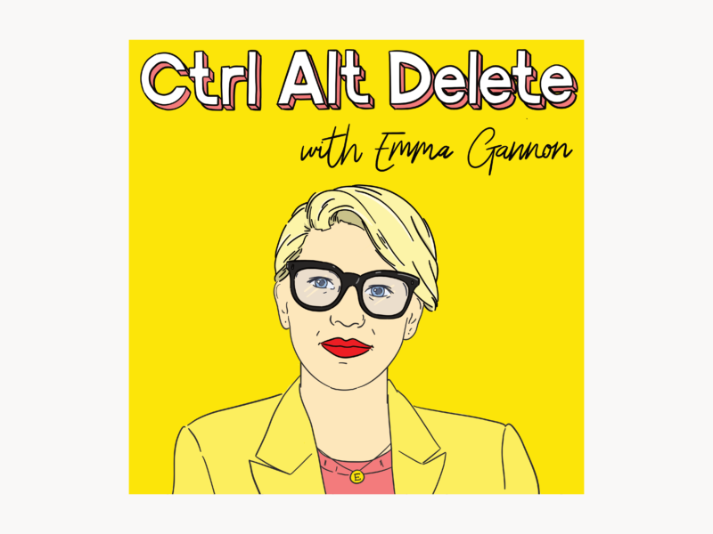
Around this time last year I designed a series of ‘podcast posters’ to celebrate some of the podcasts I love. A year on, in a strange manifest your destiny kind of way, I’m designing the real artwork for podcasts I love, most notably Emma Gannon’s Ctrl Alt Delete.
The new artwork we worked on together launched a little while ago but it’s still a thrill to see it pop up in my iTunes or when someone shares their favourite episode on social media.
Her decision to trust me with her new illustrated branding has kicked off a new wave of work for me, so I thought I’d take you all behind the scenes a little bit and show you how a piece of cover art like this can come together. If you’re interested in your own illustrated cover art or rebrand, I’ve left all the details at the bottom of this post.
But let’s get into the good stuff first.
Projects like this always start with someone getting in touch with me, and us just having a brief email conversation about what they want. For the Ctrl Alt Delete piece of work, Emma had already put together a great moodboard filled with pieces and colours she liked which was a brilliant guide.
Then I take that inspiration and turn it into drafts. Usually these focus on layout and are super sketchy like the ones above, but sometimes they’re more fleshed out. It completely depends on what I’m working on, and what we need to work out as a client-illustrator team.
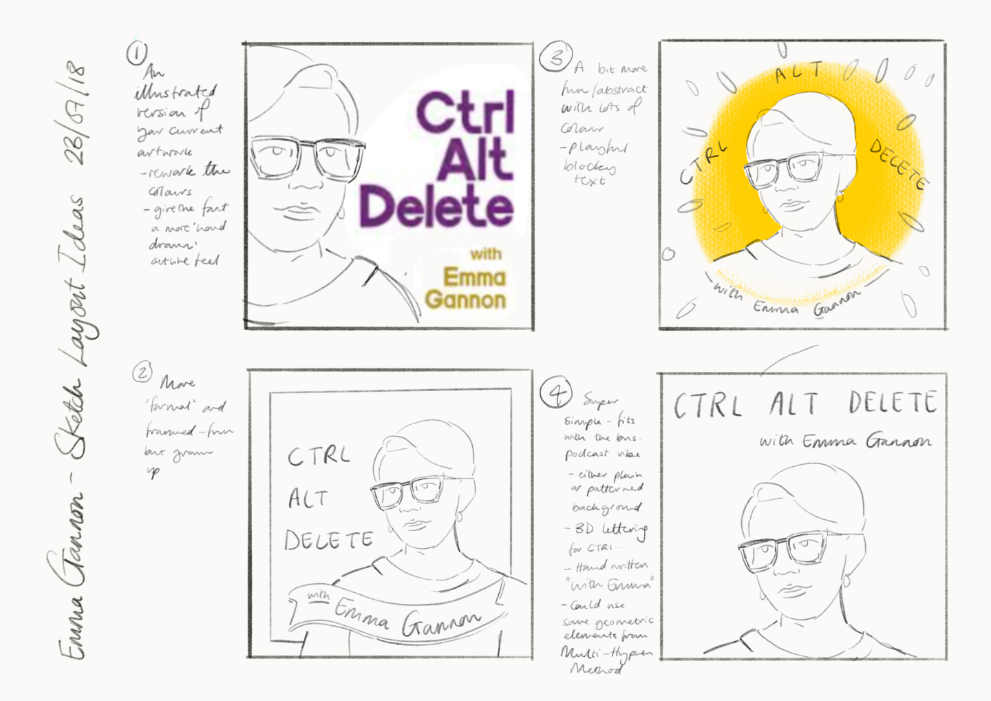
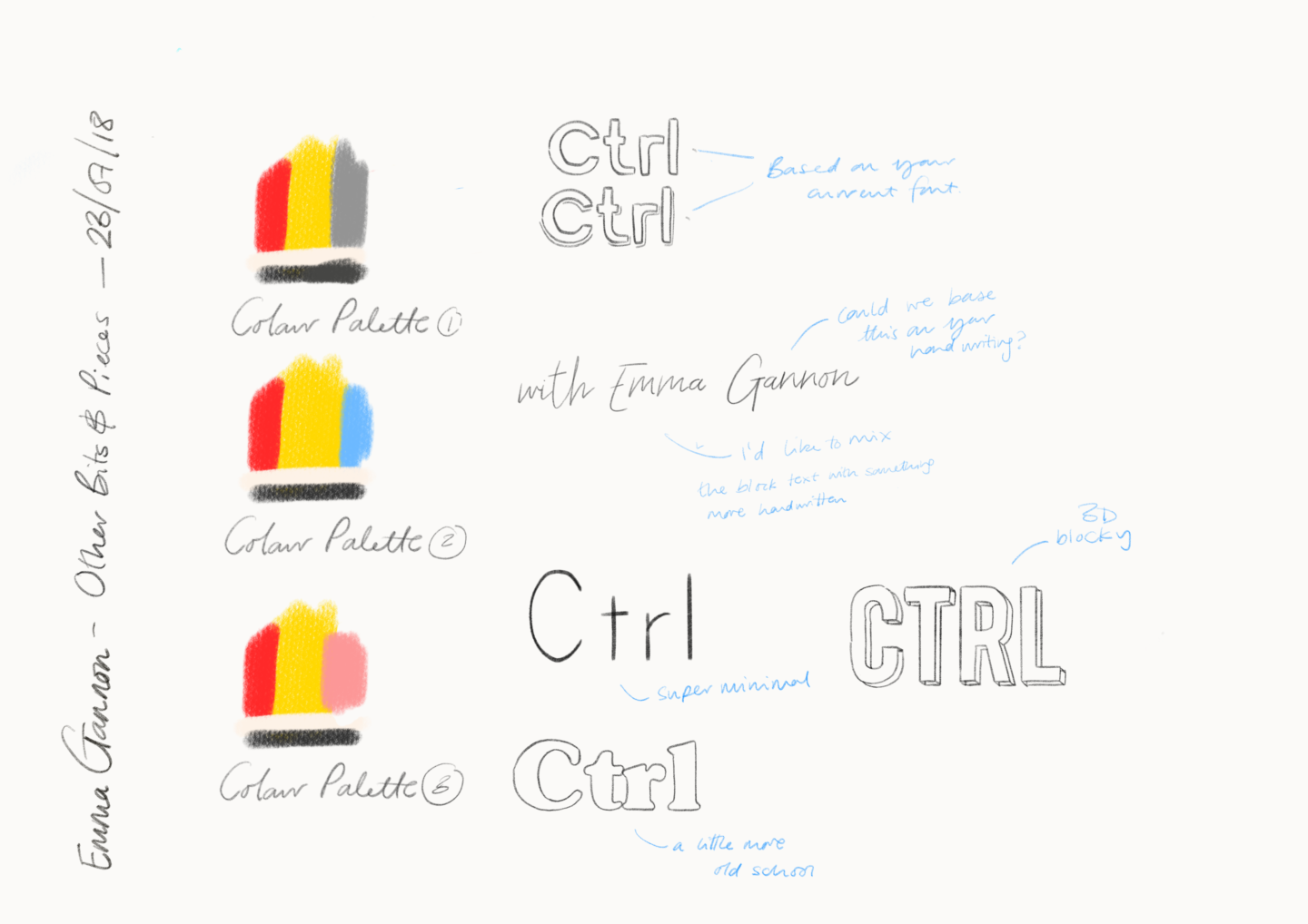
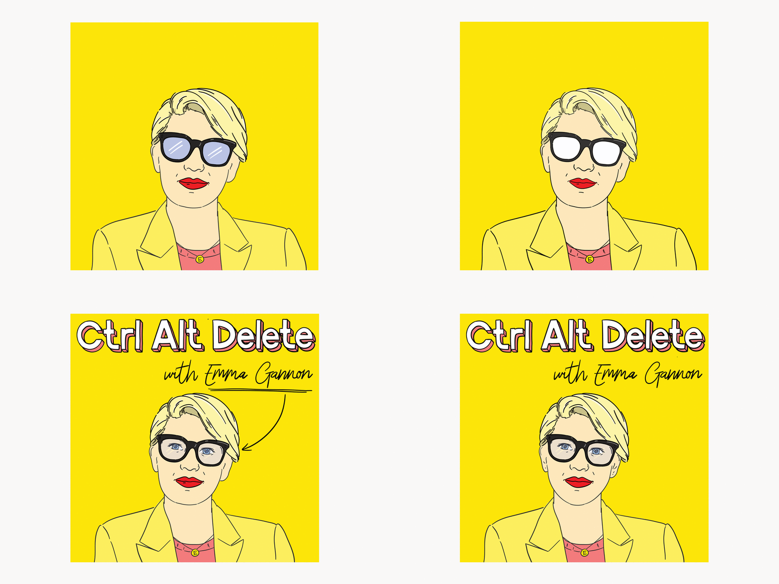
I send those roughs off and get some guidance on what the client is looking for. In the case of Ctrl Alt Delete we decided to keep it simple and focus on the bright yellow that has become synonymous with Emma’s brand. So I fleshed out the sketch with a more worked up portrait, and went through that cycle of draft and feedback again before adding in the lettering.
Then there were just some final tweaks to do before the final artwork was settled, and put into place across Emma’s social media and most importantly on the podcast itself. These final tweaks can make all of the difference, and it’s so so crucial to me that whoever I’m working with is really happy with what they get in the end – especially if it’s got their face on it!
That was where the story ended on this particular piece of work. But I’ve also worked on social media banners and illustrated frames for sharing quotes and guest profiles for similar projects. So the sky really is the limit.
If you’ve got a podcast, or any other creative endeavour, and you’d like to chat about what we can do together head on over to my portfolio to see some of my other work or just drop me a line – I’d love to hear from you!

This is so cool, Natalie! I remember seeing this on your Instagram and being so happy for you