I’m not going to be creating lots of festive content this year as I have in the past. I’ve made so much over the past few years that I’m not sure what I where I would add value or what I would personally find joy in making. But the one thing I am excited to talk about this year are my Christmas cards.
This is the first year I’ve made Christmas cards just for me, not to be sold as well, which meant I felt like I had more creative control than ever before. As I start to make more work that I’m really proud of, I want to get better at reflecting on and talking about the process behind the finished product.
For my Christmas cards this year, I was torn in two directions at first. There were two styles of cards that had caught my eye in an initial Pinterest pinning spree, cards with a floral base and cards that featured minimal winter scenes. So the first decision I had to make was what direction I wanted to go in. I started brainstorming ideas and found I was finding the floral route easier to picture so I went with my gut, storing the idea of a winter scene away for next year.
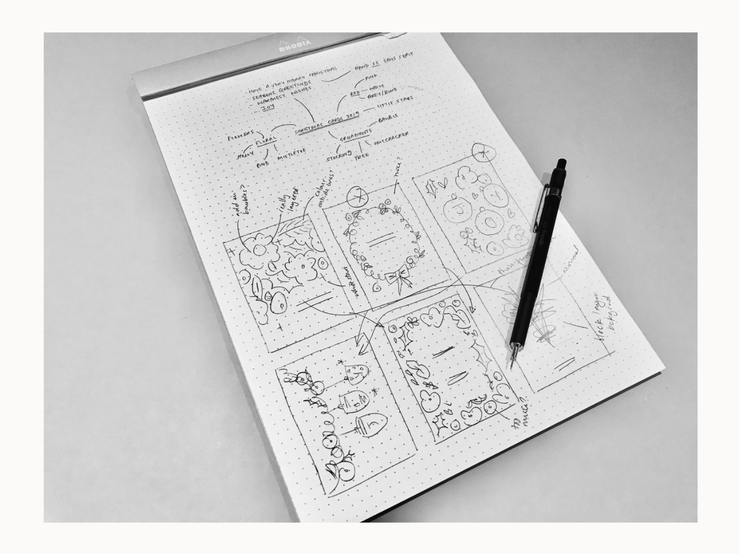
With some ideas for imagery, layout and colours all gathered together my design process started in the same way it always does, thumbnails. I’ve really been enjoying paper thumbnails rather than jumping right into a digital medium, there’s something about it that feels a bit freer, plus it was nice to work all within one page.

From those thumbnails, I wasn’t sure I’d quite got the composition right but I knew I wanted a layered botanical illustration that left me some negative space. I think that was a reaction against last year’s highly patterned folk inspired cards.
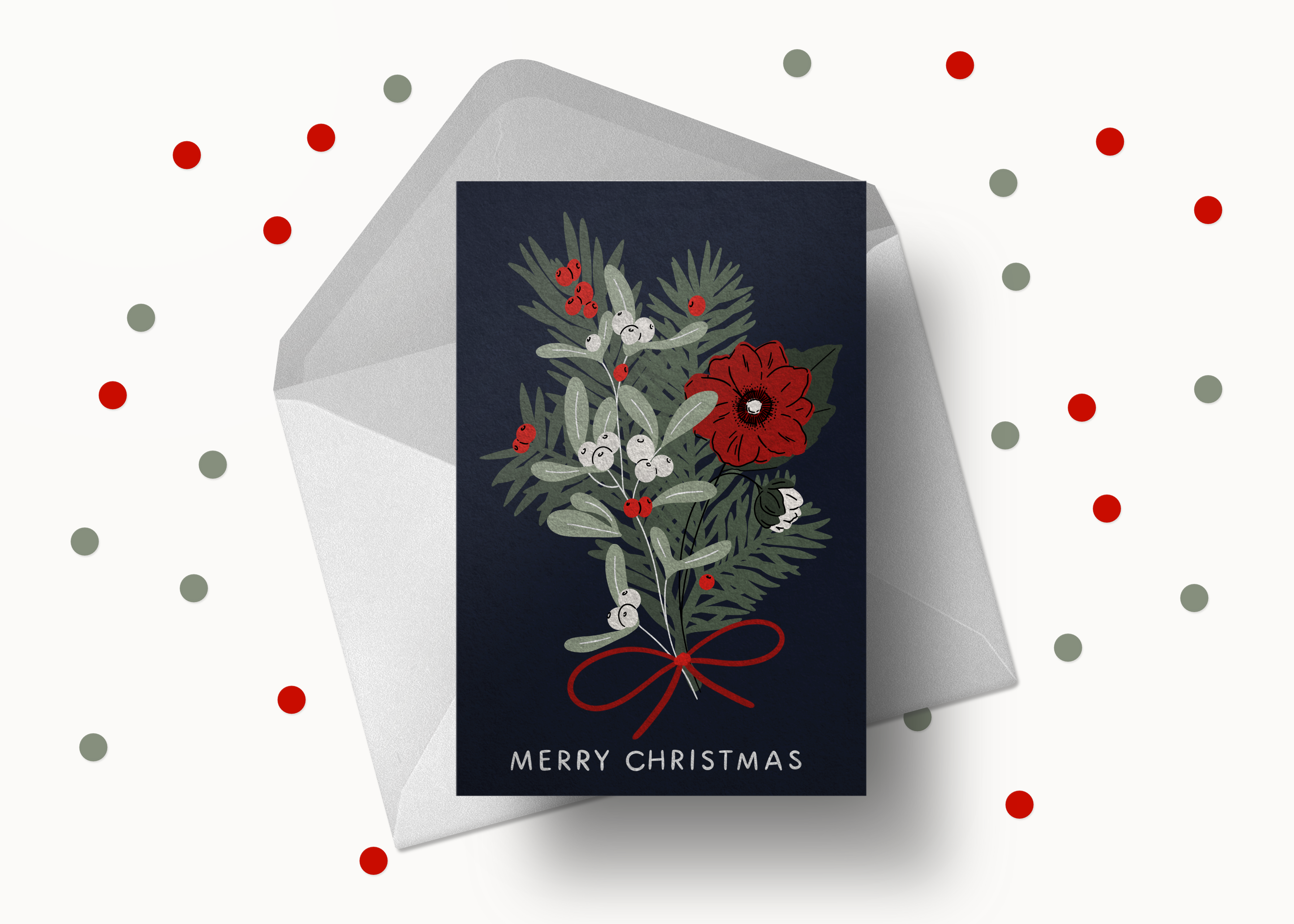
So I took a leap and just started to draw the plants I knew I wanted to include: fir, winter rose, red berries, mistletoe. In procreate, I had more freedom to move those elements around and quickly settled on the simple central bunch composition.
With my elements in place, getting the colour balance right took me a fair while. I knew I wanted to feature red and white, but finding background greens and blues that worked took a bit of playing around. I don’t have a fixed method for finding a colour palette other than referring back to my colour theory then playing around with families of colours.

The final touches came far more quickly. I added a simple handwritten “Merry Christmas” and a red bow to literally tie everything together.
Then I went from my portrait illustration into print layout, signing my name on the back.
I print all of my cards with printed.com because I find their service really reliable and good value for small batches of cards. I opted for 300gsm tintoretto gesso card that has a lightly hammered finish because I loved the luxury it added to my tarot cards last year and I thought it would add a bit of extra interest to an otherwise dark and simple card design.
I’m really happy with the finished product. I think they’re the right balance of homemade and professional and the gesso paper has a lovely texture. Now they’re printed, I do wish I’d made the stems of the flowers white and added the little stars that were in my initial thumbnails. Every time I do this there’s something to learn.
Those learnings don’t detract from the fact I’m excited to send them out to everyone I love!


These are gorgeous, Natalie! It’s really lovely to read about you working on a project that meant you could have more creative control. I always love reading behind the scenes posts – so please keep sharing these if you enjoy making them!!
Thanks so much Sian and thanks for the feedback, I’m always unsure about these case studies but I may just try to put together a few more.
These are gorgeous, Natalie! It’s really lovely to read about you working on a project that meant you could have more creative control. I always love reading behind the scenes posts – so please keep sharing these if you enjoy making them!!!