It’s the middle of February. It’s still cold and dark outside. If you’re in London it feels like you haven’t seen any sunlight in years. The new year (and your resolutions) has just about lost its shine.
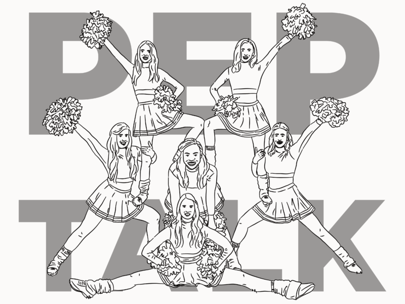
It’s time for a pep talk.

It’s time for you to remember you to just trust yourself.

You are an expert in what it is you want and need, and you can trust in that.

Take a moment to evaluate where you’re at, what you want, and then just go for it. That might mean taking some time off, or it might mean prioritising work. That might mean trying something new, or focusing in on creating depth. That might mean lying low. That might just mean you want spaghetti Bolognese for dinner.

There are so many, wonderful, people offering advice on how to progress your business, your mindfulness, your lifestyle journey, your creative work…But you have the choice whether or not you listen to them. If you’re not ready to hear it, or you have your own thing that’s working for you, have a little faith in it.

That means you don’t have to buy the latest ecourse or workshop. You don’t have to read that book that’s been recommended to you. There’s a whole army of people out there who are going to try and sell you something by making you feel like you desperately need it, like you’re not whole without it. You don’t have to play into the version of yourself they’ve created. By all means reach out and get help when you want to, expand your horizons, learn, but just make sure it’s because you want to.

The only thing you do have to do is more of whatever it is that feels right*.

It’s the middle of February and now’s the perfect time to double down on yourself.


* Or in my case eat more of what you like, that spaghetti Bolognese thing was totally about me.

You have undoubtedly heard the Picasso quote: “All children are artists. The problem is how to remain an artist once he grows up.” It’s a quote that’s famous because it’s so true. There’s a certain freedom to making art and creativity when you’re a child, that you seem to lose somewhere along the way to becoming a ‘grown-up’.

But the simple way to protect your creative child is to keep playing. But it’s harder than it sounds, so it’s something we all leave at aside.

It’s so easy to get in a space of only putting energy into creative projects that have some kind of cause, especially if it becomes part of your job. You start to associate creative time with making money, or trying to make something that will do well on Instagram. Or, you simply just prioritise the work that pays the bills rather than the stuff that feeds your inner child. It makes sense. That’s the world we live in. I know, I for one, do it all of the time. Playtime quickly becomes the least important time to ring-fence.

But making time to play is so important. It’s good for your wellbeing. It reduces stress. It’s great for helping you get through a creative block or just coming up with ideas. It’s a big part of what helps you “remain an artist once [you grow] up”.

So how do you play creatively as a grown up? Quite simply you’ve just got to make time and do it. 

Playtime has to be something that isn’t attached to a need for a certain outcome so it needs to happen outside of your working time. In order to differentiate play and work there are a few things, you can do if you make things for a living.

First, do something outside of your creative bubble as your play time. For me, my creative playtime is cooking, which is about as far from illustration as you can get. But it could also be something as simple as using a different medium or style.

Second, go back to school. By that, I don’t mean go back in time but to try a new class. While that might sound like the kind of structure that’s the opposite of play but learning something new often unshackles you from the expectation that you have to make something good.

This year, I’m going to do my very best to make more time for play, even though it feels so unnatural to me now. Do you do anything to keep your inner child playing?

A little while ago I was catching up on Austin Kleon’s wonderful blog and read his piece on the importance of revisiting and revising old notebooks and it got me thinking about revisiting old sketchbooks. I don’t revisit old rough books that often, but I’m making a concerted effort to dip into them every once in a while, now.

EXCELLENT!

Here’s why:

1. It reminds you of the importance of keeping a sketchbook

I’ve written before about the struggles I’ve had in keeping a sketchbook. It’s only something I really got into properly last year, and since then I’ve certainly had blips. But taking the time just to skim through an old sketchbook is a great reminder of what you can get out of the process. Personally, it also gives me a sense of pride when I get to go through a full sketchbook – a feeling I always want to recreate.

 2. It shows you how much you’ve grown

Seeing your old work is a great way to evaluate how far you’ve come, in whatever it is you’re making. In a world where’s increasingly easy to compare yourself (unfavourably) to others, it’s really refreshing to compare your present-self with your past-self. I can guarantee you will have grown. But you might also find something in you did ages ago that you want to go back to if you feel you’ve lost your way.

3. It’s a great source of ideas and inspiration

On that note, going through past work allows you to revive old ideas. Quite often you end up abandoning work you do in a sketchbook or at least parts of it. Revisiting those ideas can help you come up with something new. Just because something didn’t work then doesn’t mean it won’t work now. You will have new perspectives, you will have grown (see point 2) and you will have new bits and pieces of ideas you can stick together. So, if you’re feeling like you’re in a creative rut, or like you’ve got creative block, why not try reaching back inside of yourself to provide that inspiration?

4. It gives you the opportunity to revisit and revise work to make it better

This is only something I’ve only started doing recently, with super old Instagrams, but reworking old pieces can be really rewarding. I feel like we’ve all had the “ugghhhhh” feeling when looking at something we made a few years ago. Revising those pieces with any new-found skills or in a different format can be a great way to get some practice. It’s often more of a technical challenge where you are out to beat yourself. This is one for if you have some downtime and want to work on your skills – I know some people who revisit the same piece every year to see what they can bring to it afresh every time.

Do you revisit your old sketchbooks or rough work?

As I mentioned in my look at the year ahead, I’m starting a monthly roundup filled with great links and new favourites who are worth a look. This is that roundup.

For this week’s roundup, I’ve tried to avoid the January trap of yearly summaries and resolution reflections. Instead, I’ve focused in on some inspiring design stories as well as a few pieces that really made me think, in the hopes they’ll motivate you for different reasons.


Short Reads, if you’ve only got a few minutes:

1. The best ‘design‘ books that aren’t explicitly about design.

Daniel Burka asked a whole bunch of designers what books, which weren’t specifically about digital or graphic design, inspired them, and he got some great responses

2. The Hospital Gown Gets a Modest Redesign

In partnership with students from Parsons School of Design, Care and Wear has created a hospital gown in a kimono-inspired style, so, at long last, it actually works.

3. Watch: How To Watercolor x Palms | Botanical Illustration

Watch Jess Engle, of Studio Jess, create a simple a palm leaf painting. It’s so soothing and if you’re looking for an easy, but lovely, creative project this would be perfect.


Long Reads, if you want something to get your teeth stuck into:

1. How Don Bluth changed the face of feature animation

From his studio in Dublin, the American animator rivalled Disney during the 1980s and early ’90s.

2. Tiny Wins

Joel Califa talks about the power of small changes when improving how users interact with your designs.

3. Here’s My Problem With the Google Arts & Culture Face-Matching App
Kim Sajet, the director of the National Portrait Gallery, offers ideas to make the Google’s now wildly popular face-matching app better.

4. Björk on creativity as an ongoing experiment

Björk talks to The Creative Independent about what makes a good collaboration, why she doesn’t get creative blocks, the value of being grateful in your work, and why she likes projects that aren’t overcooked.

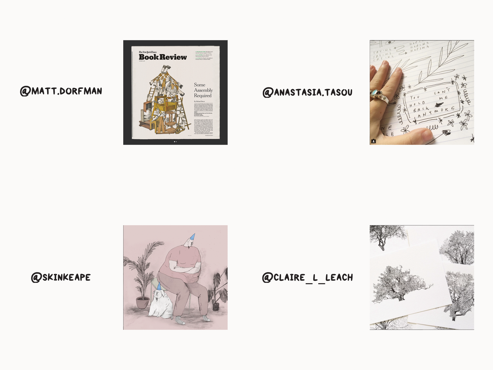
Who to follow, if you want to spruce up your Instagram feed:

  1. Matt Dorfman – Matt’s collages and editorial work are always top notch
  2. Anastasia Tasou – Anastasia’s feed is full of positivity and words of encouragement, and who doesn’t need a little bit more of that in their lives?
  3. Skinkeape – some of my favourite sketches on Insta
  4. Claire Leach – some of the most stunning and detailed black and white drawings of nature

If you want to get more links like these in your inbox every Sunday, along with insights into my work and a few freebies then you might want to sign up to my newsletter.

Sign up for more updates

* indicates required


Last year I wrote a post about starting to find my style and the lovely Asti left a comment asking if I’d ever shared my style inspirations, and it got me thinking. I have shared artists I love in the past, but I’ve never done a post about the ones who’ve had a real impact on how I work on a more personal level.

So here are a few of the names that spring to mind when I think of my artist inspirations.


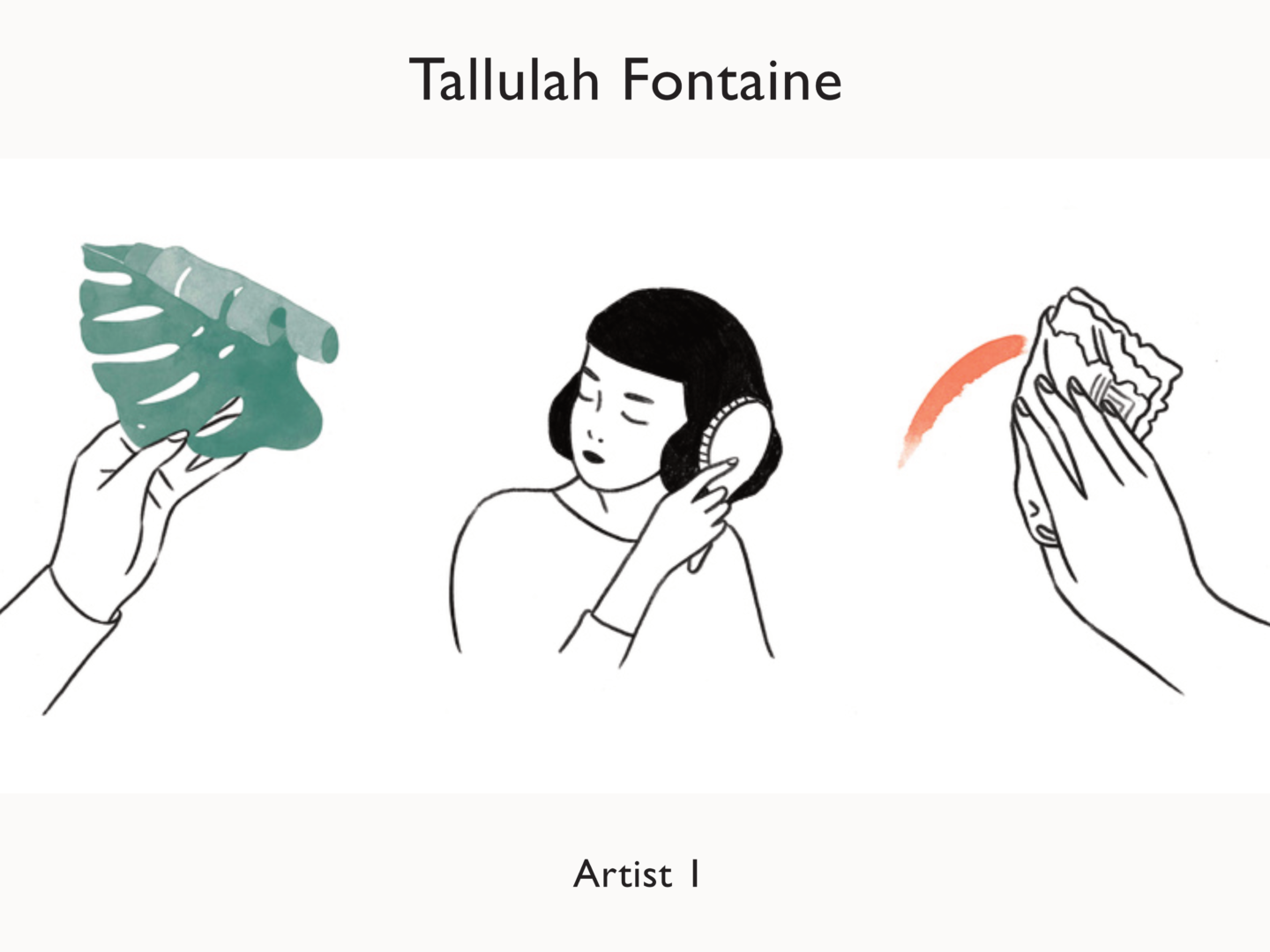
Tallulah Fontaine

I’ve spoken about my love for Tallulah’s work before, so I won’t spend too much time gushing here. There’s a certain tender quality to her watercolours, which although I’m not a painter I want to incorporate into my own work. Her characters are always very simply drawn but hold themselves in a such a way that they really do appear to have genuine emotions of their own.

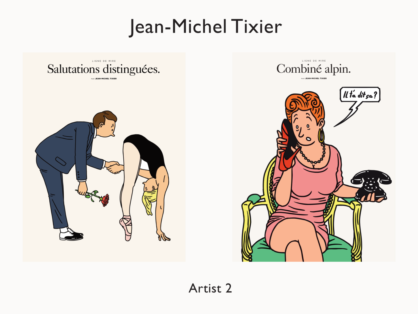
Jean-Michel Tixier

I think Jean-Michel is a more obvious influence on my work. His character illustrations always remind me of a modern Hergé. I love the way he creates playful interactions on a page using line in a way that feels quite bold without ever being static. When I first started adding colour to my own work, his illustrations were the first place I looked for inspiration because his work felt so familiar but just with something more that I’m trying to put my finger on, so it made the jump into colour that bit easier.


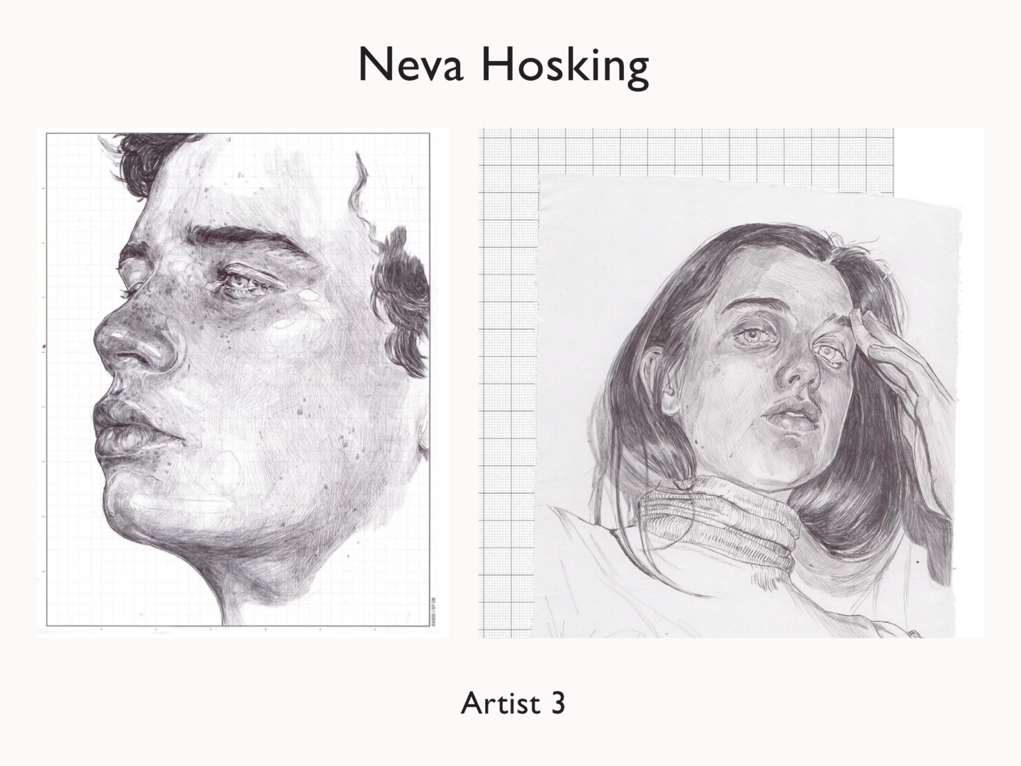
Neva Hosking

While you can certainly see Matt Blease’s influence in the work I share here, it might be slightly less clear as to why I’ve chosen Neva Hosking as a big inspiration for my work. Her detail rich pen drawings and etchings are very different to my digital work but I love how she uses line to create texture and depth within her work. It’s been something I’ve been working on more in my sketches and that I’m starting to try and incorporate in my digital. Her work is just quite simply stunning though. Her sleeping series is magical, dreamy even if you’ll allow me the pun.


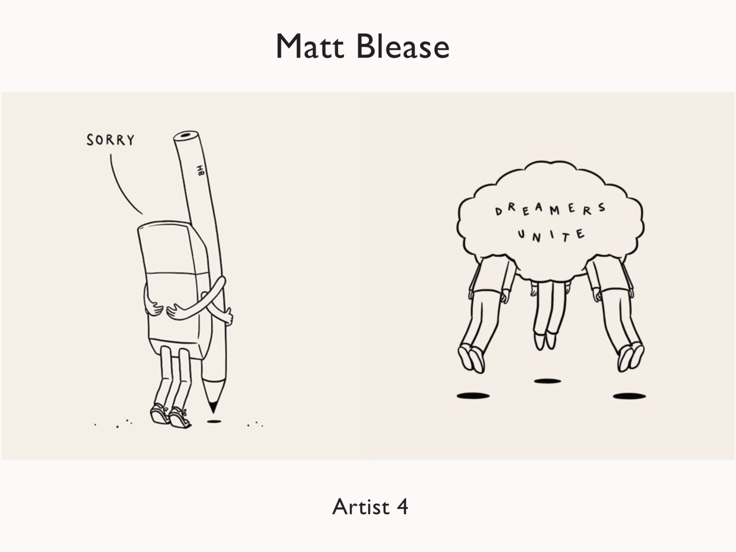
Matt Blease

Matt’s distinctive line drawings were a huge influence on my work when I first started to illustrate digitally. I think you can definitely see it more in my earlier work. He’s also the reason I use a slightly off-white background in my images to give them a little warmth and to make them feel slightly less digital. His work is clear and confident, in part because of their very minimal style which requires a certain decisiveness in their creation but also because of their matter of fact statements. Everything Matt seems to draw says something, whether that’s a statement, observation or just a great visual pun.


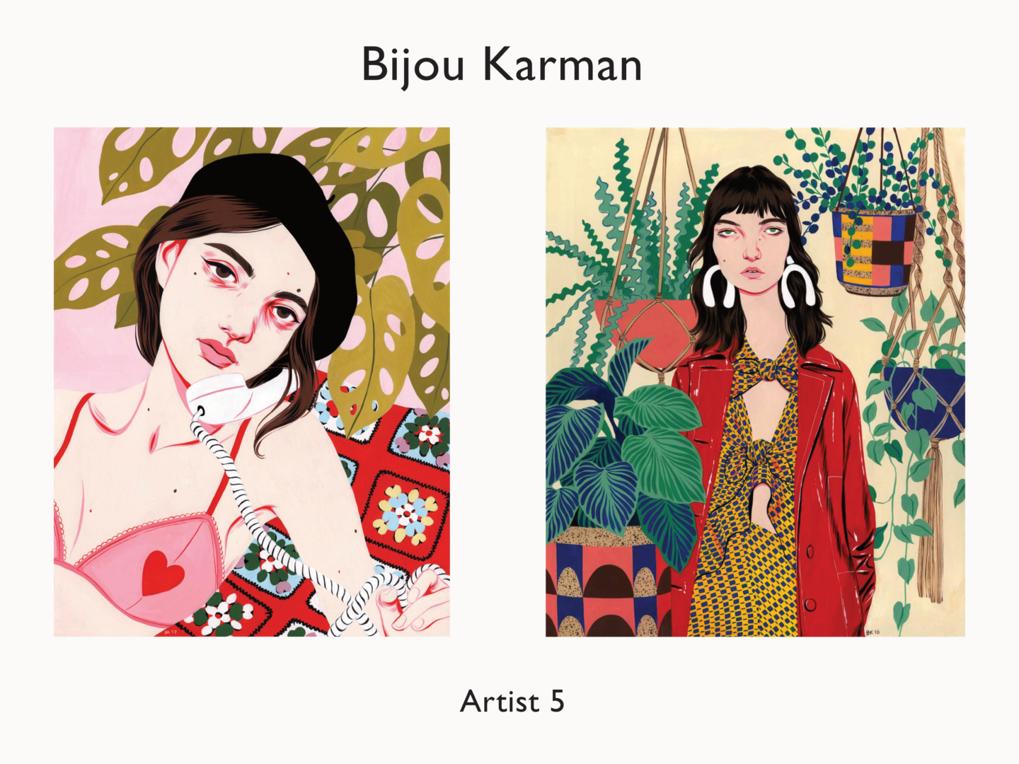
Bijou Karman

Over the past year I’ve slowly become more and more interested in fashion illustration and colour, as well as moving back out of digital as a medium, Bijou Karman is a huge force behind those changes. She’s even inspired me to start having a play with gouache because she makes it look so fun.  As you might have been able to tell, what often draws me to an artist is their use of line. Bijou adds detail, particularly around the eyes of her characters, using line in a way that really enhances their character but also makes her images look very distinctive. She also uses coloured line in a way I find really refreshing. In fact, the way she uses colour in general is refreshing, especially as someone who mainly works in monotone. Her paintings are bright and have so much depth, so many layers of interest, without ever feeling overwhelming or hard to look at – the portrait focal point she creates is so strong.

Other honourable mentions: