If asses are made by making assumptions, the design world is all out of room for them in 2018.

Up until now the world has been designed based on the assumptions of those who were in charge that everyone else was just like them. So, as white men have been in power for so long, that means that the world is designed to work brilliantly for a white man and not really for anyone else. Danielle Kayembe has a fascinating list of some of these assumption-based designs in her excellent piece The Silent Rise of the Female Driven Economy.

But, I’ll share a few examples here too. 

There’s a reason there’s always a much longer queue for the female toilets. Many women struggle to open push/pull doors because they were designed with the tensile strength of the average man in mind – presumably because they were the people doing the designing. Petite female crash test dummies weren’t mandated to be used in vehicle tests until the 2010s meaning there was a risk they hit the airbag chin first, snapping their heads back, leading to serious neck and spinal injuries. Passports, in the UK at least, are available with a braille sticker. However, this sticker just says the word “passport” rather than any of the useful information a blind person might be looking for in their passport. And to round things off, if you didn’t read about this automatic soap dispenser that doesn’t recognize darker skin tones, prepare to get mad. 

Now, catering for those who have needs outside of those of the 95-percentile man isn’t something new. But it is something that has previously been seen as something of a party piece. Brands and design studios would design specialist inclusive products to enter awards or as a PR exercise. These are often great pieces (or at least great-looking) pieces of design, but less often made into a reality. Catering for anyone who, if we’re speaking in broad terms, wasn’t white, middle-class, male, and able-bodied, was an exercise outside of their everyday. It was separate to how they saw their business identities.

But there’s change afoot.

Government services, through GDS, are leading the charge on digital design that works for everyone, by focusing on those who might need the most support don’t face any barriers to accessing their services. This means people who are hard of hearing or have visual, cognitive or motor impairments. But beyond that, it means all users – not just those with permanent disabilities.

Brands like Fenty and Nubian are making everyday products that work for a wider range of people, because sometime one size, or one shade of “nude” doesn’t fit all. They’ve put this inclusivity at the heart of their brands and it has paid off in spades 

Then you have a brand like Heist tights, who have taken a product we all have in our homes, tights, and asked the question “why does wearing tights have to be the worst?” They put in their user research, found the pain points, and actually designed a product that works for the people who use it. Unsurprisingly, they’ve had somewhat of a hit on their hands.

As is proved by the success of the companies mentioned above, getting to know your user putting building something that actually works for them at the center of your business pays. Plus, as more and more companies who genuinely put the user first and focus on diversifying their design teams in order to do so spring up it will soon be damaging not to.

So, in short, there’s no more room for asses in design in 2018.

So, at the start of the year I announced a few changes that you’re going to see coming into play throughout the next few months on this blog and also in my work more generally.

I’ve made those changes because in 2018 I want to really find some more focus in my work. I feel like last year I laid a lot of groundwork, I got my hands dirty, but in order to grow I need a focus to grow towards. In order to achieve a goal you need to know what that goal is*. That meant doing some serious thinking at the start of this year.

Having a focus or purpose behind your work is often described as this moment of divine inspiration. You just need to “find your niche” or “follow your passion”. For me at least, it hasn’t been that simple. I’m interested in lots of things, and I don’t know that I have an automatic “niche” especially within my non-blog work.

So, I decided to set myself some homework, in the same way that I would for a client. Now that I’ve done it myself, and seen what works, I thought I’d share it with you in case anyone else hasn’t had their purpose just leap out and grab them, or if you just want to have a bit of a refresh and remind yourself what it is you’re trying to do.

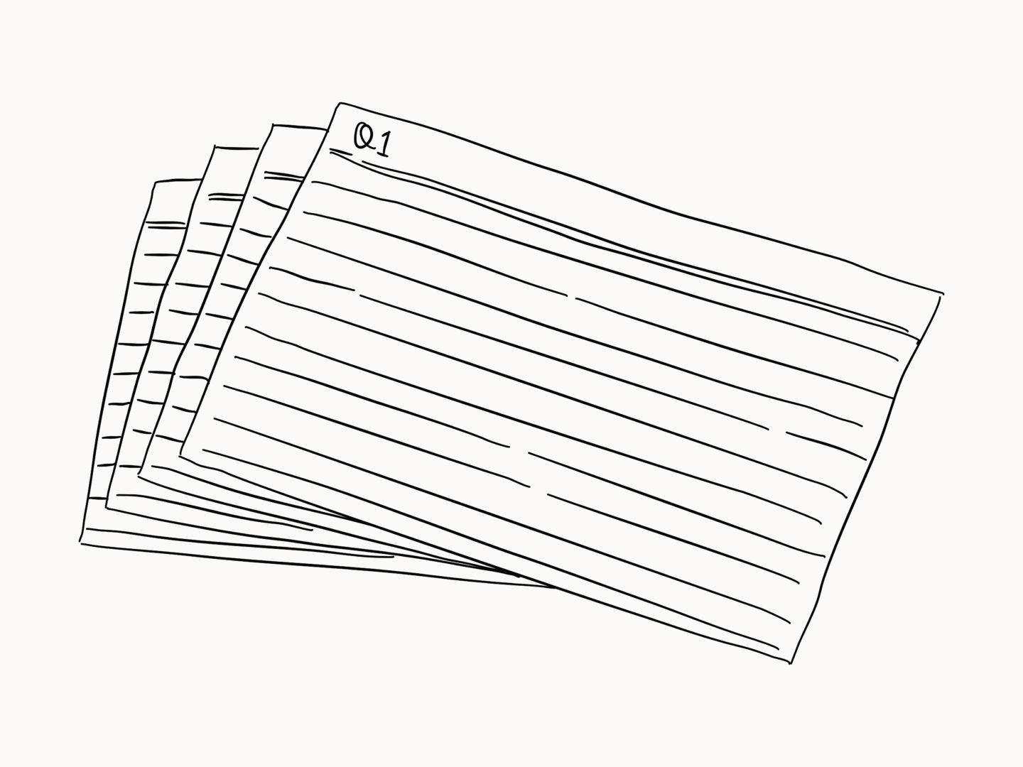
I wrote out the 8 questions below out on cue cards and did my best to answer them. I used cue cards to give me something physical to work on because I always like to have a tangible outcome. Using individual cards also meant I could switch around the order, and answer the ones I knew first and then move onto the harder ones. I divided my cards down the middle so I could answer the questions for the blog and my personal work separately, but you could also go with a project per set of cards.

While they’re only simple questions, don’t be fooled into thinking that answering them is a quick or easy task. It took me a good chunk of time to work out what the best answer to each one of them was.

I’ve put my answers below each of the questions to give you a bit of an idea as to how you might answer, and to keep me honest.

1. What do I want to get out of this?

  • Share my learnings and encourage others to pursue their creative interests
  • Establish myself as a thought leader around design, creativity and productivity
  • Add depth/credibility to my design and illustration practice

2. Who is my audience?

  • Essentially people like me
  • People interested in learning more about design/creativity
  • Young professional women mostly

3. How do I want my work to make people feel?

  • Informed
  • Empowered
  • Like they have a slightly different take on the world around them

4. What can I offer?

  • Illustrated blog posts – something more editorial compared to a lot of lifestyle blogs
  • Insight into my dual roles
  • My experience as a junior illustrator/service designer
  • Researched editorial content – use my English degree
  • Curation of the wild web

5. What are my core values?

  • Honesty
  • Consideration – work that’s thoughtful
  • Inclusivity

6. What is the personality of my work?

  • Credible
  • Friendly
  • Straightforward

7. How do I want my work to be known?

  • As smart and good to look at

8. Can you sum that all up succinctly?

I want to create work that’s considered and well easy on the eye, which encourages people to see design in the world around them.


Now that I’ve put some work into finding a focus for my work. I’m going to try and anchor everything I do to that purpose, because it’s a big one. So, every blog post I write, every time I take on some work around this platform, every time I start to think about a new social media series I’m going to ask myself how does this link to my mission statement?

I might even pin it up in massive lettering above my desk so I can’t avoid it.

*By the way, in all of this it’s also 100% okay if your end goal in your blogging or creative outlet is just to have fun. In fact, it’s super useful to identify that, so you can use it as a reminder not to take on anything you’re not going to have fun doing or get something enjoyable out of at the end.

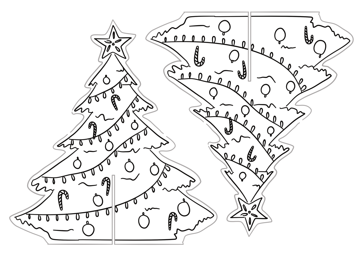
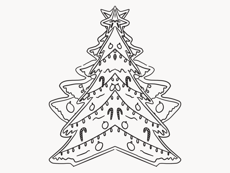
As a part of last year’s blogmas I made a couple of printables, and I wanted to do the same this year with something new and improved. I had a think about what I would want to print and make, and there was one idea that stuck out a mini- tree! I wanted something I could have to spruce up my desk at work, that I could easily move around, because I’m in a hot-desking office – so I needed to create something foldable, robust, and good enough that I wouldn’t be embarrassed to have it sat out for everyone to see.

So, that’s what I’m sharing with you here, a printable tree that’s easy to construct, simple enough for grown-ups and children alike, and is perfect to sit on your desk or mantelpiece. It’s made of just three pieces so you can quickly take it up and down. 

The tree is blank for you to colour in however you like, in case you want to create your own design or just need an excuse to sit and colour in – at this time of year I know I’m always game for a bit of quiet me time. I’ve added a little bit of extra gold sparkle on my version, because that seems to be a recurring theme in my festive designs this year.

So, how can you put together your own baby paper tree?

  1. Print out the 2 copies of the pdf, it works best on card if you have some
  2. Colour all 4 trees in
  3. Cut out the shapes along the grey lines this is probably easier with a craft knife but scissors work too
  4. Glue the two trees from each page together back to back, so you have a double sided tree
  5. Slot the tree shapes together
  6. Display your tree wherever you like and wait for the compliments to roll in

Download and print your tree!

PART 1 / PART 2

If you make one of these, please do let me know by leaving a comment, or, even better, sharing a picture with me on Instagram or Twitter because I’d love to see them in the wild!

After my post on my commission process to help explain some of the things on offer in my shop, I want to spend a little bit more time here talking about my work, and how it actually gets done. So, today, I’m going to talk you through a recent illustration project I took on at work for my old grad scheme website.

As a quick bit of background if this is the first post of mine you’ve read, last year I was a part of the Engine Graduate Scheme. The Grad Scheme is a year-long look into the world of marketing and communications, which comprises of four three-month long rotations in various best in class agencies covering everything from consultancy, to sport sponsorship, to events, PR, data and, of course, above the line advertising.

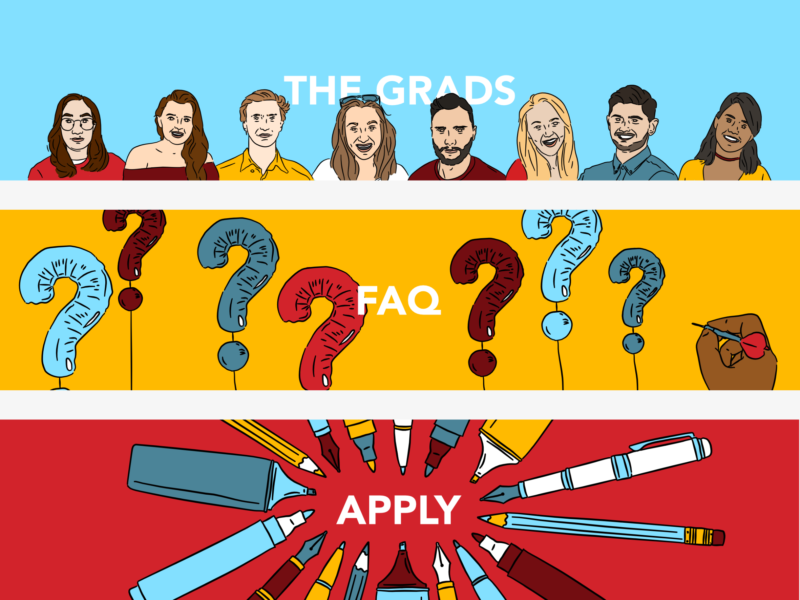
Every year the most recent group of grads take over the website, so this year it was our turn and we wanted to give the site a bit of a spruce up. The first step in this process was moving to the Engine Group site, from our .wordpress site. Then we moved onto content and visuals, which is what we’re talking about today.

So how did we go from a need for a new style to the site that’s up now?

CREATING THE BRIEF

First off, we came up with a bit of a brief, which was relatively informal and more of an agreement between ourselves as to what we wanted. We knew that we needed something fun and colourful and that suggested we were a more creative scheme than the visuals we had before.

As well as deciding what we wanted we also had to work out what our limitations were. We knew we weren’t going to be able to get any new photography done, so we decided to go with something illustrated. We were also limited by the structure of the web pages on the Engine site, which meant we were mainly just working with set header images.

But we also knew we’d need designs that could work for our social media in terms of branding and generating content later.

COMING UP WITH IDEAS

The ideas for the images bounced off the copy, for example, the sweets in the companies page came from someone describing the choice of placements as a bit of a pick and mix. The one image I really struggled with was the scheme page, so we came together as a group (over WhatsApp because I had a meltdown at 10 pm) and tried to come up with the simplest image for building we could, which turned out to be children’s building blocks.

THE ILLUSTRATION PROCESS

Then we got to my favourite part, the illustrating! I started by gathering reference images for the portraits, then drew from those. I also found references for the hands and the sweets in the companies header. Once I’d drawn the outlines of all of the images I came up with a colour palette. I started with the red of the Engine logo and worked from there, adding a darker version of the red, two shades of the blue, and the yellow for highlights. I stuck to this palette for everything other than the skin tones, and I think it really ties all of the images together.

SIGNOFF AND UPLOAD

As anyone who has ever made a commission like this knows, the work isn’t actually done until it’s signed off and on the site. In order to get sign off, I put the designs into very basic web page scamps in powerpoint, to give an idea of how the pages would come together. Once we’d made all of the amends to the copy and visuals we needed to, I worked with the guys who run the Engine site to get everything live which included editing sizes and doing a few tests on a staging platform. I also made versions of our imagery for the scheme Facebook and Twitter.

If there’s something you’d like to work on together, or you just want to say hi, feel free to drop me a line!

I know I’m a little late to the game. But I know that there are probably some of you out there who are still looking for gift inspiration, if not for Christmas then for new year birthdays. So without further ado, here are some of my picks for gifts for creative types.

THIS BOOK

So you all know I love Adam JK. Things Are What You Make of Them is his latest book and it’s incredible. It’s the pep talk we all need from time to time. It’s chock full of great advice and support. Each page is in full colour, and is perforated so you can save it for later or even share it. This is the gift you’re going to want to get two of, because there’s a good chance that as soon as you start reading you won’t be able to give it up.

THESE TRAVEL GUIDES

Travel is one of the best forms of inspiration, and while in the age of the smart phone you might not necessarily need a printed travel guide these ones are so gorgeous that your recipient is really going to want one.

SOME CLASSES

Give the gift of learning. Picking up new skills is essential, but it can easily be overlooked. So vouchers for classes work as a great reminder, and give someone the opportunity to expand their horizons and their practices.

A STATIONERY SUBSCRIPTION

So who doesn’t love stationery? Keep your loved one full stocked throughout the year with a stationery subscription. There are plenty of good ones out there. In particular, I like the Paper Gang by Oh Deer and Post by Katie Leamon. It’s the gift that keeps on giving.

A PRINT, OR TWO, OR SEVEN

It makes sense that artists love art. Getting someone a print by a maker they love is a great way to show you care, and to give them something that they’ll look at and think of you every day. You can even support a good cause or two, by buying prints where the profits are given to charity or inspire social action like The Good Cause.

SOME COMPANY

The studio can be a lonely place. Get your friend a little company.

SOME PEACE AND QUIET

So one of the best things I’ve bought this year are a pair of noise cancelling headphones. If you’re feeling a little spendy, they’re an incredible gift. They’ve helped me focus and kept me on task and sane throughout so many hours of work this year.