I’m built out of pieces of everyone I’ve ever admired and it feels like my research practice is developing in very much the same way. From how I conduct interviews to how I structure write ups to I work with participants, I’m constantly learning from the people around me. Largely, I’d say my research work is still finding its form. I’m trying on hats and seeing how they fit. But there is one thing that seems to have become a solid and distinctive part of how I work already. 


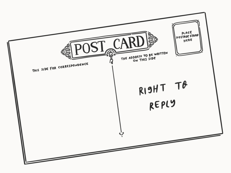
I’m a firm believer in the right of participants to reply to research.


We discussed the ethics of an ethnographic approach and people based research in my Goldsmiths anthropology course. In those debates about potential tensions between ethics and morals, about taking the time to be aware the potential consequences of your research, about avoiding harm, and about informed consent, I started to draw my own boundaries, in pencil at least.


When I consider the ethics of my research, I’m not just looking to do no harm and offer true informed consent, but I want to pursue beneficence, research that does good. For me, that often links into a collaborative approach to research and design that empowers participants to shape the future of the services I’m working on. 


In order to do that, I try to take my baseline for how I make decisions in session design on the principles of trauma informed care. These are principles that have always rung true for me, but that also acknowledge that there’s always the potential for harm in research just as there is always the potential that someone is carrying harm around with them.


In short, as cribbed from the Wisconsin Department of Health Services, a trauma informed practice values:


The right to reply fosters a sense of safety because participants are empowered to know they will ultimately have a say in what the research looks like. It gives them a choice in how they are represented. Taking a transparent approach to report writing builds trust and ultimately acknowledges that you’re working together in partnership.

As much as possible, I take a collaborative approach to research and design. I’ve been so fortunate to work with some brilliant advocates for co-design and true human centred practice approaches. Working collaboratively is cultural as well as process driven, and it should, in my opinion, be foundational. The right to reply is just a tiny piece of that foundation.


Giving participants the opportunity to respond to research outputs directly, as well as involving them in a wider co-design programme, has helped build a solid research network. I’ve found the small effort of allowing participants to be part of shaping the narrative of our sessions together has given them confidence in the work we’re doing. 


Whether interviewing people who have sought asylum about their legal journeys or colleagues about their views on career progression, I never want my voice as report author to overwhelm theirs. I want to be able to elevate their voices then work together to produce some harmony that can be used as an anthem for change. 


On a more practical note though, the right to reply just helps you maintain accuracy. It gives experts an extra chance to share their expertise and participants sharing personal stories a moment to feel comfortable with what’s said.


One of the things I love about user research is being able to acknowledge, very openly, that you don’t know the answers and actively welcoming help. Whenever you set up time to learn from someone during research, it feels like you’re saying let’s work together to make something a little better, I can’t do it without you. 


But there’s careful work involved in making the right to reply work. 


First, you have to make clear that responses are optional. Replying shouldn’t feel like homework for a participant, it should be part of a collaborative approach, if a participant wants to collaborate, and not everyone does. I like to explain that I’ll send over my notes as I take someone through any consent forms and part of the next steps at the end. 


Second, there’s a little bit of extra thinking that needs to go into how you structure the notes you share. Knowing that your participants are going to read your notes changes how you think about them. For me, it’s made me even more conscious of being accurate and neutral in my reports and observations, then making sure I clearly frame an analysis or thoughts. My write ups are about being a representative voice of the appellant, which is making me slow down on my analysis taking each step as it comes.


Third, you have to have a way to incorporate the feedback. It can’t be a hollow action. Personally, I make small updates straight into our shared notes space, e.g. if I’ve misheard someone’s title, and just track the changes. Our research is ongoing, so I have to worry a little less about ensuring a final publishable version. But any new points, especially if I haven’t covered them in a face-to-face run through of the research, I call out as direct addendums.


I don’t think it’s a method that works in every situation. I’ve yet to find a way to build a space for response into user testing, for example. I’m not sure that many people would be all that interested in my notes on their missing a button we’d just turned from green to grey. I also don’t know how much value a response from a user would add to those notes. Instead, we try to test multiple iterations or be part of private beta launches, that way they can give more feedback and see the impacts of their insights on services.


I’m confident the right to reply will continue to be a feature of my research practice, but I’m also confident that how I use it will change and evolve, because I’m changing and evolving.

Whenever I wanted something when I was little I would make it. Crafting and building things was all about doing things for myself. I was focused on the outcome but also on having something that kept my weird little introverted only-child self enthralled.


I’ve lost that a bit as I’ve grown older, busier, more independent in other ways.


It’s something I’ve been missing. Making things for an audience has kept me accountable to keep pushing my illustration, but I think only making things with someone else directly or inadvertently in mind has left me feeling empty with my practice. 


I’ve tried to just start making things for fun but without a clear project, it’s easily fallen by the wayside to work for clients or visible work for this blog.


That was until watching hours of Bon Apetit’s Gourmet Makes reminded me of the child in me who loved to make homemade versions of what she’d seen polished and shiny out in the real world, even if it was half cobbled together.

Ever since I started my job as a design researcher, I’ve found myself envious of the stickers that seem to adorn the well beaten macbooks of my colleagues.


Adorning your laptop seems to be a right of passage. It always seemed to me that it would take a certain kind of confidence to display a message or an identity so prominently everyday. (Note: this is why I don’t commit to slogan t-shirts). It also seems to be a right of passage because I don’t know how these stickers seem to magically find their way into people’s hands.


Recently, I’ve been feeling a little bit of that confidence in the values I want to embody and the version of myself I want to work towards being. So, I felt like it was time I earned my stickers.


Or rather, it was time I embraced my inner child and made them.


In the spirit of embracing my inner child I took inspiration from my 15 year old self who covered (some may say vandalised) one side of a desk in the art room I spent every lunch in with apple stickers. It was my way of claiming a sense of belonging. Plus, fruit stickers are the coolest.

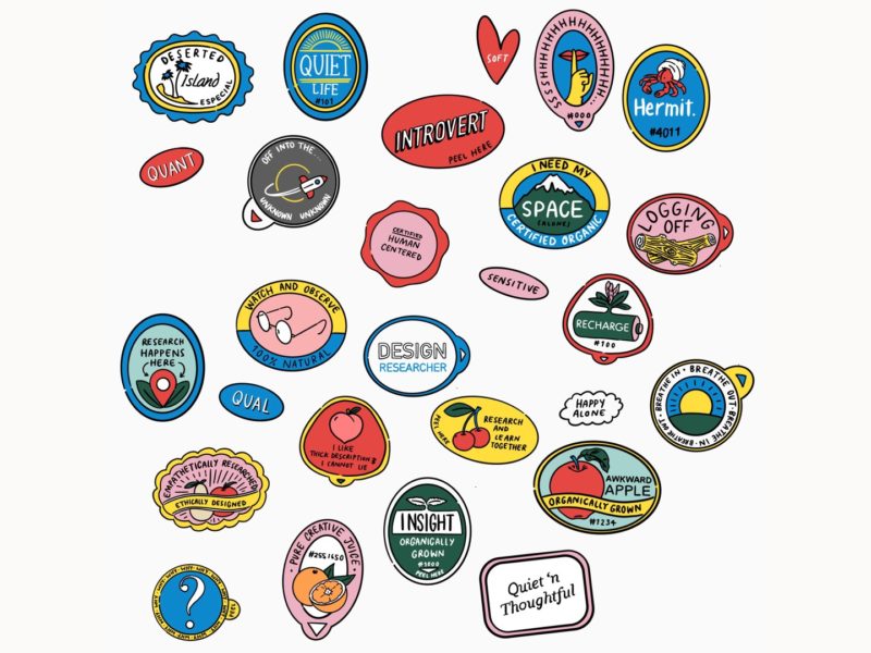
So I did a little bit of research into vintage fruit stickers, then just got drawing. I used the basic oval and pull tab shapes as a basis then filled them with things that meant something to me. Largely, I worked around two themes being a quiet soul and design research. There not universal themes. As I mentioned in my last post there might not be all that many introverted user researchers out there. But these were stickers for and about me so I kept it personal. 


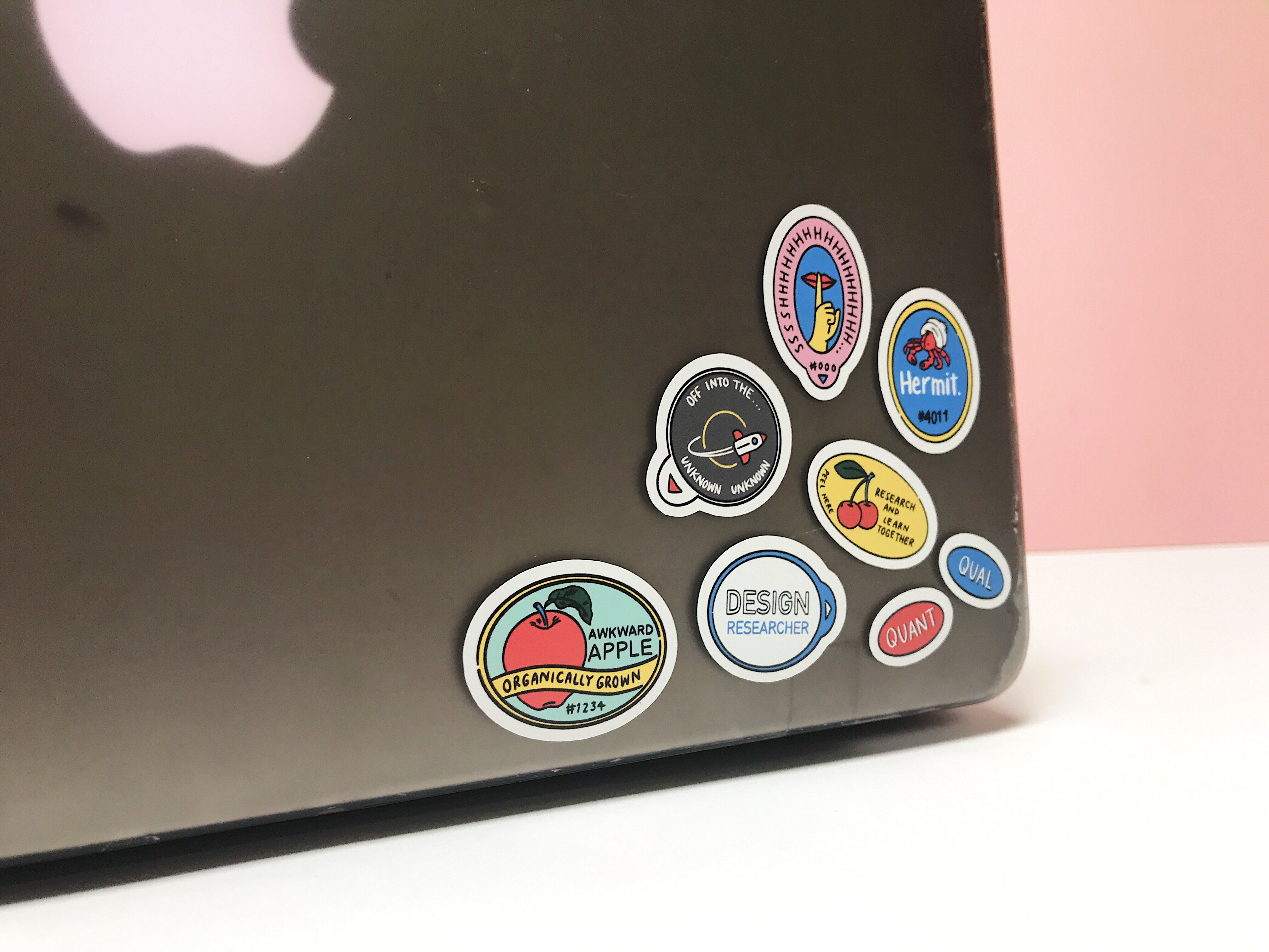
I now have my own fruit inspired stickers, which I’m using to mark out my space of belonging even if I only have a hot desk.


It felt really good to make something just for myself. I couldn’t stop ruffling through the sheets when they came in the post. They’re now proudly displayed on my own well beaten macbook and my notebook, and they’ll probably make it onto any new office supplies I get. If there’s one thing I’ve learned hot desking across offices, if you don’t mark your charger it will be borrowed, never to be returned.


I think making these stickers was a bit of a turning point for me. I’ve talked a big talk about making work for myself in the past, but never really followed through. But the joy I got out of having something I had made and wanted to use was so huge that I’m prepared to say no to other people and put the things I want to make first. 


I have another couple of projects in the works as well as a big overhaul of my online ‘branding’ for the want of a better term. So I’m hoping to share a few more of these kinds of posts soon.

Every day I get up and I go to work as a design researcher. I enjoy my work and I’m getting better at every day. But I have been told a number of times by other researchers, by designers, by well meaning by standers, that user research is a job for extroverts. I most certainly am not an extrovert.


Well, let me rephrase that. I’ve been told more times than I can count that it’s not a job for introverts. No one ever says a thing is for extroverts, but they are happy to exclude introverts with the assumption the norm is extroversion.


They see introverts as shy and awkward and antisocial. I can certainly all of those things. You can be shy and an introvert without a doubt. But that’s not what it means to be an introvert.


As Susan Cain, author of Quiet says, there are lots of definitions of what it actually means to be more on the introverted side of the spectrum, and it is a spectrum. But one that she seems to go back to, along with the idea of where we get our energy is “people who prefer quieter, more minimally stimulating environments.’ The key is about stimulation: extroverts feel at their best and crave a high degree of stimulation. For introverts, the optimal zone is much lower.

But even that definition might seem to suggest that user research isn’t for the introvert at heart. User, or design, research in its current format involves a lot of ethnography, of speaking to strangers, of new environments, of absorbing stimulation. It’s a people and adventure job.

It’s also a job that’s about listening and paying attention to the people you’re researching with. The natural quietness of introverts is usually read as shyness, which I can understand and is probably sometimes the case. But that potentially slightly awkward style is often because “introverts want to take in what you’re saying, think about it and then respond, while extroverts want to engage in a back-and-forth.” While building a back-and-forth rapport with participants to make them comfortable is hugely important, research relies on being quiet and taking in what you’re being told or shown


Research also relies on you picking up on a whole range of details. Introverts are often highly sensitive people, which means you pick up on everything around you from sounds to sights to smells. That’s why they’re often overwhelmed or have to quietly process in stimulating scenarios. That’s also why if you leave an introvert in a research session and give them time to process what they’ve just been part of they can pick up on details other people might have missed. This might come at the cost of them not saying as much, but having someone who can watch body language in the room is never a negative.


When you’re doing research you need to be able to relate to and work with all kinds of people. Somewhere between 16 and 50 percent (I know that’s a big range) of people are introverts. So you’re bound to meet a few when you’re out and about doing research. When you’re an introvert, I think it’s sometimes easier to notice the signs that someone else is on your quiet wavelength and adjust your style to suit. Plus, I always like to start any co-design sessions with some time for people to do some silent and solo work where there’s time to write answers down, in part because that’s what I like to do.


While a lot of what’s visible about research from the outside is the fieldwork, fieldwork is very rarely valuable without careful consideration and analysis. That’s something introverts are notoriously good at. We don’t make quick decisions and we’re not bold, but we are contemplative and able to weigh up a whole range of information, which is key to getting insights out of the data you get from fieldwork. 


Those are just some of the ways that introverts, contrary to popular opinion, can make great user researchers. But there are some things you need to do to be able to thrive as an introvert in a supposedly extroverted role.


Build in time for reflection. This is the big one. I’ve realised that I can’t process a session as quickly as my colleagues might like. I’ll be hounded with ‘how did it goes’ as soon as I get back to the office. I am forever grateful that they’re excited to hear about what we’ve found. But for me to share valuable insights I need some time alone. So now, I schedule in feedback sessions (close to but not immediately after) research. That way everyone knows they’ll hear about what happened but I can take time to process.


Understand that not everyone will work in the same way as you. When out researching with more extroverted colleagues, I’ve often found myself steamrollered. I leave a few seconds after someone has spoken to make sure they’re done and to let me formulate a meaningful question based on what they’ve shared. Other people aren’t so comfortable with that silence. If that happens to you, you can either just accept it and spend your energy observing or try to explain your style before setting out. Either way know you’re doing valuable work.


Just because everyone else likes to brianstorm doesn’t mean you have to be in a whirlwind. I’m not great at big group exercises where everyone is talking. My sensitive brain is taking in a lot of information and I can’t process it quickly enough. Plus, I genuinely enjoy listening. But often in design teams decisions get made in groupthink sessions. As a researcher, your job is often to be the voice of the user in the room to feedback insights. If you’re just listening, your team don’t get the value of that advocacy. So, what I’ve found works for me is to spend a little time beforehand thinking about the key points and quotes from the people I’ve spent time with.


Even with those caveats, I know that user research isn’t a job for all introverts, just like it’s not a job for all extroverts. If you find meeting new people particularly taxing, there are so many other brilliant roles for you my quiet friends.


Design research hits a sweet spot for me. I’m fascinated by people but I do often find big social interactions tiring and I’m not a big personality. But with research I get to meet so many fascinating people. I get often get to talk to them about things they’re passionate about, we get straight to the good stuff, it’s not small talk. I get to people watch. I get to listen. I get to have this already defined neutral role in a conversation. I get to spend time with people one on one. I get to do all of that, then consider my findings and affect real change. 


That’s what I’m thinking everyday when I wake up to go to work, not that I’m not the extroverted people person I’m sometimes expected to be.

In my taste finding expedition, I’ve found myself being drawn to more complex and narrative pieces which juggle multiple elements.


I’ve always loved looking for structure in whatever I’m looking for whether that’s pattern when I’m researching, rhetorical devices or clever conclusion when I’m reading or hidden triangles when I’m walking around a gallery. But since leaving school, where the importance of composition was drilled into us in with almost a gull term of arranging triangles, squares and circles when we were 14, I’ve gotten lazy.


So I thought I should go back to basics and do some research. When I’m doing research, I’m a big notetaker, because that’s the only way I remember anything. This is a spruced up version of those notes in case you’re looking to put some more visual structure into your own work, or to just feel like you’re in the club when you’re looking at art. This is definitely not a comprehensive guide, but it’s what stuck with me.


The Tate defines composition as “the arrangement of elements within a work of art


What makes good composition?

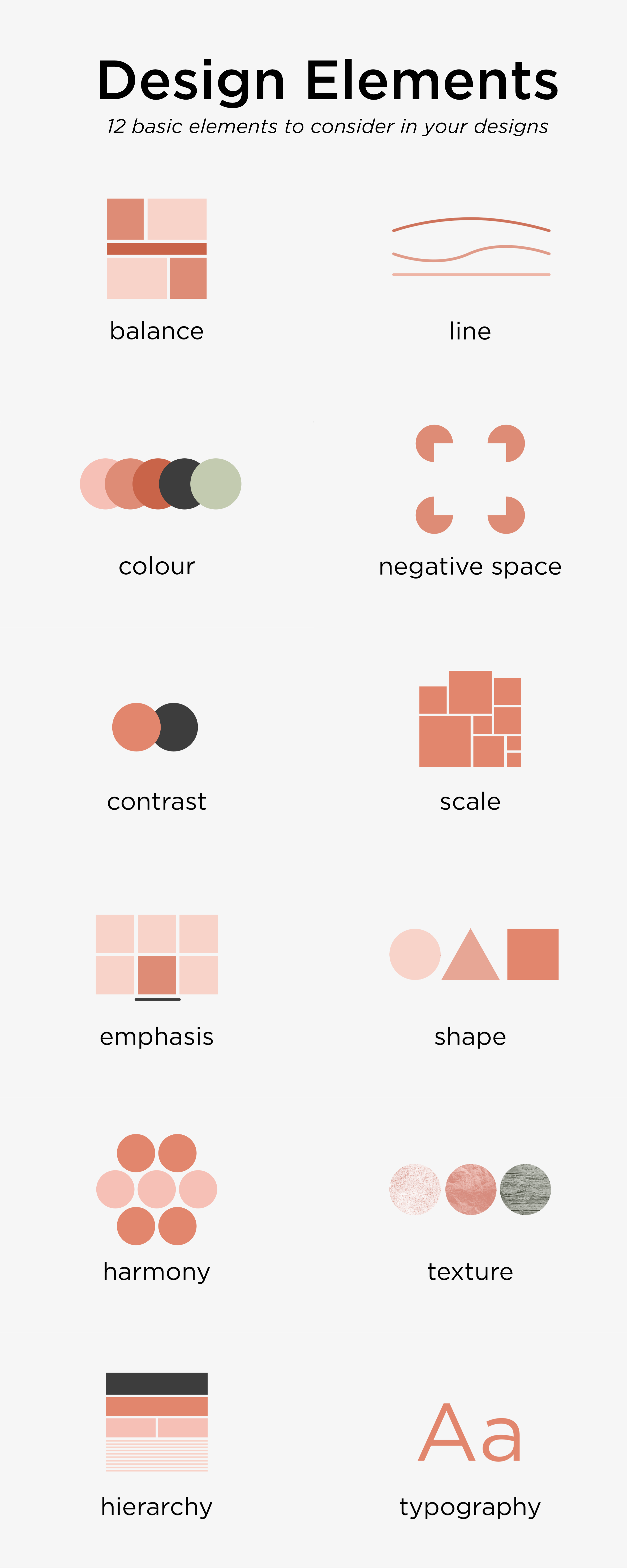
The qualities that make good composition seem to almost mirror the qualities that make good visual work more generally, which I pulled together a little while ago in poster form (below). The qualities most relevant to composition (with a little explanation) are the following:

  1. Proportion – how do “things fit together and relate to each other in terms of size and scale; whether big or small, nearby or distant”? This is the most obvious quality of composition.
  2. Emphasis/focus – where is the viewer’s eye drawn? Creating contrast and playing with balance, rhythm or movement can make certain elements of a piece stand out and appear more important.
  3. Balance & unity – do all of the elements work together? Symmetrical compositions instil a sense of order and calm (think Wes Anderson) whereas asymmetrical ones create more dynamic and active pieces.
  4. Rhythm & movement – what is happening in the image and how does it draw your eye? Leading lines and underlying shapes/tones can direct the viewer to focus on certain elements of give a sense that a piece is going somewhere at a certain pace.
  5. Pattern – do elements of the composition repeat? Using repetition can give clear structure or draw certain parts of an image together.
  6. Contrast – how do elements of the piece appear different? Contrast may come in many forms including hue, tone or scale and can create dynamics within a piece.

12 Basic Elements of Design

Tried and tested structures.

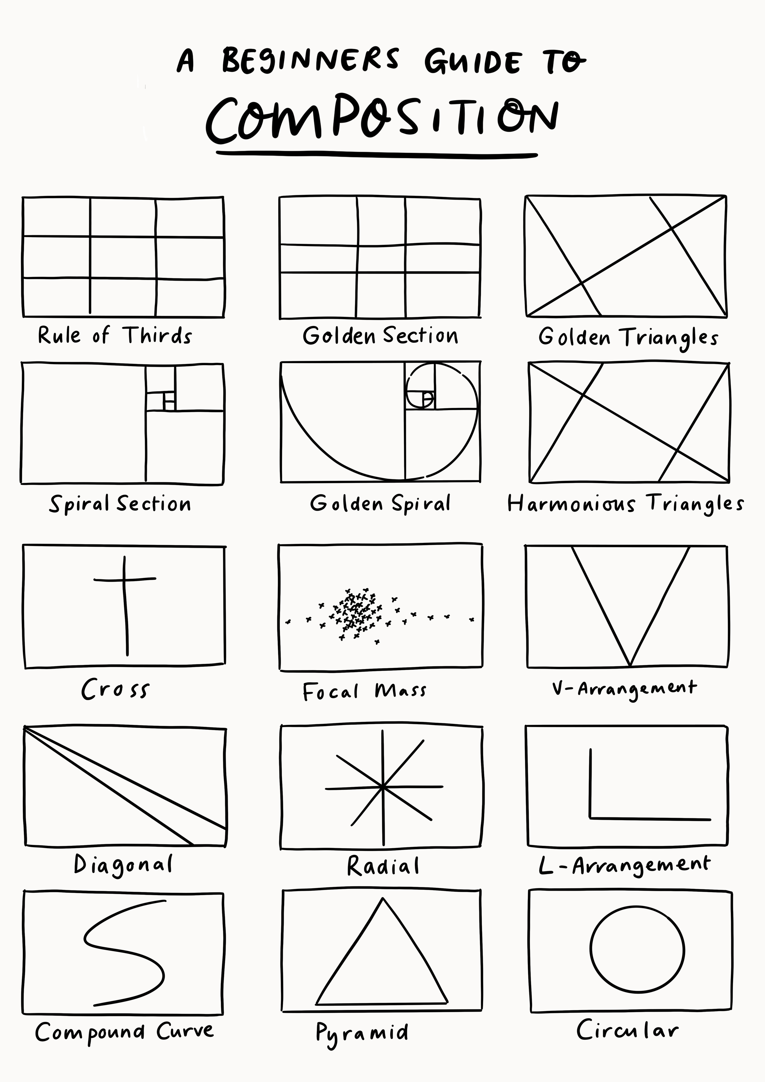
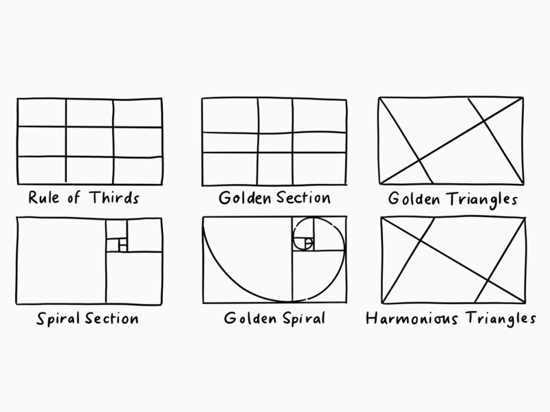
There are a number of “rules” in classical composition like using the golden mean or the rule of thirds. These seem to be less rules in the strict sense, but tried and true templates we can use to inform our own compositions. I’ve put together a visual guide to these templates/bits of composition inspiration.

Top tips

  • The rule of thirds works best in rectangles (not squares)
  • Aim for variety in the sizes and spaces between elements for a more dynamic composition – but there is a time and a space for super regular work.
  • As well as the scale/spacing of elements, also use colour and tone to draw the eye.
  • Use objects and light to point at the thing you want people to focus on.


So those are the bits of advice I’ve collected so far, but if any of you have any other top tips or have more formal art backgrounds and can help a girl out I’m all ears!


But for now I’m just going to try out what I’ve got in my illustration and by burgeoning photography practice.

The Creative Pep Talk podcast is one of my favourite design/illustration listens. I was a bit late in coming to it – despite having followed Andy J. Miller for a long while. It’s absolutely brilliant “through ridiculous analogies, personal stories and artist interviews, Andy [helps] you break free from confusion and make a plan for your creative career success!”


I was listening to 229 – the 6 step process to unlock powerful creative business momentum in which Andy asks and answers the big question “if it’s not about practice, passion, talent or skill, what’s the real foundation of great creative work?”


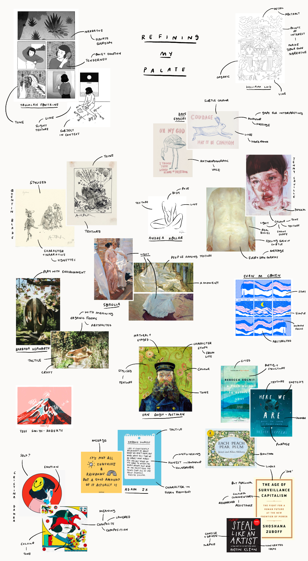
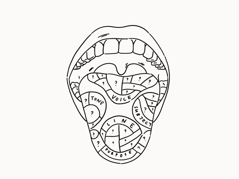
It was an episode that really came to me at the right moment. I’m currently in a personal place of re-evaluating and evolving what creative work it is I want to do. To use the language of the episode, I’m cleansing my palate.


Without giving too much away about the episode, because you really should go and listen to it, the first steps Andy suggests for unlocking what will make you great in your own right are to forget what you think you know, to identify your super sense (not what you’re good at but what you notice) and to develop a taste profile of what it is you like. For this third step, he described a task of gathering up art from 3 contemporary and 3 historical sources and drawing out what it is about them that makes your spidey senses tingle.

It sounded like a lot of fun, and like something I could really benefit from. So that’s exactly what I’ve done, or at least I’ve made my own attempt at it and I wanted to share it out in the open with you because I think it probably says more about who I want to be as a maker than anything else.


So here’s a collection of pieces of creative work, both timely and timeless, which really speak to me. I’ve gone beyond just illustration and I’ve delved into books and film and design because I wanted to see if I could draw out any super macro themes and because I don’t just want my creative work to be still standalone visuals.


I’ve made moodboards before, but I’m usually concerned with creating something with a clear focus that answers a question or creates a coherent visual output. But here I just pulled what I liked and added a few words.


Seeing such a range of pieces together really made me take a step back and re-evaluate what it is I love.

Here are a few of the key values I found myself being drawn to:

  • Line – I feel like it comes as no surprise that strong line work is something that I look for in a piece
  • People – in general I gravitate towards works with a human focus, or that look at a human impact. Even in images with animals, I’m looking for anthropomorphisation
  • Organic forms – there’s something that’s difficult to put my finger on but that’s definitely rooted in nature in a lot of the images I’ve been drawn to
  • Texture – pieces that come across as tactile or show their human makers in their texture
  • Light and tone – colour on its own doesn’t catch my eye, but the use of tone to create a narrative or to indicate light is something I always love.
  • Stylised realism – while the use of colour doesn’t have to be realistic, I do generally prefer works that are representative of life
  • Clear voice – strong personality and message is key in both written and visual works
  • Personal but well researched – I have a huge amount of respect for people and pieces that seem to have a wealth of emergencies at their fingertips but manage to keep their work from feeling too academic and lacking in a human focus
  • Endings – I like a clean close, which probably links into the below point about purpose. A narrative shouldn’t just fade out.
  • Cultural purpose – works that draw on the world around them and offer new insights are my favourites


This is just the beginning, I’m only half way through the steps Andy suggests in his podcast and I’m barely taking the first steps on my own creative journey. But now, at least, I have a compass to give me some direction for what good would look like for me.


If you’ve got some time and a desire to collage (or a keen pinterest trigger finger) I’d definitely recommend giving this task a try.