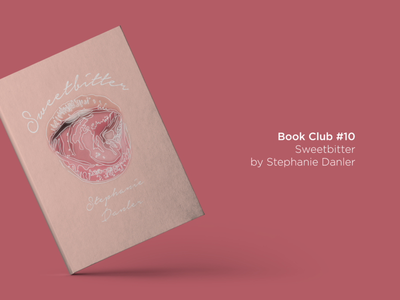
It took me a long time to read this month’s book club pick, in fact I was a bit worried that I wouldn’t have a new review to share with you in time. Stephanie Danler’s Sweetbitter isn’t a long book, it’s your average 300 pages or so. But the mixture of a change in work schedule and a lot of things kicking off meant that I lost my regular reading time.

Despite those setbacks I knew that I wanted to read Sweetbitter. It, along with Emma Cline’s The Girls, was one of the most hyped books of 2016. It had a load of things I love in a book, a bit of a bildungsroman, an insight into a world I don’t know all that much about, and some romance. But it was Danler’s descriptions of food I was most interested in; good food writing is one of my favourite things to read.

I think the quote on the cover from Stylist – “think Girls meets Kitchen Confidential” – ended up being the most accurate description I read. Danler’s debut follows the classic coming of age format of a small-town girl moving to New York. However, Tess doesn’t dream of being a star or falling in love, she has no ambitions at all. Danler’s slight twist on the norm, still relies on the romanticism of moving to the big city even if the epigrams she often starts chapters with would claim be too jaded to be swept up by the delights of New York. It’s a tone that’s come to be used to describe the contemporary young woman in her own voice in the last couple of years, and it’s something that resonates me as someone who falls into that category.
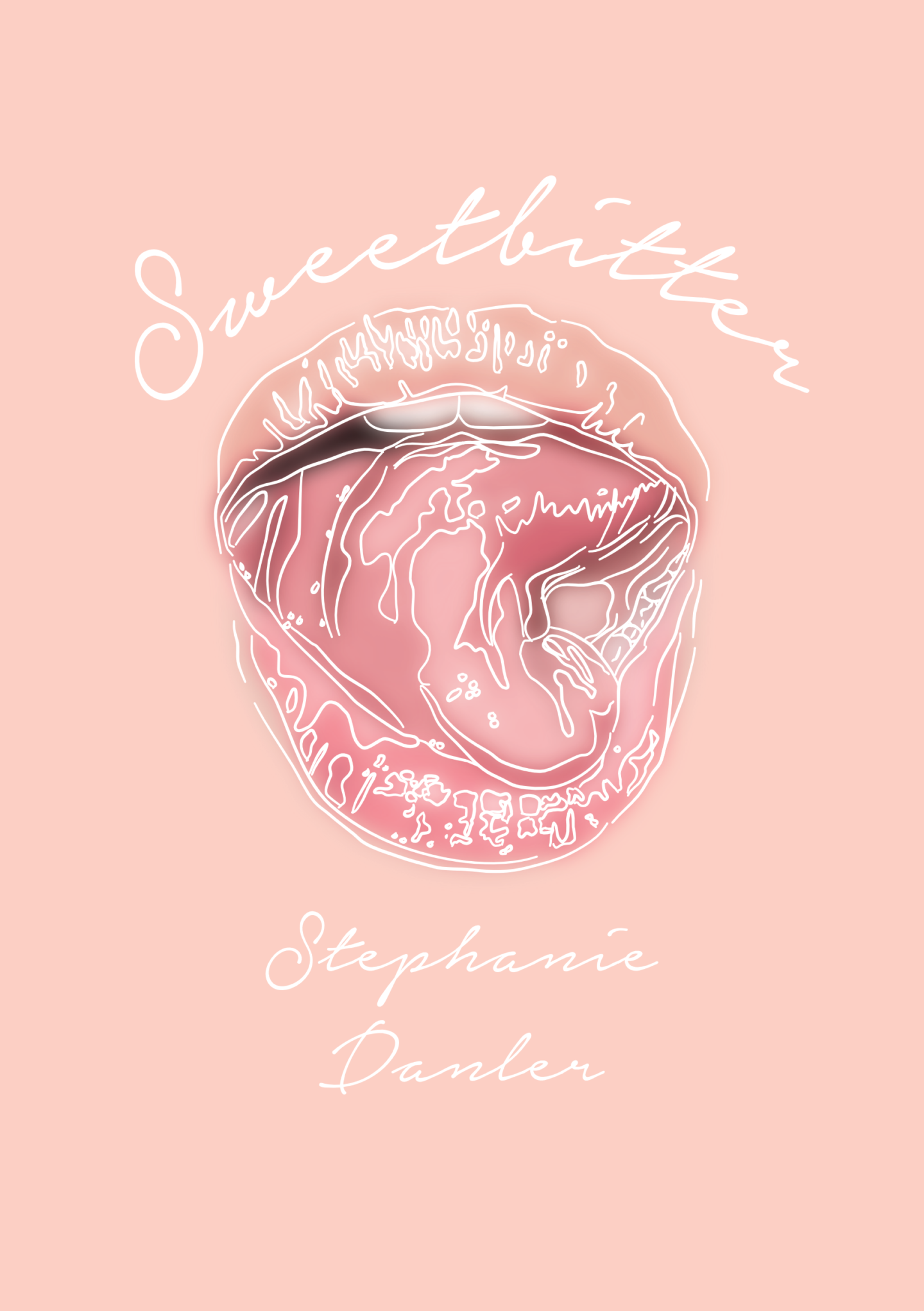
Tess finds herself a back waiter at a Manhattan restaurant where meals probably cost more than I spend on groceries in a month. As someone who has never worked in a restaurant, but who has watched and read a fair bit about them, I really enjoyed Tess’s perspective. She’s finding her feet, and in a weird middle ground between front and back of house. Tess also finds herself in the middle of a bizarre love triangle, with a bartender called Jake, who she views only sexually, and the experienced waitress who takes Tess under her wing, Simone, who you could say is her real love interest.

As much as I quite enjoyed reading Sweetbitter, I don’t think it was quite deserving of the sparkling praise it received. It had neither the in-depth documentary style look at a restaurant I wanted nor a thrilling plot, so by the time I finally got to the end I had that slightly hollow feeling of “oh that’s it?”. The novel, like its main character, lacked drive or argument. On the one hand, this makes a lot of sense, and reflects a stasis within an industry where everyone is seemingly only waiting until their big break as an author, actor, singer etc. On the other hand, as a reader as much as I’m happy to read about a character’s lack of direction I still want the text I’m reading to get me turning the pages. That said, I did keep reading and I did enjoy a lot of the time I spent reading.

If you’re looking for a slightly more indie feeling beach read or a casual lunch time companion this one is for you. If you watch Girls, Fleabag, or Broadcity I think you’ll like it, especially if you live in or love New York. If you’re looking for something more, I’m not sure if this one is for you. Now, I’ve read Sweetbitter, I’m really looking forward to seeing what Danler writes next (and I’m sure there will be something) to see if she capitalises on and refines what worked in her first novel.

SOME QUESTIONS TO PONDER AS YOU READ

  • Danler’s descriptions of food, and how she interweaves them with the story are one of the most praised elements of the book, what do you make of them?
  • How well do you feel you know any of the characters in the book?
  • Can you imagine the book as a movie? Who would cast in which roles?
  • Endings, for me, can quite often make or break a book, what are your thoughts on how Danler closes Sweetbitter?

IF YOU WANT SOME FURTHER READING TRY…

IF YOU WANT MORE BOOKS LIKE THIS HAVE A LOOK AT…

Why not use Sweetbitter themed bookmark I designed to keep your place as you read? You can print and download it for free here.

As ever, let me know if you’ve read Sweetbitter, or if you have any recommendations for what I should be reading next.

I changed jobs a month or so ago, so I thought I’d share a bit about what it is that I actually do when I’m not writing and drawing on here. Finding a day job that works for me as much as I work for it has been a bit of a tricky search, but I think I’m just about there and I’m really enjoying what I’m doing and learning now.

For those of you who don’t know, here’s a quick bit of background. In September, I completed a yearlong grad scheme with The Engine Group. The scheme included rotations in a number of marketing and communications disciplines including consultancy, PR (corporate and brand), advertising, customer relationship management, and data, as well as options to work in events, sports sponsorship, media creation and media buying. All of these rotations gave me the chance to try out lots of different jobs and to work out which industry, and which kinds of environments, suit me best. If you’re just starting out in a grad scheme, I’ve written a load of posts about my experience and getting the most out of them.

Eventually, I came to the decision that the place I felt most at home, and the place I felt I could get the most out of was digital consultancy. Thankfully, the consultancy I worked for agreed, and so I’m now a part of the Transform team.

Transform focus on putting digital at the heart of a business, meaning they help their clients make sure they have the right services and skills to make their work actually work for real people in 2017. Their work is anchored around strategy, service design and technology working together. So, they’re not really your typical consultancy. They actually build a lot of the services they come up with the strategy for and design.

You know how you can renew your passport online now? That was us! You know how easy it is to do click and collect with Argos? Yeah, we helped make that happen.

They’re also a small tight-knit team of super smart people, which always helps.

My role in all of this is kind of a business analyst/user researcher hybrid, depending on the project, with a focus on service design. But what does all of that actually mean? 

Essentially, I do a lot of research and testing to find out what people want. I spend a lot of time either in businesses, government departments, or out and about interviewing people to find out how they work and then turning that insight into solutions. Then we prototype those solutions, which is something I’m learning to be able to do and test them to make sure they work for the people who are actually going to use them. Seems like common sense, right? That’s the crux of what I do – taking in lots of information and then coming out with the best, common sense solution to the problem, then making sure it works. Outside of those key elements, I also do a fair bit of analysis, workshopping, presentation building, and pitch prepping. No two days are the same, or even in the same seat, which definitely keeps me on my toes.

So that’s what I’m up to now. I know I normally write more about design and work more generally, but would you want me to share more about my day job specifically and working in marketing as a junior? Is Service Design something it would be interesting to learn more about?

Let me know, I want to make sure I’m making content that’s relevant and useful to you guys.

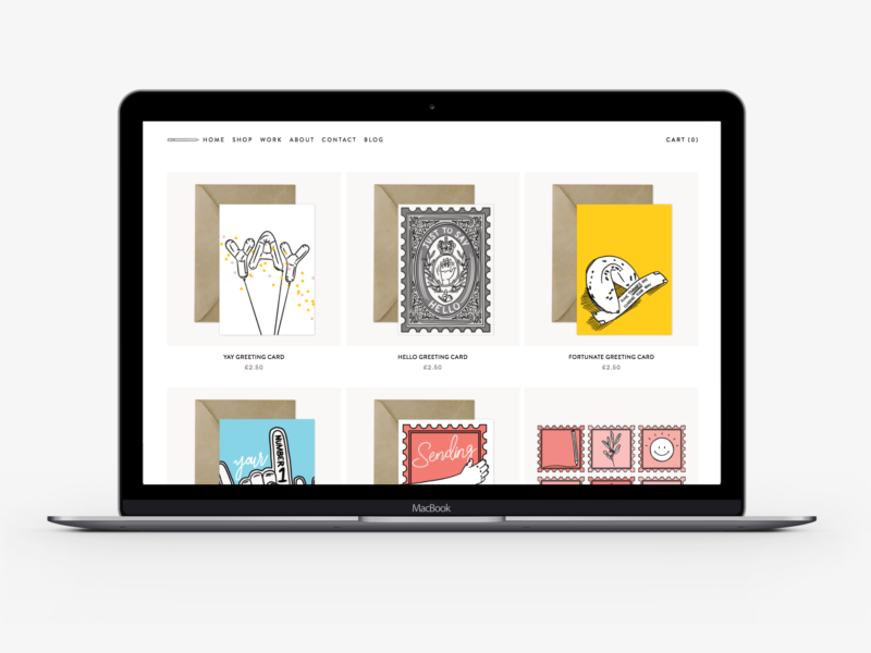
If you don’t know already I recently redesigned my portfolio and opened a store over at natalieharney.com. Because this blog is all about sharing everything I’m learning as an illustrator and designer (and human) I thought it would be worthwhile sharing the redesign process with you. Plus, it’s the kind of post I like to read, so I thought it might be the kind of post other people might enjoy too.

When I made my old portfolio, I was an English student, the work I was creating was very different, the skills I had were very limited and I didn’t need a portfolio all that much – or at least I didn’t share the link all that often. So, I thought it was about time I had a portfolio and personal site that really showed off the work that I’m doing and that I was proud to share when emailing people about commissions or even when my colleagues ask what I do outside of work. Plus, I really wanted to start selling some pieces on my own terms. Both of those meant that the time was right for me to build a new portfolio.

Once I’d come to the decision I needed a redesign, it took me a good month or so to actually find the time to do anything about it. Or rather I procrastinated because I had a blank slate, and there’s nothing scarier than a blank piece of paper.

So, my first stage was to try and build some boundaries into that blank sheet of paper. I created a list of the basic things I would need from my portfolio:

  • a short but engaging landing page
  • a grid portfolio page
  • flexible individual project pages
  • a store page
  • product pages
  • an about/contact section
  • all of the extra information sections that come with running a store

Then I gathered some inspiration by going through the sites of people who are doing similar work to see what they had included and how they’d laid out their content. Thankfully I feel like I’m digitally surrounded by so many incredible artists and makers with wonderful portfolios like Kitkat Pecson and Katie Suskin, which meant I was spoiled for choice. I also did a run through of the classic design inspiration Pinterest, Behance, and one page. Through that research as well as picking up a few new cards, I started to have an idea of how I wanted my new site to work and look.

After some more research, I decided that I wanted to use Squarespace to build my new site. I use WordPress for this blog, and it’s great, but I’ve used WordPress for previous portfolios and found it cumbersome and inflexible as someone who can’t code.* I’d heard good reviews of Squarespace and it seemed to tick all of the boxes I needed.

With Squarespace (as you probably already know) you have a selection of themes to choose from to base your site template on. I chose Brine as it fulfilled all of the basic criteria I established at the start, and seemed to offer me more than enough flexibility so I could make it my own.

Rather than just jumping into designing on Squarespace, I chose to start with pencil and paper. I wrote a list of all of the design capabilities and options I had with Brine and then I tried to imagine what I would do with all of those options instead of tweaking the options on site and getting a cookie cutter portfolio. I think I did okay.

The next step was obviously to build the thing, which thanks to Squarespace was really easy and didn’t take much time at all.

This might have been the wrong way to have done things, but I didn’t start making content until I had that framework in place. It worked for me because I know my own body of work pretty well, so from the start, I was already imagining how best to display it. I do think I underestimated the amount of time it would take me to turn a few years of work into a set of concise project case studies. Plus, it took me a good warm-up period to get over the discomfort of writing another about section. But once I’d powered through the curating, writing, editing, and uploading process I was left with a selection I’m pretty happy with and I think shows off a good range of the things I can do. It has also given me a lot of food for thought on the kind of work I want to do more.

Before sending it live, and sharing it with you, I tested it on a couple of friends and colleagues to get their feedback and to have an extra few pairs of eyes to spot typos. I’m still gathering feedback and improving and I think I will be for a long time, but that’s all part of the process to isn’t it?

All in all, it took me about a month to sort out my new portfolio (whilst still doing my 9-5, working on the products for my store and posting on the blog).

I think it’s hugely important in this day and age to have a portfolio you are proud of, and somewhere you can direct people to that explains what you do. If I can do it, I think anyone can, especially with the number of tools out there to help.

Please do head on over to my new portfolio and leave me any feedback you have on the site, or if you like what you see pick up some new stationery!

*I have also used Wix for other projects, but it just didn’t offer the level of control I wanted.

Continuing my new found love of non-fiction, I recently read Alain De Botton’s Status Anxiety and knew it had to be included in my next book club post because it had such a profound effect on how I think. I’ve been a big fan of De Botton’s writing for a while, but I’d never read what is arguably his most popular work.

Just in case you haven’t heard of it already, Status Anxiety is “a book about an almost universal anxiety that rarely gets mentioned directly: an anxiety about what others think of us; about whether we’re judged a success or a failure, a winner or a loser.”

I realise that I’ve gotten to Status Anxiety over a decade after it was originally published in 2004, but I think I read it at exactly the right time for me. So many of the topics touched on in the book seemed to seamlessly weave into qualms and questions I’ve been having about my own life and the world around me recently. I feel like particularly after starting blogging and trying to navigate the world of work while deciding who I want to be and what I want to do, perceived status has been a silent shaping force in my thinking.

My perceived status does matter to me. I know some people will see that care as something negative, wrapped up in vanity and ego, which I guess to some extent it is, but not conicously. Status Anxiety has really helped me to understand why I care so much about my status and why that doesn’t necessarily make me a bad person. So much of how the world is shaped and organised is based on status, it’s how we’re taught to make sense of the world and our position. That doesn’t mean it has to rule us though. But even just knowing that has helped me debunk my negative perception of myself for caring about it, and to some extent diminish its impact.

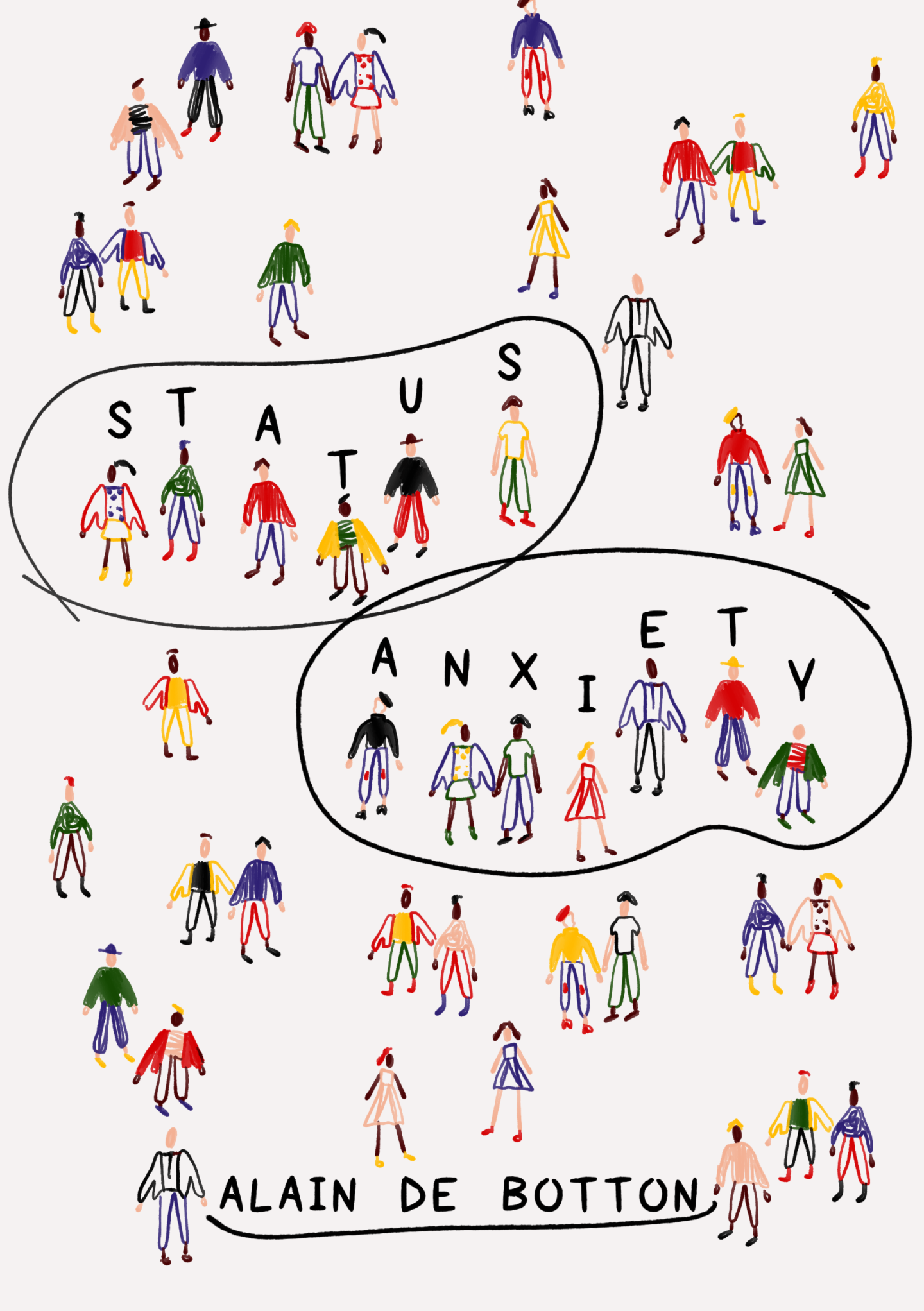
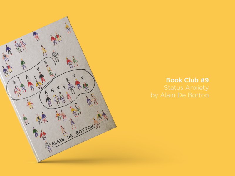
My alternative cover design for Status Anxiety

The first half of Status Anxiety sets out De Bottton’s case for why status anxiety is real and a particular problem in the modern world (I would love to see an update on it for an increasingly digital world). He collates a thinking from a whole host of other philosophers as well as examples from throughout history. While at times this can feel more like De Botton is synthesising ideas rather than adding his own, the clarity with which he stitches these different ideas together is what makes Status Anxiety such a useful read. Yes, many of those ideas were out there already. Does a lot of what De Botton claims read like common sense after a while? Sure. But would I have read those other texts, or brought all of that thinking together on my own? I don’t think so. The principles this first section presented to me so eruditely have given me an additional set of lenses to view my world through.

The second half of the book poses some potential solutions to suffering from status anxiety. I have to admit that I didn’t get along as well with this half of the book. I wasn’t really all that convinced that any of the solutions presented worked as anything more than outward performances, but I guess it is hard to know how someone else truly thinks. This section, for me, turned into a challenge to try and think of ways that I could reduce my own status anxiety. I have yet to find a solution, but maybes the first step in that is just acknowledging it as a common condition.

I would whole-heartedly recommend Status Anxiety to anyone and everyone. It’s such a good eye opener and thought provoker. It doesn’t have all of the answers, or anything that’s particularly ground-breaking, but I think that’s its power. It’s easy to relate to and use as a platform to start reconsidering your own thought process. Plus, despite being a philosophical text it is surprisingly accessible and easy to work your way through – I think it took me a little over a week to finish just reading it in my lunch breaks.

SOME QUESTIONS TO PONDER AS YOU READ

  • Do any of the anxieties and principles suggested in the book affect you? If so how aware of them were you?
  • To what extent do you think that status anxiety can be diminished or eradicated? Have you done it?
  • How do you think social media has affected our perception of status, and thus our feelings of status anxiety?

IF YOU WANT SOME FURTHER READING TRY…

IF YOU WANT MORE BOOKS LIKE THIS HAVE A LOOK AT…

Other books (this list is a little short because I need to read some more to be able to recommend things to you confidently – please add to this in the comments, and I’ll amend the list!)

Why not use Status Anxiety themed bookmark I designed to keep your place as you read? You can print and download it for free here.

As ever, let me know if you’ve read Status Anxiety, or if you have any recommendations for what I should be reading next.
You might not know that one of my big, pipe-dream goals for the future is to write and illustrate a book. I made my first one when I was 16 for a class, about a Llama who lost her Mamma and I loved it. It’s still at my home in York, and I like to flick through it when I go back.

Now I’m a little ways away from being able to have a published illustrated book, but there’s nothing to say I can’t make my own. So, in a now age old tradition I decided to self-publish and start small by making my very first zine.

And where better to start than with something I love?

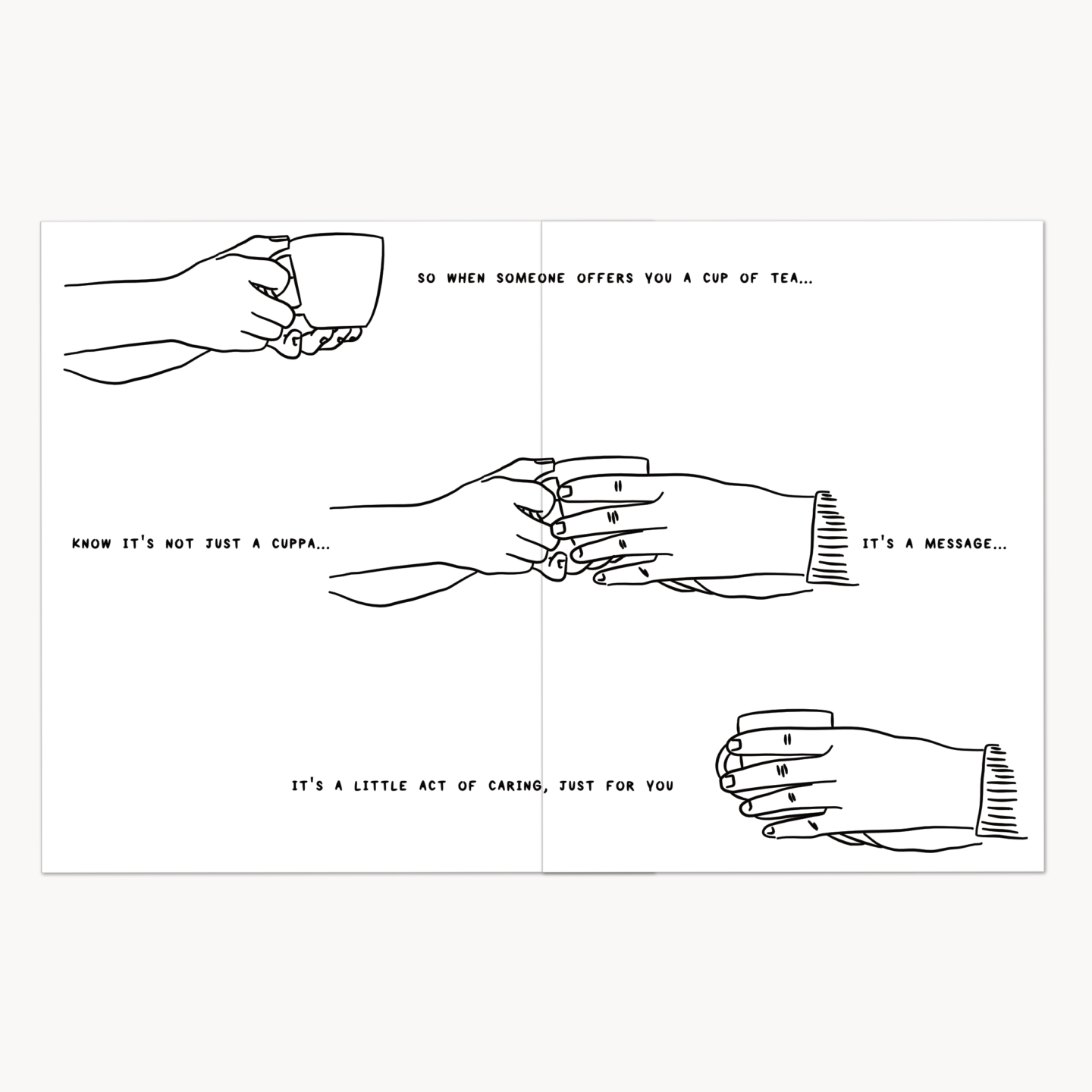
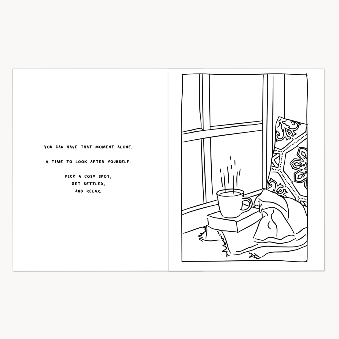
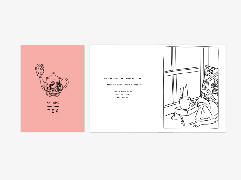
An Ode to Tea is all about why tea is so much more than just a drink, it’s a comforting hand, it’s a ritual, it’s a moment of understanding. Tea can be everything and I think it’s so easy to forget how much can be wrapped up in a simple cuppa, and that’s the story I wanted to tell.

Actually putting the zine together was a lot of fun. It started, of course, with me making a cup of tea. Then I mind-mapped everything I love about tea. There was a lot. Then I made an attempt at some story boards, so I could try and stitch all of those separate ideas together into some form of a narrative. Then I drank some more tea and got on with the illustrations.

When it comes to creative work I’m usually someone who just dives straight in and tries things out. I don’t have a lot of patience for planning in the way that I do with other kinds of work. I just want to make. That’s what I did when making the zine. So there were a lot of images and bits of text I scrapped in the end because they didn’t work. But making all of those failed attempts is what informed the finished product and I think it’s so much the better for it.

It took a lot longer than I thought to be ready to print properly – I did print a few drafts to see how it would look, but the final one took a few weeks in the end. But the moment when I saw all of those pages churning through the printer I felt like I had joined a special club. It felt like I had joined a union of self-publishers. Is that weird?

As fun as mass producing your illustrations is, I really wanted the zine to still feel personal. That’s why each on is assembled, signed and finished by hand, so you know each one has really come from me.

You can buy my zine on its own or in a bumper par-tea (I know I’m hilarious) bag, which includes the zine, postcard, a greeting card, and an exclusive sheet of biscuit-y stickers for just £6. That’s the same as a tea and a slice of cake, and a bit of a bargain if you ask me.