This is the third and final installment of my mini-series about my room (read parts one and two). I’m closing the series, for now at least, with a bit of an insight into how I used design thinking to shape my room and make the most of the space, as well as some top rental room renovation tips.
First off, I thought it would be worth doing a quick recap of what design thinking is, in case you haven’t come across it before. Design thinking is all about taking a user-centric approach to a problem and then solving it in a hands-on iterative way. You focus on the real user to build something they actually need, rather than what you think they need. Taking this insight and working with it iteratively, prototyping and testing means you fail small and often as part of a process rather than dedicating a huge amount of time and resources to a project that might have an underlying flaw you hadn’t noticed. This process can take slightly longer at first, but it becomes more time and energy efficient overall because you work out more of the kinks at the start. If you’d like to know more about design thinking, check out the full post I wrote about it. 

So how do you apply that relatively abstract concept to designing your space?

  1. Work out how you use a space – live in the space for a while. Where do you spend the most time? Is there anything you can’t do that you want to? Is there anything you don’t need?
  2. Start with the bare minimum and find out what you need as you want to reach for things – can you hack a solution to see if it will fulfill your needs, can you prototype the solution you want to see if it works?
  3. Test before you buy – measure your space and get a feel for what will fit, and try things in store – especially if you’re buying furniture.
  4. Research the most user-friendly option – write up a list of requirements and shop according to those rather than blankly looking for a chair within a certain budget – what is that chair for? What do you want it to do? Where do you want it to fit?
  5. Consider the future life of your space – what you need your space to do will evolve with you, make sure you consider your future needs/changes when your designing. Where possible make life easier for future you.

In practice, what this meant for me was living in my space for a while before I started really getting into designing it and buying any new pieces. There are some things in my room that are completely fixed, my bed can’t go anywhere, the shower and sink and plumbed in, I’m not sure I could fit my desk in another space even if I tried.

But when I moved in there was a second desk in what is my living area, there were no drawers in the wardrobe, there was no extra shelving, there were no towel hooks and there certainly wasn’t an armchair. For the first few weeks, I worked out what I needed and what I didn’t, and started by priority. I needed somewhere to store my socks stat. The second desk just got in my way and I never touched it because I preferred the natural light in my office. I wanted some more shelves to store bits that I reached for a lot whether that was paper or face wash.
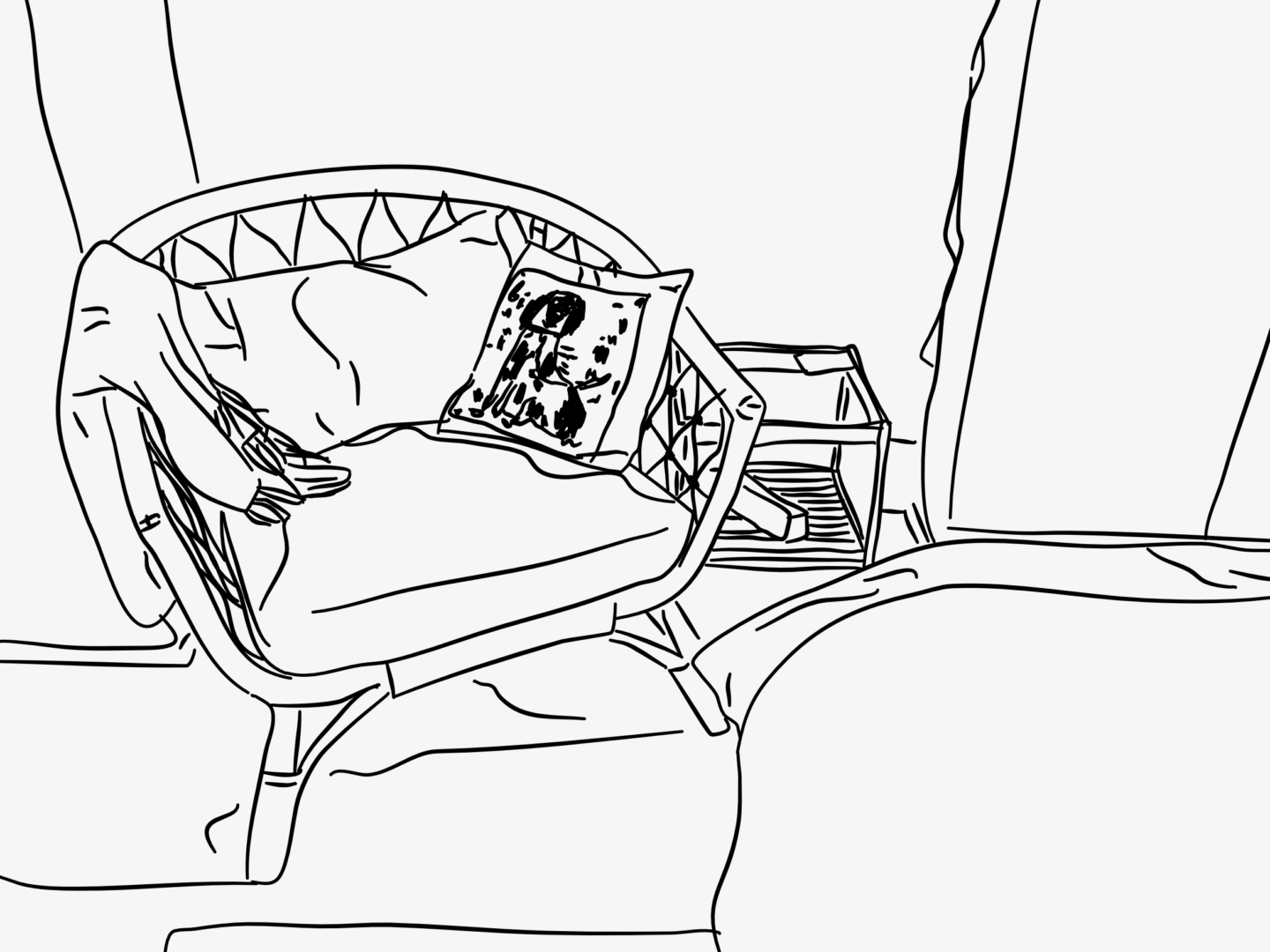
Illustrated Room Tour

The big space design project I’ve been working on is the seating/living area. I started with a minimum viable product (MVP) solution which was a floor cushion. It gave me somewhere to sit and was easy to put away to give me extra space. But after a while, I found it wasn’t comfortable enough, and I didn’t get any joy out of sitting on the floor – I wanted to feel like a grown-up. I trialed using my desk chair but it became a pain point for me to move the chair and not to have the separation of work and rest. So, I knew I had to find another solution. I wrote a list of user (my) requirements that included: something big enough that I could tuck my feet up, something light that was easily moveable for when I leave, something that was neutral and not too bulky to fit with my space. I also knew I would need a side table for tea and books because I would always have them with me when I sat down on the floor. Then I did my research and found a chair and table I thought would work. Then I marked out the space it would fit in with washi tape and attempted to move around it for a week to check it wouldn’t hamper my routine. Only then did I buy my new chair, and you know what it’s absolutely perfect for what I needed (and within budget).

And finally…here are just a few extra rental room renovation top tips:

  1. Find out what you’re allowed to change – check your contract before you do anything substantial
  2. Command hooks and washi tape are your best friends
  3. There’s a lot you can do with soft furnishings – rugs make rooms more homely. Changing your bedding can change a room try something more neutral if a space is too loud or small, or picking a statement colour if the space needs a little life. New curtains (as long as you hold onto the old ones) can be used to let more light in and can almost be as good as repainting
  4. Measure your doors before you buy any furniture – this is just a general life thing
  5. Use lighting to transform a small space for different occasions – I have a working light, a daytime light, and a set of evening time lights (aka fairy lights) which help me differentiate the space for different uses without having to really change anything

How have you made your room your own? Would you like more mini-series like this?

This is the second post in my mini home series. Now you know the lay of the land, I thought I’d share a few of my favourite design pieces that really make the space feel like it belongs to someone who’s slightly cooler than me!

THIS PAINTING

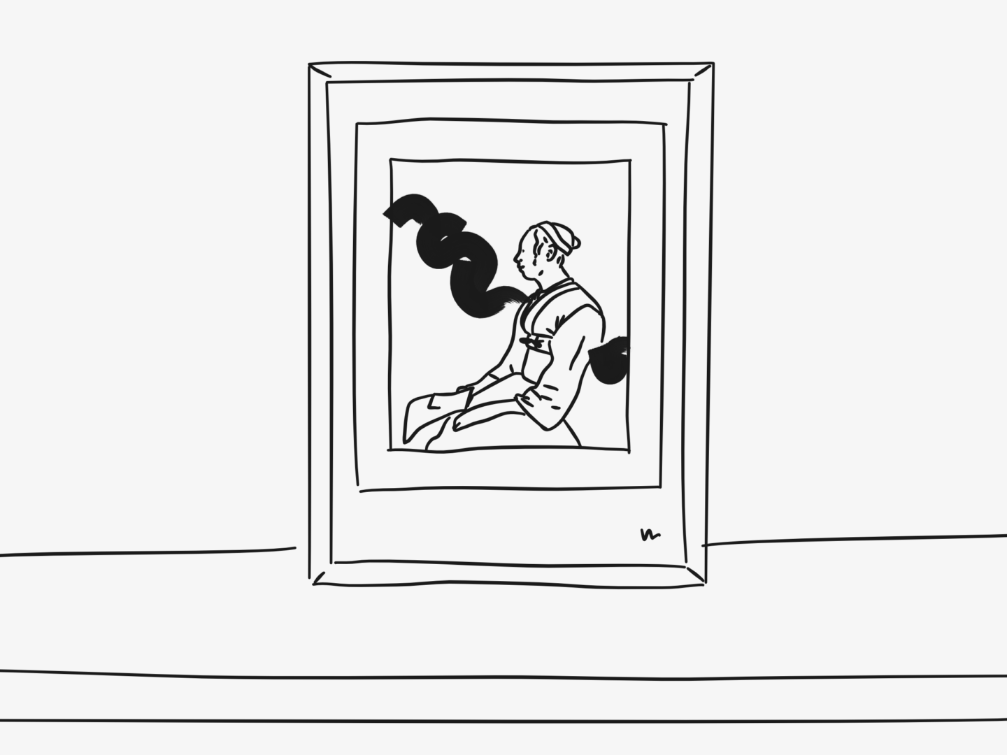
The most obvious piece to talk about is the biggest piece of art work in my room. It’s a mixed media piece that I picked up at one of the Ruskin Art School sales when I was living in Oxford. When I first saw it, it instantly made me feel. It reminded me a bit of the work done by Chad Wys who I’ve been a huge fan of for a long while, but it has something slightly more delicate to it. It’s quite a muted piece so it works really well in my space and helps keep my room a calm sanctuary-like space.

MY JENNY SAVILLE PRINT

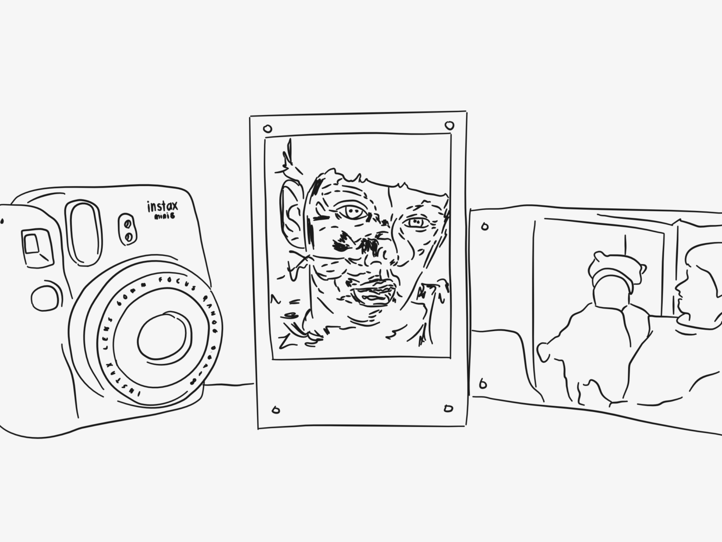
Another favourite that I picked up in Oxford is a postcard sized Jenny Saville print. I had an A2 size poster print of this on my wall all 3 years when I was in Oxford, and made sure I picked up a smaller size so I could carry it with me in the future. I picked it up from Modern Art Oxford, which was somewhere I spent a lot of time – I used to have a standing Saturday lunch date with myself in their café. The gallery is right next to my old college and I volunteered there for about a year too. So, it’s a print that’s attached to a lot of memories as well as being of an absolutely stunning painting. I could happily live in a room covered in Saville paintings and never get bored of them.

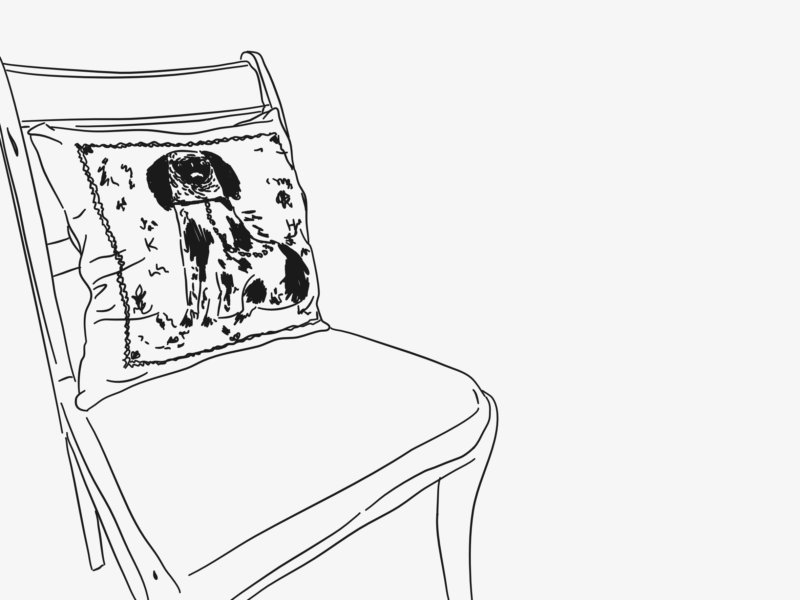
MY UGLY KEATON HENSON CUSHION

This kind of ugly King Charles Cavalier print cushion by Keaton Henson is quite a new addition to my room. It sits on my desk chair and keeps me company. For some reason the illustrated pooch and I feel like kindred spirits, I fear that if I had a patronus that he would be it. I love the way that the cover harks back to those porcelain dog figurines in a weird and distinctively Keaton way. Twists or hand crafted takes on classics make up a lot of my favourite designs.

MR BINGO’S HATE MAIL

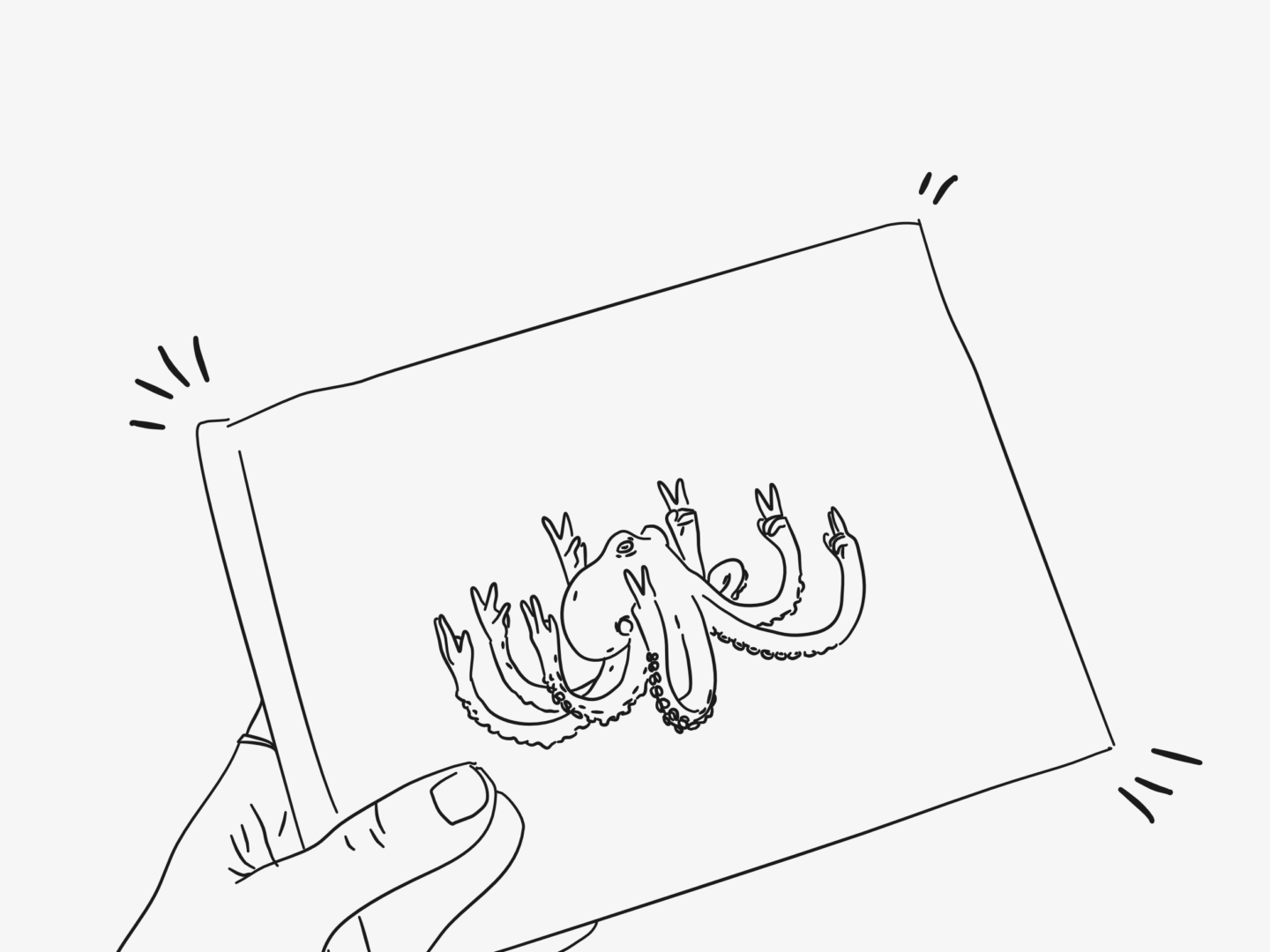
I managed to pick up a copy of Mr Bingo’s Hate Mail for £3 at Urban Outfitters by chance after looking at it longingly for a number of months, and it’s a definite contender for bargain of the year. If you haven’t heard about/seen/already bought it, Hate Mail is a collection of illustrated hate mail that Mr Bingo sent on vintage postcards to willing weirdos. Not only is a great coffee table book to impress friends and visitors (perhaps not your mum though) it’s also a great pick me up. Whenever I need a little cheering up, or someone has really irked me, I reach for it and flick through to find a new postcard design.

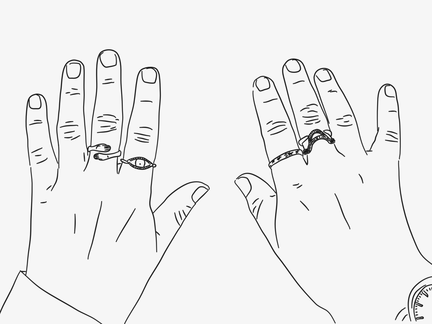
MY KAYE BLEGVAD RINGS

Okay so these aren’t really homewares, but they are design pieces that are often in my room (because I am) so I’ve decided they count, and I’m in charge here. I own four rings from Datter, which is the incredible Kaye Blegvad’s jewellery line, and there’s still so much more that I want. They are by far my favourite pieces of jewellery and I’ve received so many lovely comments on them. All of her pieces really feel crafted, they’re slightly irregular and the marks on them have a lovely distinctive line to them. They are oldest to newest as you go left to right, with the oldest being about 4 years old now. They’re the kind of design pieces where their character and the care that went into making them rubs off on you (literally and metaphorically) to the extent that I now don’t feel like myself without them.

THIS LITTLE BERLIN BEAR

Last but not least I want to talk about the Berlin Bear I got for my 21st birthday that’s on my bookshelf. I was born in Berlin, and when I was younger (I think 13 or so) my family went back for trip so that my parents could show me all of their old haunts. While we were there, there was one of those city-wide art projects on where a load of artists are given the same blank statue to decorate and make their own. In this case, a selection of countries (perhaps cities – it was at least a decade ago) were given Berlin bears to decorate. I was obsessed with taking pictures of every single one I found and documenting it. That might have been the start of my interest in trying to find the design in every city. So, when I turned 21, my parents got me the Berlin version of the bear, which I still love now and reminds me of them and that trip. 

I’m a complete homebody so I thought it was about time that I did a mini-series about my room. This is the longest time I’ve had a single space to call my own since I lived at home. I live in a shared house, so my room is the only space that I can really call my own, and now I’ve been there for a year it really is my own. I’ve dismantled and built furniture, decorated, and even filled the whole space with the scent of lavender and tea tree.

I make my one room work pretty hard. Because it is my only real space, it has to do everything. I’m very lucky that I have a room that’s big enough to be able to handle everything I want from it. If I’m honest I didn’t expect to have quite so much space in London, but I’m so so glad that I do.

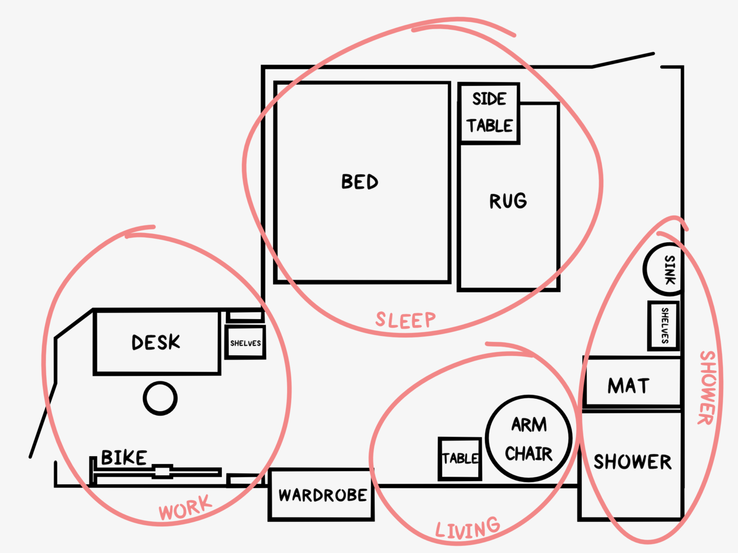
My room is laid out in sections by use. That’s in part by design and in part because of where the immovable elements of the room are, but more to come on that in a future post! There’s a sleeping area, my semi-bathroom, a living room, and my office. I’ve drawn a little diagram to help give a little context to the tour, and because I always struggle to join up YouTube room tours where the camera cuts around. I also just really wanted to draw a semi-architectural diagram.

I’ve decorated the space in as much white, and light neutral colours as I can to try and capitalise on the small amount of light I have in my room and to make the space feel even bigger and more calming.

SLEEP

My bed is my favourite place in the world. Moving to London was the first time I had a double bed in my life and let me tell you it was a glorious step up. The blanket my grandma crocheted for me sits at its foot, and a sensible, I think, number of decorative pillows sit at the top when it’s made including my sleepy sloth friend. The side table is often home to too much rubbish, but when I have it in check it’s just my light, some of the jewelry I don’t wear every day, my book and a few other little bits. The rug on the floor is something I’ve had since I was at Oxford, and I really think it makes the space feel homelier. It’s a lovely grey pattern, that’s just subtle enough for my liking.

LIVING

My little living area is a relatively new development and is in a bit of a thoroughfare tucked under the mantle of an old fireplace. On the mantel, I have all of my books (I’m trying not to let the collection expand too far), some art, and either a candle or my oil burner. I also have a string of fairy lights that I got for Christmas last year spread across the mantel which I turn on for my evening/relax lighting. The star of the show though is my big rattan chair. This is my watch TV or read spot and I absolutely love it. It’s snug and cozy, but still light and airy enough to go with the room without being imposing. The side table next to it is perfect for tea and biscuits as well as storing a few bits including my speaker and my journal.

SHOWER

I have a strange shower set up in my room. I have a shower and a sink to myself, but no toilet, and no division from the rest of the room. I’m not complaining though. I love having a shower to myself, knowing I can get in whenever I want and hang out in my towel for as long as it takes for me to procrastinate. I have an open shelving unit with all of my toiletries (it’s effectively a medicine and makeup cabinet) and my spare towels, as well as a few selected cleaning supplies. It’s a bit of a pain to clean and dust but it does the job.

WORK

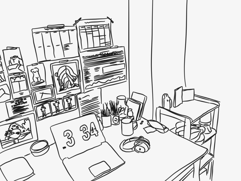
I love that my workspace is physically divided off from the rest of my room. This little space contains my desk, chair, and all of my work materials, as well as acting as storage for my bike and laundry dryer. This area has the best (and only) natural light with the patio door and skylight, which makes it the ideal working space. The main feature of the area is my desk, but I also have a little open shelving unit that helps divide the space and contains a random assortment of items from photos, to tea, to fruit, to washi tapes, my collection of letters and spare paper. My “office” is also the most decorated area of the room with my prints and postcards all up on the walls, as well as my resolution tracker.

Keep your eyes peeled for the next post in this miniseries all about my favourite design pieces in my room, which will be here in the next few days.