Today I’m going to create my very first font, and I thought it would be interesting to document the process and share anything I learn along the way and from all the bits and pieces I’ve read.
I’m making a hand-written typeface based on my own handwriting, because it seems to be the recommended starter and it’s something that will be immediately useful to me, as I currently hand write a lot. I think it’s probably a great start for a beginner because you’re working with a style that you know really well and can draw naturally without having to think about it.

STEP 1
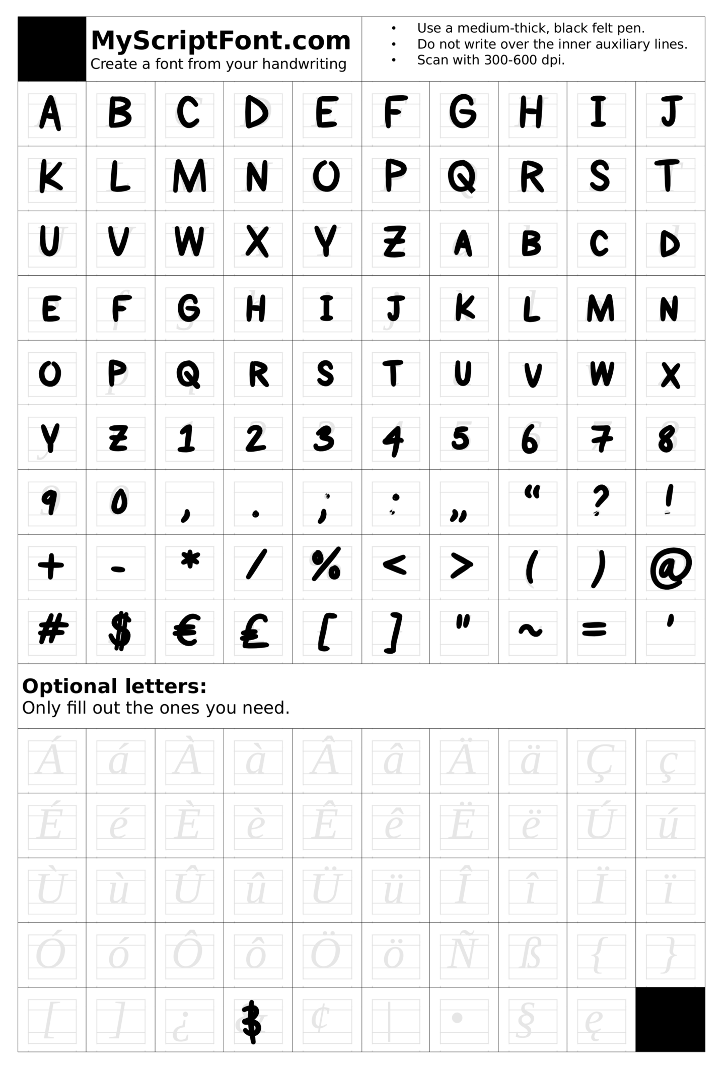
The first step I took was to pick a programme to use to create my font. I went with Paint Font, which is free and online, both of which are always good things. I decided to go with Paint Font rather than My Script Font which is very similar because it allowed me more options when it came to the characters I could design. Both of these programmes allow you to hand draw your font and then scan it which makes them very accessible. If you’re looking for a more digital option, FontStruct seems to be completely computer based, which would perhaps be better if you’re looking to build more standardised fonts.
STEP 2
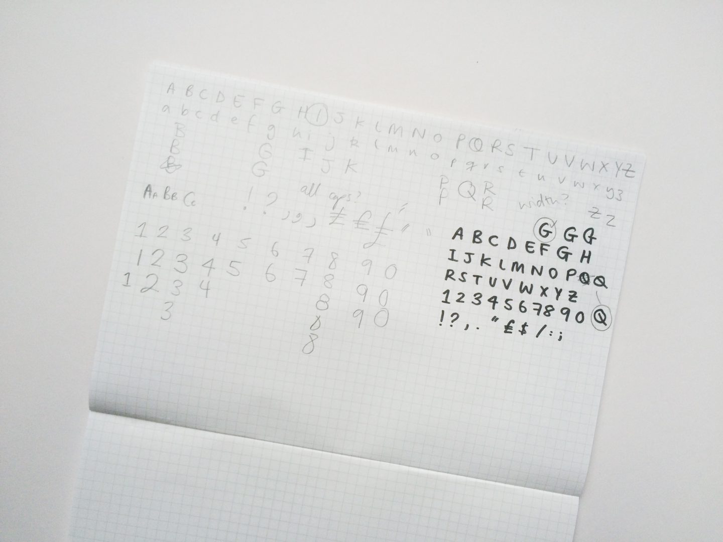
This was the fun bit: drawing out my letters. I decided to start out by hand drawing my letters because it felt the most natural and the easiest for quick drafting. I kept playing around until I was happy with the set of characters I had. In the end, I settled on an all caps font, with slightly smaller caps as lowercase letters, as this is the way I normally write in my design work and in my planner which is where I like my handwriting the best.

STEP 3
You could just draw your letters onto the template by hand, scan it and upload it. But I wanted to put my letters on digitally as it allowed me more control and the ability to refine my letters more in regards to weight and also mitigated the inevitable “oh no my hand slipped!” moment. I scanned all of my letter forms, and then made them vectors by tracing over them in Affinity Designer. I refined the points, curves, and line quality, then added them into the template. If you’re just going in by hand, make sure you use a relatively thick (a fine felt perhaps) very black pen, so that your letters show up clearly when you scan them.
STEP 4
Then it was time to upload my doc to Paint Font and wait for the magic to happen. This process was pretty simple and painless, and in no time I had a .TTF file of my very first font. The finished product was a relatively good quality font, that I think I’m going to get a lot of use out of.

STEP 5
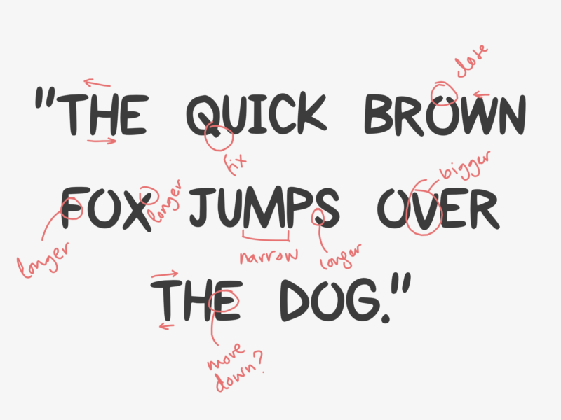
Then I tried out my font, typing out the customary “quick brown fox…” and just having a bit of a play really, and then printed it out for assessment. There were a couple of letters I wasn’t completely happy with so I changed them and repeated step 4. Once I was happy with that base font I also made a light version, a bold version, and an italic version. Those alternative styles were made infinitely easier by the fact I’d vectorised my font before uploading it, because I could easily edit the letters without having to redraw them all.
TOP TIPS
- If you want to make a font, do it! It is SO easy.
- If you can vectorise your font, I would highly recommend it. It makes editing and creating alternative versions so much easier.
- Sketch out your ideas, and try out a few variations of everything. It’s just good practice.
- Start with a font you know to get used to the process, plus it’s just fun to make your computer write like you do.
- On that note, do your own thing, don’t just add serifs to Helvetica it’s a rip off and it’s just boring. The reason I really liked my font was because it was new and something I would use.
- Go beyond just A-Z. If you’re working in English, and your font is for personal use, you probably don’t need the entire Russian alphabet but you will need numbers and punctuation for your font to be truly useful.
- Print your test type. It makes it easier to see how your font will look in situ and sometimes it’s easier to work using pen and paper.
- Have fun!
All that’s left to say is I’ve officially caught the homemade font bug, and will be making some more of my own typefaces in the very near future!


Wow, this is pretty cool, I didn’t think that making your own font would be so easy. I would love to try it out, obviously, there is a little tweaking to be done with spacing etc. but to me, it looks great, so I would be happy with just my handwriting as a font no matter how it came out :).
It is so satisfying to see your handwriting come out as you type – I would 100% recommend giving it a go if you get the time!
I have wanted to do this for a while, but i don’t have very nice handwriting so I think I need to work on that first… Loving your font though!
The Quirky Queer
Thanks Izzy! I had no idea it would be so easy. I think using a thicker pen is absolutely key in terms of making your handwriting look nicer for being turned into a font, I’m not the biggest fan of mine but you can go wrong with all caps and a felt pen!
I’ve never even thought of doing this before but now that I’ve seen how easy it is to do I want to go write an alphabet 800 times and make some fonts. I think creating a font out of personal handwriting is a fun idea and especially good if you like using it in your work. I loved the result of yours and am so curious how mind would turn out. (Though I have to say, I don’t feel like I’m ever consistent in my lettering so I’d really have to experiment to see what I want my writing to look like. Hm… my brain is all over the place now! haha.)
It’s so much fun as well – it feels a bit like magic when you see your handwriting come out on the screen! It’s so quick you could make one for all of your styles or maybe mix and match? I love had fonts that really have personality – if you end up doing it, please let me know I’d love to see what you make!
I have no idea about design whatsoever but I just stumbled across your blog and it’s so interesting! I never knew how this was done and I really love the font you’ve created – if I had nicer handwriting I’d totally give this a go myself!
eat, write + explore
So glad you’re liking it, Grace! I feel like you can give it a go no matter your handwriting, I think as long as you can write the letters separately (not cursive) and use a thicker pen you can come up with a really lovely and personal result!