While you shouldn’t judge a book by its cover, sometimes those covers are so lovely that they need just as much attention as the book inside. When I was little I really wanted to be a book cover designer (amongst a few other things) and I still kind of do, and I’ve been working on that urge as a part of my book club, where I review and redesign a book every month.
I love great book cover designs, and there have been so many that have stuck with me and inspired me through the years. So, I thought I would share some of my favourite book cover designs (I’m sticking mainly to novels here), and a little bit about why I like them. These are listed in no particular order, and there are so many I haven’t mentioned, but these are 25 covers I love.
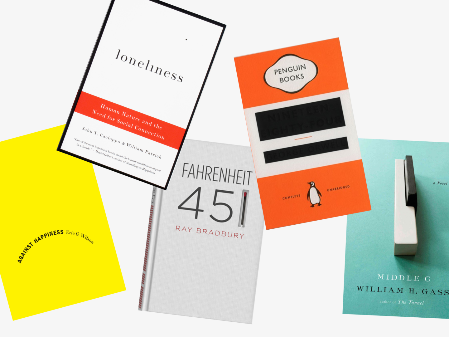
Against Happiness, Eric G. Wilson
Designer: Jennifer Carrow
This cover is essentially just text on a blank background. But the choice to turn the text into a downwards curve, an upside-down smile, conveys the book’s subject matter more effectively than any other image could. That frown in contrast to the supposedly happy bright yellow cover not only catches the eye but draws it in to find out more.
Loneliness, John T. Cacioppo
Designer: Peter Medelsund
This is another simple typographic cover (I just love them okay). The dot of the i in Loneliness has drifted off. This subtle detail poses a puzzle for the viewer and beautifully illustrates the idea of loneliness.
Fahrenheit 451, Ray Bradbury
Designer: Elizabeth Perez
Whenever I think of clever cover designs, my first thought is always this experimental cover for Farenheit 451 by Elizabeth Perez, which beautifully capture’s the novels central image of the burning of books in a really impactful way.
1984, George Orwell
Designer: David Pearson
My second thought is always this updated version of 1984 by David Pearson. The idea of censoring the key information on a novel which focuses so much on the control of information is just genius. You can tell that the designer worked really hard to leave just enough of the author and title on the cover, through the use of embossing, whilst seeming to remove them from the page.
Middle C: A Novel, William H. Gass
Designer: Gabriele Wilson
This cover is as perfect a visual interpretation of the book’s title as you could imagine. A singular middle C, that apparently was quite tricky to get hold of, photographed on the most beautiful and slightly melancholic light teal background.
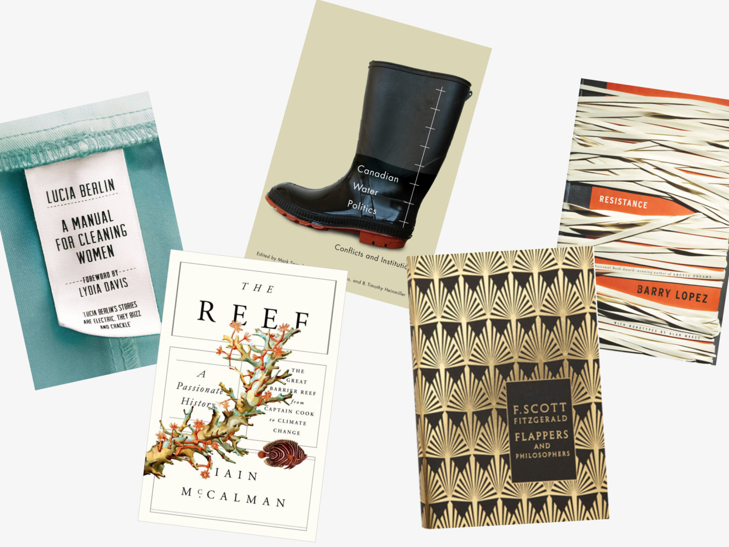
Resistance, Barry Lopez
Designer: Gabriele Wilson
Gabriele Wilson’s photographic cover for Resistance evokes a real feeling in the viewer. It’s not hard to imagine the taught resistance of all of those layered rubber bands. The earthy, almost sepia tones, always remind me of much older books and give what is quite a modern cover a grown up feel.
A Manual for Cleaning Women, Lucia Berlin
Designer: Justine Anweiler
This one is clever, beautiful and so so well made. I love that they actually made the clothes label, the commitment to the concept is what sells this cover in my opinion. It also doesn’t hurt that the idea of seeing inside the striking blue uniform is a lovely play on the novel’s look inside the lives of the women who wear those uniforms.
The Reef, Iain McCalman
Designer: Oliver Munday
I’m not entirely sure why I like this one. I think it’s just how well it is balanced and the way that it updates vintage botanical illustrations in a really aesthetically pleasing way.
Canadian Water Politics, Mark Sproule-Jone, Carolyn Johns & B. Timothy Heinmiller
Designer: David Drummond
I’m a sucker for simple well placed sans serif text on image covers, as you will know if you read my book club on The Shepherd’s Life which has the most stunning cover. Everything about this cover is so well placed and considered despite each element being very unassuming on its own. The composition of this cover really elevates an academic text on what might not immediately seem like the most interesting topic to something special.
Flappers and Philosophers, F. Scott Fitzgerald
Designer: Coralie Bickford-Smith
I love the entirety of Coralie Bickford-Smith’s F.Scott Fitzgerald series, the gold foiled art-deco patterns not only capture the spirit of the age in which Fitzgerald was writing, they’re also elegant enough that you can picture them sitting on his shelves. I picked Flappers and Philosophers simply because I love the pattern and I thought it might break up the high number of white/light covers I’ve picked for this list.
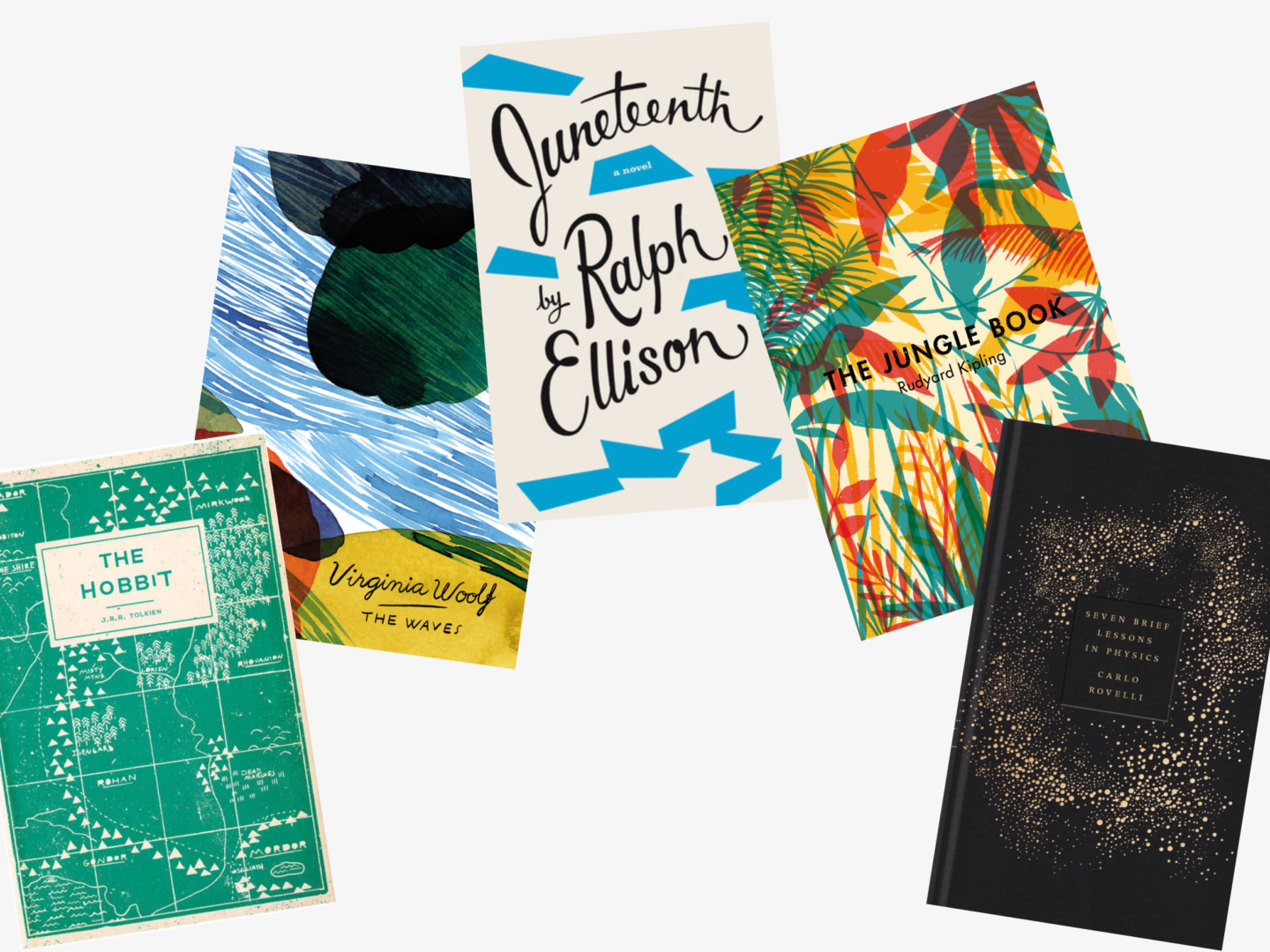
The Hobbit, J.R. Tolkien
Designer: Adam Busby
Adam Busby’s cover for The Hobbit sadly isn’t real. Despite it’s being a mock cover, I absolutely love its design. The flat map design is at once a nod to The Hobbit’s past and a move to bring it up to date with the present. It wouldn’t be hard to imagine a character in a Wes Anderson movie pulling this version of The Hobbit out of their neatly packed suitcase.
The Waves, Virginia Woolf
Designer: Aino-Maija Metsola
Aino-Maija Metsola designed a series of these abstract covers of Virginia Woolf’s novels. The choice to go abstract really fits with Woolf’s modernist style which often relies on fragments and feelings to convey its messages in the same way these covers do. All of them are equally lovely so I chose The Waves, because it’s my favourite Woolf.
Juneteenth, Ralph Ellison
Designer: Barbara De Wilde
This jazz inspired cover is part of a whole series of Ellison’s works reimagined by Barbara De Wilde. What really struck me about these covers is how fun they are and how they really capture something of Ellison’s energy. I also love that when they’re stood together the colour blocks on the spines of the books come together to create a similar irregular, jazzy pattern.
The Jungle Book, Rudyard Kipling
Designer: Tatiana Boyko
Tatiana Boyko’s use of primary colours and simple leaf shapes reflects what an important, foundational work of children’s literature The Jungle Book is. But it also makes the cover feel modern due to its minimal style and centrally placed block sans serif title.
Seven Brief Lessons in Physics, Carlo Rovelli
Designer: Coralie-Bickford Smith
This one is just stunning, I mean look at it!
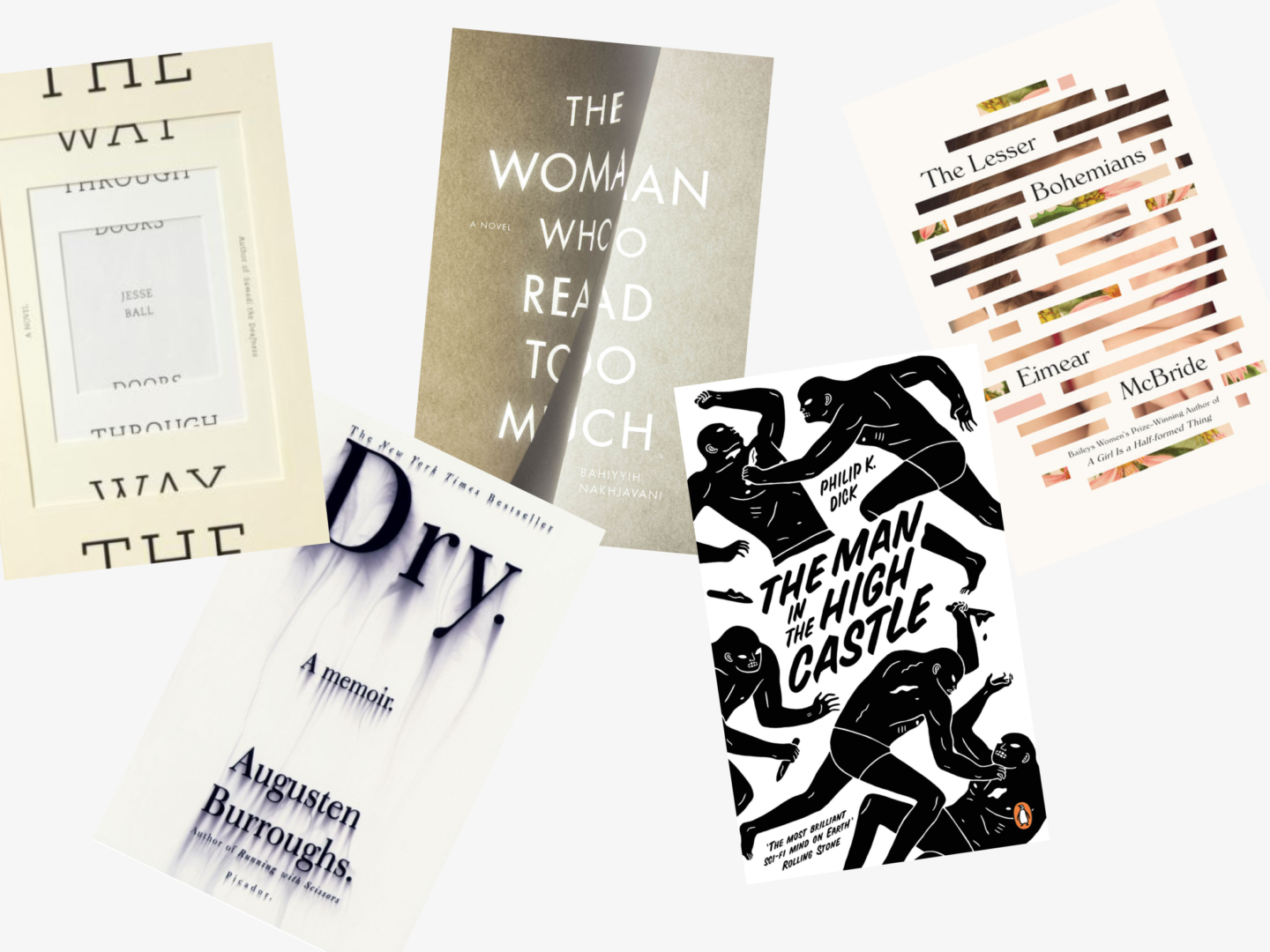
The Way Through Doors, Jesse Ball
Designer: Jason Booher and Helen Yentus
The cover for The Way Through Doors is potentially one of my favourite papercut covers ever, even though its paper element is so simple. The way that the title is divided on either side of the cut to literally allow you to see the way through it is so clever and really well done, this could easily have been a cover that was much too hard to read to be effective. For me what really makes this cover though is the fact you can see it’s real paper in its colour and texture. The little touch of the sideways extra text is so lovely as well.
Dry, Augusten Burroughs
Designer: Chip Kidd
There’s a reason Chip Kidd is thought of as one the masters of book cover design. The visual irony of this cover reflects perfectly the idea of an alcoholic in denial which features prominently in Dry. It’s seemingly simple cover but so effective.
The Woman Who Read Too Much, Bahiyyih Nakhjavani
Designer: Anne Jordan
There is something fleeting about Anne Jordan’s use of light to create this cover. I love how the text spreads between the two pages whose division feels almost sculptural.
The Man in the High Castle, Philip K. Dick
Designer: Cleon Peterson
Cleon Peterson’s illustrations for Philip Dick’s The Man in the High Castle are so visceral and convey a sense of pace and drama about the novel. The figures on the cover almost don’t look human as they attack each other with knives. The entire composition appears to be set on a diagonal driving the action forward and setting the scene for some precarious tension in the novel.
The Lesser Bohemians, Eimear McBride
Designer: Oliver Munday
Oliver Munday features in this list 3 times with good reason, he makes stunning work and this cover for Eimear McBride’s The Lesser Bohemians. His fragmentation of the portrait leaves just enough of the woman’s face there to be identifiable whilst interspersing it with text and fragments of a floral painting, which come together to produce a cover I would not be opposed to have hanging on my wall as a work of art.
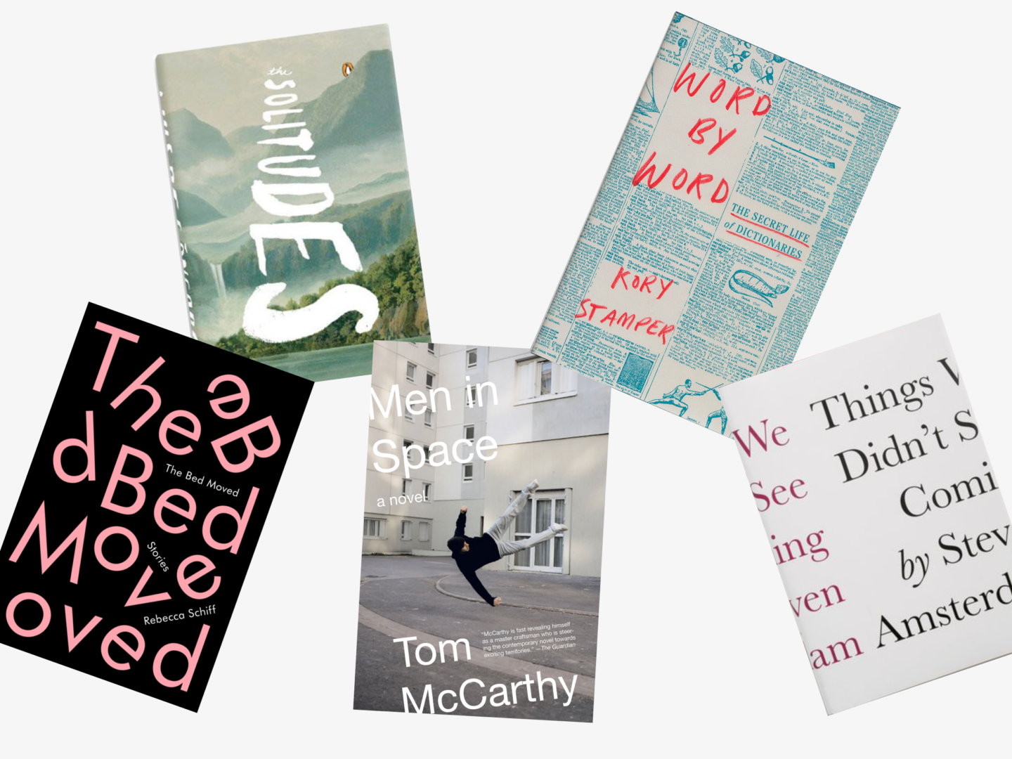
The Bed Moved, Rebecca Schiff
Designer: Janet Hansen
Yes, it’s another typographic cover. I love how fun this one from Janet Hansen is though, with its scattered letters reflecting the book’s title. The way the non-scrambled text is still placed on angles and slotted between the big pink text means that it doesn’t detract from the design or spoil the fun. I’m also always a sucker for a bit of pink.
The Solitudes, Luis De Gongora
Designer: Eric White
The way the hand type comes vertically through the centre of this cover is just magical. The muted blue grey tones of the background scenery give it a sense of atmosphere, and make the white text seem even bolder. Also, can we talk about how perfect the placement of the Penguin logo is on this cover please?
Men in Space, Tom McCarthy
Designer: John Gall
The way that the figure in this photographic cover is hovering in the air is marked out perfectly against the pale urban setting in his black hat and jumper, the focus is always on this man caught in the space. The choice to have the text edge just slightly off the page expands the space beyond the physical bounds of the page without ever distracting from the singular focus of the figure. I think it’s also worth noting that John Gall designed a series of these covers, each a little different, so it would work digitally as well, which I think is going to be more and more important in the coming years.
Word by Word, Kory Stamper
Designer: Oliver Munday
There are a few covers knocking around like this, a title peeking out from columns of text. But what marks this one out is Oliver Munday’s use of colour and handwritten text, the mix of unexpected textures and tones in a familiar setting makes Word by Word’s cover that little bit special.
Things We Didn’t See Coming, Steven Amsterdam
Designer: Peter Medelsund
The concept, the use of colour, the justification of the text, everything about this cover is absolutely genius. But I would expect nothing less from Peter Medelsund.
If you want to keep up with all of the covers I’m loving I’ve created a pinterest board just for that! It’s currently got over 100 pins and is growing.
What are your favourite book cover designs? Which books have you judged (rightly or wrongly) by their covers?


I remember loving Fahrenheit 451 when I first read it. I’ve been wanting to go back to it but keep on forgetting! I get distracted by other books so easily!
Lisa Favre
http://marblecrumbs.com
I know that feeling! I always have a stack of books to read then another one will catch my eye, or a friend will recommend it – there are just too many good books out there!
I love book covers, especially really colorful and beautiful ones. I especially like the third photo you featured– I dunno, colorful things just always stand out to me.
I definitely judge books by covers when it comes to reading sometimes. When some books are so beautiful and unique you can’t help but be drawn to it!
This was really interesting to read and now I have a few books I want to read more about!
Julia | juliainbluhm.com
Exactly! A great book cover will draw you in, and I feel like that’s a good thing. I mean anything that draws you to a book is a good thing! I also think a lovely cover is a big part of the joy of a physical book and the experience of wandering round a bookstore
Really love The Reef’s book cover! The contrast between a botanical illustration and squares. Well designed book covers are quite important, because they do catch our eyes first! I am also into minimal cover designs, such as Observers’ and Penguin Books.
Great post – I enjoyed looking at these beautiful designs as well as discovering new books!
Katrina Sophia
I know it’s stunning right? I love the classic penguin covers, they have stood the test of time so so well they really are classics in and of themselves!