This is perhaps the closest I will ever get to being a beauty blogger and I am pretty excited about it. I am so excited in fact that I am coming at you with not one, but two design stories this time. I’ve taken a couple of objects from my makeup bag, inspired by the classic “what’s in my bag” Youtube videos, and telling their story: the compact mirror and the lipstick bullet.

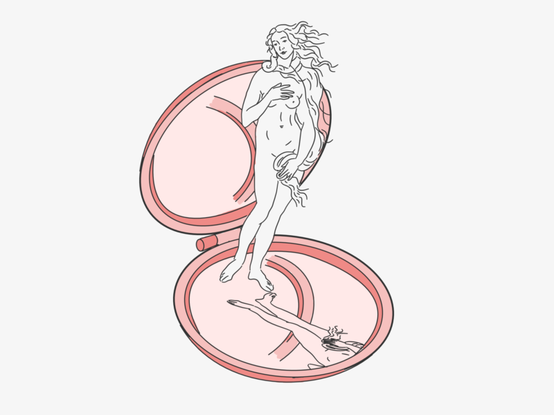
COMPACT MIRROR

Silvered glass mirrors, like the ones we use today, have been around for almost two centuries. In 1835, Justus von Liebig, a German chemist, created a process for applying a thin layer of silver to one side of a pane of glass. His choice of silver instead of the previously used lead and mercury was not only safe but a lot more reflective. It took him 20 years to refine this process to a stage where it could be marketed to manufacturers.

His method stood until 1930 when John Strong, an astronomer and physicist from California University of Technology, created a method using a vacuum to deposit aluminium foil to telescopes and scientific instruments which was later appropriated for mirrors. This is the method we use to this day.

However, mirrors have been around for as long as you can imagine. The first mirrors were simply pools of still water. Who can forget the story of Narcissus who fell in love with her own reflection in a pool of water?

Moving beyond puddles, in Turkey, obsidian mirrors from 6,200 BCE were discovered in an archaeological dig and people in Iran have used polished copper as mirrors at least as early as 4,000 BCE. Mirrors have been present throughout history, being developed independently by different cultures.

A Chinese source from 673 BCE states that the queen wore a mirror at her girdle, suggesting that the compact mirror has a long history as well. But the decorative, clam style, compact mirror we would think of today didn’t rise to popularity until the early 1900s when as Andrea DiNoto states in Art Plastic: Designed for Living that as “women began to enter the workforce in greater numbers it became necessary to transform vanity items into portable forms.” And these compacts became increasing decorative statement pieces. While the compacts of today aren’t quite as important as status symbols they do owe their design to all of the interweaving stories that have been a part of the mirror’s history.
LIPSTICK BULLET

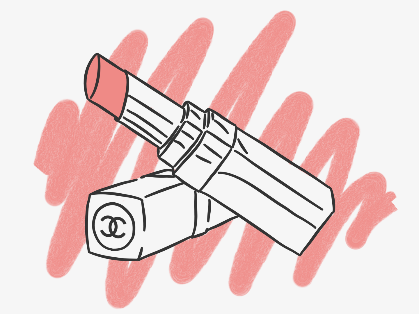
Now I’m not a regular lipstick wearer, but when I do, nothing makes me feel quite as special or grown up as rolling up a lipstick bullet or the satisfying magnetic click of the closure as I purse my lips together.

Like mirrors, lipstick has been around in some form or another for aaaages. In Mesopotamia, Queen Shub-ad of ancient Ur, was reportedly the first to use a lip colourant made of white lead (not her best idea) and ground red rocks, in approximately 3500 B.C. From around 2000 B.C. rich Egyptians, including Cleopatra a little later, used crushed carmine beetles, and occasionally fish scales for shimmer, to add colour to their lips.

But we’re not here to talk about the colour itself, instead, I wanted to know about the bullet that holds the product. While there are rumours that, in the 16th Century, Queen Elizabeth, who made her own personal crimson shade, invented the lip pencil by mixing ground alabaster or plaster of Paris with a colouring ingredient and rolling the paste into a crayon shape before drying it in the sun, it wasn’t until the 1910s that lipsticks were readily sold as sticks. Guerlain is credited with that move, selling lipsticks in paper tubes or tins to aristocratic customers, a style which became more accessible by World War I.

Maurice Levy is most often credited with creating, or at least commissioning the first metal push up tube for lipstick in 1915, which was then mass produced by The Scovill Manufacturing Co. However, there are a number of arguments that suggest such packaging was actually in use before Levy began selling it through his cosmetics company.

Whoever invented this first push up packaging, it was only popular for around a decade because in 1923 the first swivel-up lipstick was patented in 1923 in the USA by James Bruce Mason Jr. There seems to be little written about how he invented the swivel tube, except for his own notes on his patent:

“An object of my invention is to provide a device of the character described which affords facilities for removably holding a lipstick so that the latter is available for application when desired and when not being used is protected by an encasing body.” 

What we do know is that after Mason Jr.’s invention lipstick soared in popularity because it was now portable and easy to use. Meaning women could mimic the styles of popular movie stars on the go, including taking inspiration from the original “It girl” Clara Bow who made the “Cupid’s bow” style of lipstick application a hit.

Key Sources:

There are plenty of design myths around. Some are good, some not so much. So, I thought I would debunk some of the worst ones because letting them lie is pretty damaging to the industry and individual designers. So here we go…


THE CLIENT ALWAYS KNOWS BEST

Clients give briefs and designers work to them. That’s the usual process. Sometimes it goes smoothly, sometimes it doesn’t. While designers are expected to keep their clients happy, they are also expected to produce the best work they can. Sometimes that means recommending something that isn’t what the client has in mind. Designers, to varying degrees, are experts in their field, and will more often than not have more experience in design than their client. And so sometimes the designer knows best, they know what will work and what things won’t and sometimes the client needs to trust in those recommendations and that they’ve hired the right person for the job.  Sometimes, as Clients from Hell has shown us, they are just plain wrong as well.


DESIGN IS JUST MAKING THINGS PRETTY

It’s not. As I discussed in my post about design thinking, design is a process, not just an outcome. It’s quintessentially about making things that work, quite often those things are attractive but that isn’t their only function. Steve Jobs once said, “design is not just what it looks and feels like, it’s how it works” and while he might not be a designer I think he really hits the nail on the head. In order to make something that works a designer has to understand the user and their needs and be able to work to fulfil them. Design isn’t just making things pretty it’s understanding what people need and making their lives easier, no matter what you’re creating.


ALL YOU NEED TO KNOW IS PHOTOSHOP

Just as design isn’t just making things pretty, photoshop isn’t the only skill a designer needs. There are a whole wealth of technical skills you need from sketching to an understanding of typography to working with vectors. But more than that you need to know how to be empathetic, to understand both a client’s needs and a user’s needs and balance those things. You need to be able to work to a brief and know when you can push it. You need to understand all of the basics from composition to hierarchy and how to make them work seamlessly. If you freelance you need to know how to be an entrepreneur, how to manage a customer. I’m not listing all of these things to put anyone off learning to be a designer, but to explain to those customers out there who think that when they’re hiring a photoshop monkey they’re getting so much more that they don’t see, and that skill set deserves respect.


CREATIVITY IS AN INNATE TALENT

It always makes me really sad when people say they’re not creative, or when, on learning I design in my spare time, people say I didn’t realise you were a creative person. Everyone is creative. Everyone has an imagination. It’s not some special power some people are born with. Sure, we all channel our creativity differently, but it’s always there. On the flip side of that, the suggestion that creativity is innate does a disservice to the amount of work that goes into harnessing and utilising your creativity. Creativity’s not a thing you have, it’s a muscle you have to work.


A LOGO IS ALWAYS THE ANSWER

I’m not sure if this is a common enough misconception to be a myth, but the number of times I’ve heard people say they just need a logo is staggering. Repeat after me a logo is not a brand. Logos are great, they can be little visualisations of your brand they can be printed on anything and everything, they can even become icons. But they’re not all you need to make a brand. A brand is all of the decisions that go into the identity of your business, its character, its products, how it speaks, what it represents and, yes, how it looks. A logo is one little part of that how it looks element. The other bits of the visual element include deciding the fonts and colours you’re going to use, the kinds of images that will represent your brand, even tiny things like the way pages on your website are structured. Yes, logos are great but they’re only a tiny part of a big old brand puzzle that will evolve over time. A logo on its own is not the answer to your branding woes.


DESIGNERS ARE ALL HIPSTERS

There seems to be an idea out there that all designers dress and look alike. Yeah, that’s not true. Designing is a job. Like any other job anyone, no matter where they come from, look like, or listen to, can do it. The more we encourage diversity in the industry the stronger and more interesting it will be. That’s all I have to say.


YOU CAN GET GOOD DESIGN ONLINE FOR FREE

No no no no no no no. One of the auto-fill options on google for “logo design…” is “free” – how terrifying is that? Good design comes from good designers, and good designers like all other human beings need to eat and somewhere to sleep, and so they need to be paid for their work. It’s really quite that simple. If you want design that resonates with your customers, with your brand, with your vision, if you want quality work, if you want a good working relationship, if you want to be challenged to make something really great you need to pay because it’s right and because someone who can offer you all of those things has spent years studying and practising and you need to respect that. Pay designers fairly.

Which design myths really get your goat?

I can’t believe it has been well over 6 months since I did an update of the awesome creative blogs I’m following. I still love everyone on in my last updates. But now that I’m using Bloglovin, I’ve found, and refound, and read more of, so many incredible content creators that I just had to share. So here are 10, well 11 really, blogs I keep coming back to and saving posts from:

GREENHORN

Greenhorn is a new blog from Marie Jaquemin, who you might know from the awesome New Age Creators project on YouTube. Its name comes from a term which “often describes fools or know-nothings in old westerns, but what it should actually describe is the acceptance that no one knows it all and that life is about learning and growing at every turn”. So, fittingly, Greenhorn is a blog all about learning, being green, and finding your place as a creative. It’s safe to say that I absolutely love this one, it ticks all of the boxes: interesting people, creative content, stunning visuals, great writing and a topic that I couldn’t resonate more with if I tried. I’m so excited to see Greenhorn grow!

ELLA MASTERS

I am a little bit ashamed to say that I’ve only just started reading Ella Master’s blog, but that has meant I could binge to my heart’s content! She has a real mix of themes, but all of them are incredibly well written and accompanied by stunning visuals – not that I would expect anything less! In particular, I’ve loved her behind the scenes look at her collections, her more personal feelings-y pieces, and her little fashion interludes. She has so much variety in a consistent style that it meant I was happy to sit and read for a good 2 hours, and I’m not sure there’s much higher praise than that. Also, if you like her blog definitely have a look at her illustrations and shop – I am so tempted to get a pet portrait of my fave furry fella.

GRAPHIQUE FANTASTIQUE

Natasha Nuttall’s Graphique Fantastique has been a blog I’ve followed for a good while, but I’ve really gotten back into it, revisiting its plentiful archives, over the past months after watching more and more of her Youtube videos (you can check out some other creative Youtubers I love over here). Natasha’s blog follows her life as a freelance designer and features so much great design content on everything from paper and stationery (her stationery week posts were so good) to DIYs to run downs of inspirational creatives. Her blog recently had a bit of a rebrand, think all the turquoise triangles, and it’s looking so fresh – I’d highly recommend you check her out if you find any of my content vaguely interesting or if you love colour and design!

SNAIL MAIL LOVE

This is another blog I’ve fallen back in love with. Fab’s blog used to be about great mail, and as a huge fan of letters I loved it, but she’s recently had a bit of switch in direction, and let me tell you I love it just as much if not more. Snail Mail Love is now more about illustration and design, with lifestyle and awesome stationery still thrown in. Her posts are always absolutely stunning, but they’re also really useful and easy to read. As someone who follows quite a lot of blogs that’s something I cherish, trusting that when I sit down to read a blog there’s going to be some quality content in there that I know I’ll get something out of. Fans of illustration, creativity, and stationery definitely check her out!

WORK WORK WORK

Work Work Work is all about how women in aspirational, often creative, industries got where they are through hard work and struggles they’ve had to face along the way. It’s not just a blog it’s “an anti-perfectionism project which aims to reveal and explore the non-edited challenges that women face behind the fantasy of social media”. I feel like this is such a necessary voice, or rather group of voices online, and it’s absolutely fascinating to get to see what it’s really like to do many of the things that are glorified across the web. Work Work Work is also incredibly produced, honestly, their posts are of such high quality. It should really be required reading for anyone who’s comparing themselves to images and ideas they see online.

WIT & DELIGHT

Whenever I read Wit & Delight I just feel better. Kate Arends started W&D in 2008, and since then she’s been growing it as a source for all things style and designed lifestyles. We’re talking fashion, food, wellness, beauty, homes, travel, careers and everything in between. I particularly love her pieces on becoming a freelancer and alternative career paths, as someone who isn’t 100% sure about where they want their career to go (and who is) they have given me a lot of food for thought and also a lot of reassurance and motivation.

PAIR AND A SPARE

I started reading Pair and a Spare for their DIYs. I love a good DIY, especially when the outcome doesn’t look like you did it yourself/got a child to do it and it’s relatively simple which is what they specialise in: easy DIYs that have awesome outcomes. But I find myself coming back to them for their blogging and lifestyle content which is really lovely and has given me so much, take notes and use it outside of the internet, inspiration.

MAN REPELLER

It’s not a blog. But I find myself of Man Repeller at least once a day so I had to include it. It’s so much of what I would want in a fun magazine and so much more. It’s funny and smart and much more colourful than I am. They talk about everything from fashion to pop culture to relationships and feminism. While most of their stuff is upbeat and quirky, and just a little bit sarcastic, every once in a while, they have a thought piece that makes you stop for a hot minute and just reflect. If you need to up the quality of your daily reading, or just want to add an injection of colour and cool ass ladies, Man Repeller is definitely for you!

DESIGN FOR MANKIND

I love how Erin Loechner writes, it’s the perfect balance of poetic and creative and easy to read, and I just love it. Her blog is somewhere on the creative lifestyle spectrum, but I’m not sure where because it inhabits a corner all of its own. It’s at once real and relatable, and inspirational and a bit motivating. I think you just have to read it for yourself because clearly, I’m not sure how to describe it other than in vague and gushing platitudes.

THE DIELINE & FOR PRINT ONLY

I love both of these blogs for inspiration. They post some really high quality and inventive design work, all centred around print. It’s amazing to see what people are doing and managing to innovate, in a medium that has effectively been around forever. Whenever I feel stagnated or like everything I’m seeing is the same these are the blog to which I turn. To add to that, For Print Only structures its posts so so well, and I love how they include production or personal lessons from each piece. It’s really refreshing and adds something personal to what could just be a “hey look at this cool thing” post.

Which blogs are you loving right now? Who should I be following?

PS – if you’re not following me on Bloglovin I’d recommend it, it’s the best way to keep up to date with any new posts/what I’m reading!

I have found myself gravitating towards the illustrated books on recent, and quite frequent trips to bookshops. For as long as I can remember I’ve loved illustrated books; one of my final GCSE projects was an illustrated book about a llama who got lost. They’re not just works of art, and they’re not just stories, they’re a magical melding of the two that elevates each element to something more.

So, I thought I’d share 10 of my favourite illustrated books at the minute after having so much fun doing my list of the best book covers. Without further ado, and in no particular order, here are 10 of my favourite illustrated books (that aren’t just for children):


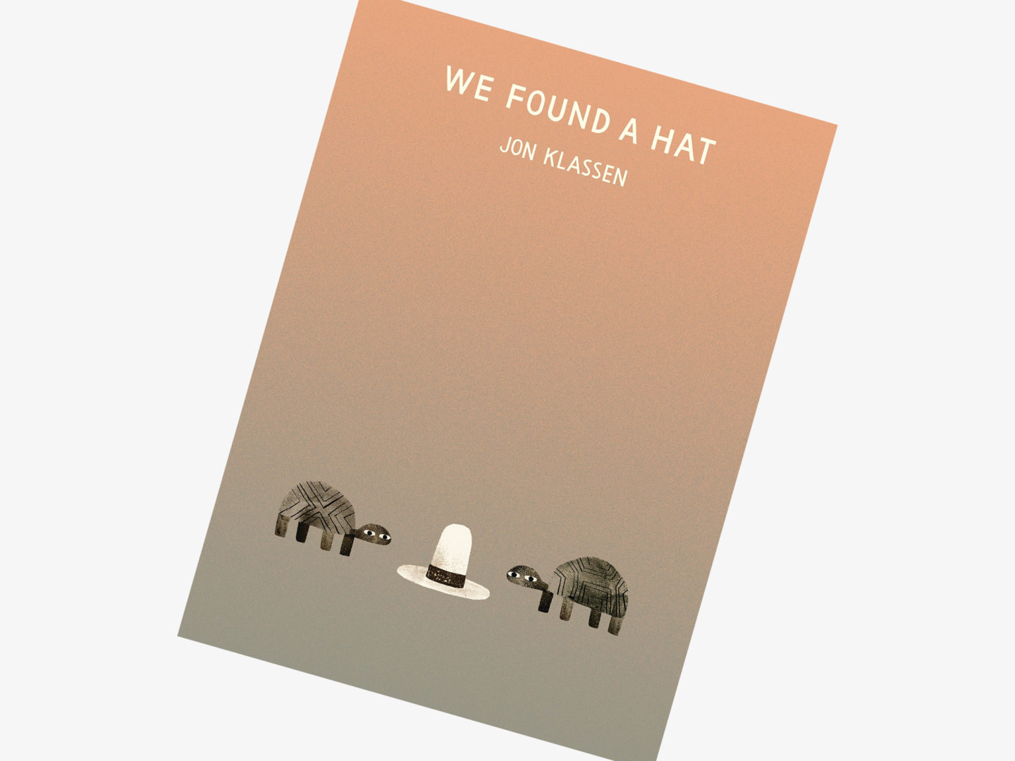
We Found a Hat, Jon Klassen

Illustrator: Jon Klassen

We Found a Hat is one of the most aesthetically pleasing books on this list with its graded backgrounds and pastel shades. It’s a simple story of two turtles who find a hat, which is paired perfectly with Klassen’s minimal illustrations that leave plenty of breathing room on the page for you to think. It’s a quiet book, but it’s filled with heart and a subtle humour. If you have a friend you need to buy a gift for, I can’t recommend this tale of friendship and hats enough.


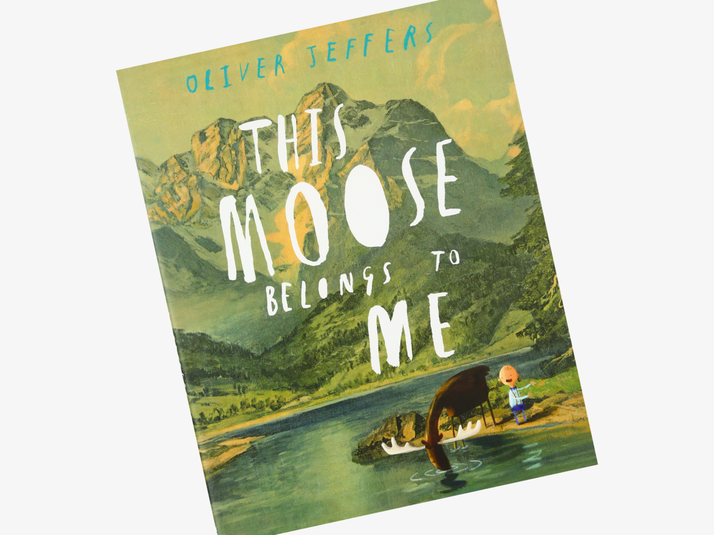
This Moose Belongs to Me, Oliver Jeffers

Illustrator: Oliver Jeffers

I could have included every single one of Oliver Jeffers’ books on this list, but I thought I should restrain myself. I love how This Moose Belongs to Me really showcases Jeffers’ gorgeous landscape paintings without detracting from his characters. Their sense of scale within the vast world he has painted only serves to amplify their story. Also, it features a moose, what more do you need?


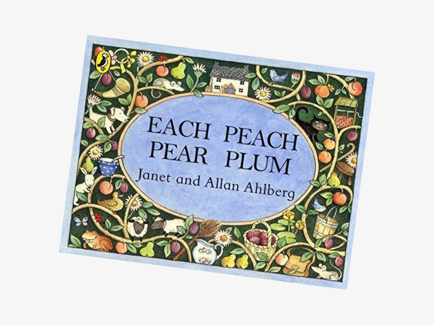
Each Peach Pear Plum, Allan Ahlberg

Illustrator: Janet Ahlberg

I know the story to Each Peach Pear Plum off by heart, much to many of my friends’ great distress when I recite it. Its illustrations remind me of a very specific part of my childhood in the most wonderful way. But my favourite images will always be the front and back covers and the way they take what is quite a grown up almost Morris-eque pattern and fill it with nursery rhyme imagery – they’re just perfect!


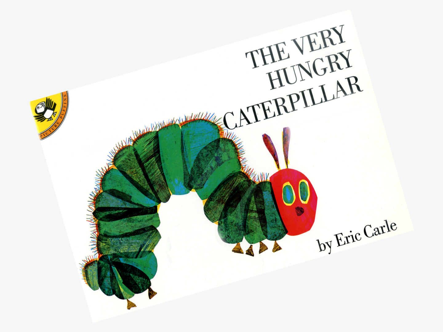
The Very Hungry Caterpillar, Eric Carle

Illustrator: Eric Carle

The Very Hungry Caterpillar is another unescapable classic. There is nothing more I can say about it. It’s the Very Hungry Caterpillar. It’s amazing. If I have kids they will read it to their kids and so and so forth ad infinitum.


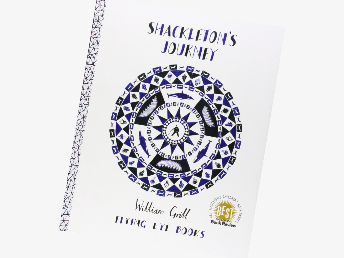
Shackleton’s Journey, William Grill

Illustrator: William Grill

William Grill’s illustrated guide to the true story of Ernest Shackleton’s journey to the heart of Antarctica might just be the most charming book I have ever had the pleasure of reading. I love his coloured pencil drawings, for some reason they remind me of school geography projects, but the school geography project you wish you could have made. There’s just something about the softness of it. I also learned so much when I was reading it, I had no idea they took so many dogs with them!


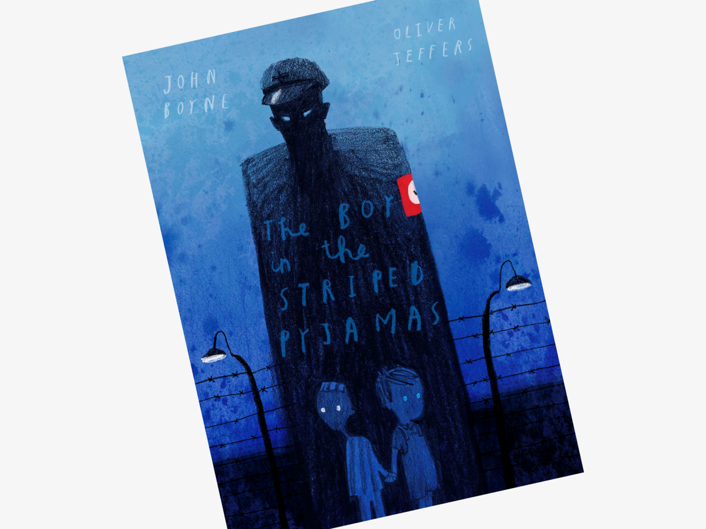
The Boy in the Striped Pyjamas, John Boyne

Illustrator: Oliver Jeffers

Okay so I know that I said that this list wasn’t going to be all Oliver Jeffers, but you know what it’s my list and I couldn’t just pick one, and I felt like this illustrated version of The Boy in the Striped Pyjamas brings something a little different to this run down. The Boy in the Striped Pyjamas is an incredible novel in its own right, but Jeffers’ illustrations really add something extra to the story and bring it to life. I’m not normally a huge fan of novels with sporadic illustrations, but here it just seems to work and the images are perfectly placed and designed to make you reflect more and understand the story.


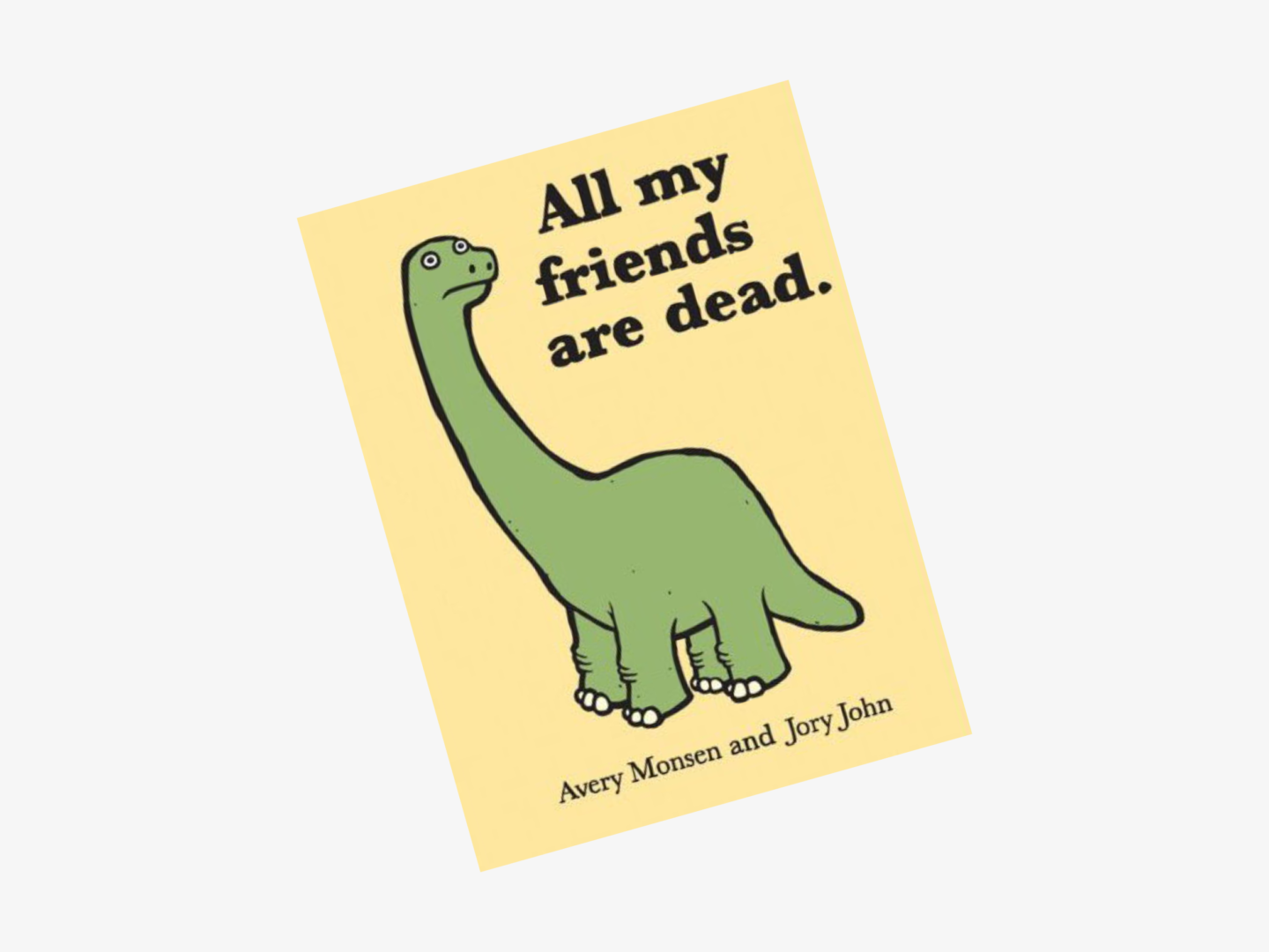
All My Friends Are Dead, Jory John & Avery Monsen

Illustrator: Avery Monsen

All My Friends Are Dead is at once wickedly dark and funny, and just a little bit too cute. I feel like everyone already owns a copy so I don’t need to spend too long singing its praises, but what I will say that whenever I’ve felt down and picked up this book I have always felt better afterwards.


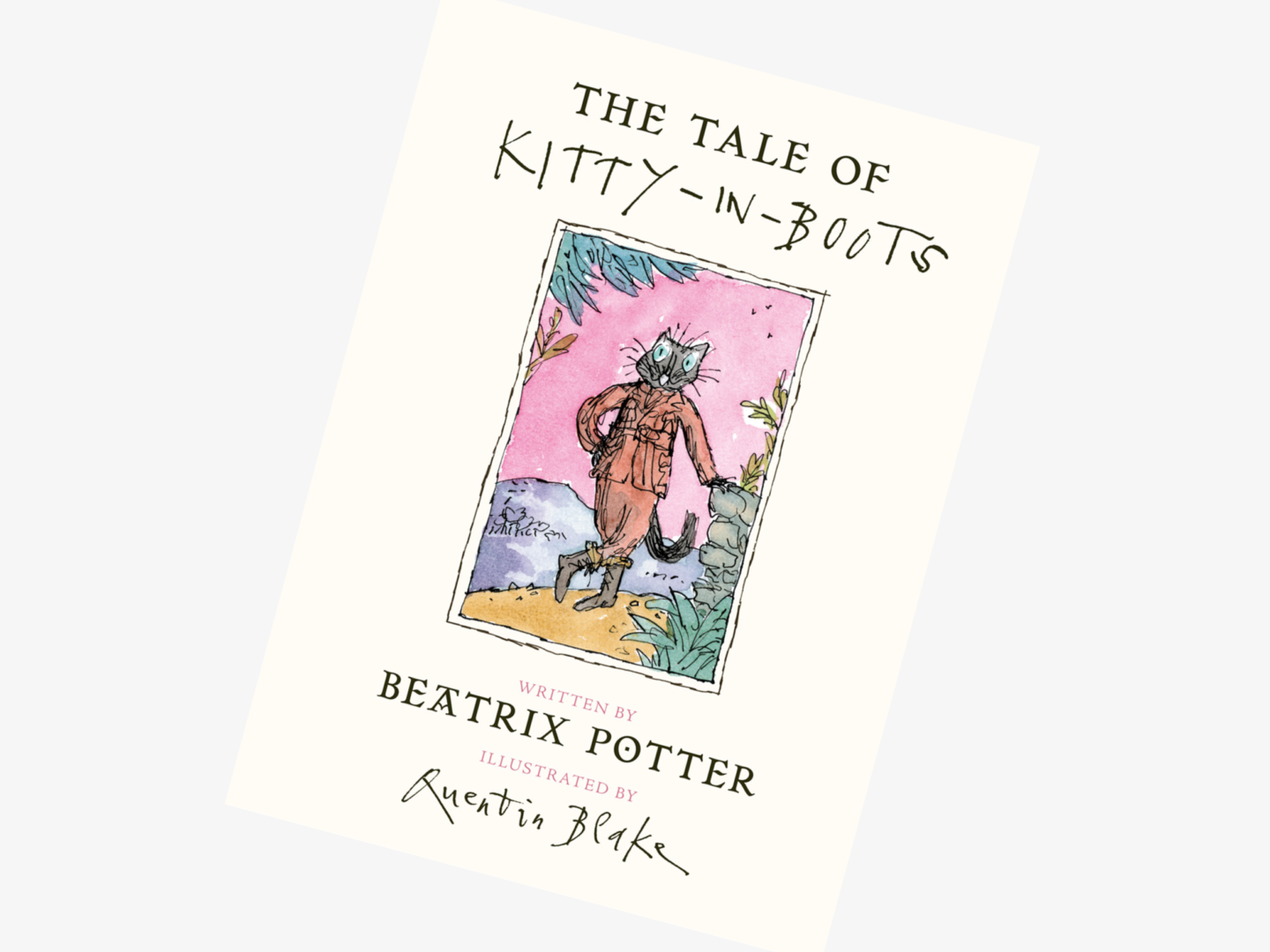
The Tale of Kitty in Boots, Beatrix Potter

Illustrator: Quentin Blake

I went to an exhibition at The House of Illustration all about Quentin Blake’s illustrations for this recently discovered Beatrix Potter story of a cat with a double life. The partnership of Potter’s humour and rebellious feline hero and Blake’s lively and energetic style is just perfect. Even though his distinctive illustrations are quite different to Potter’s they fit perfectly and it’s easy to see why he was the first choice of illustrator when Penguin Random House decided to publish it. I think this quote from Blake really captures some of that playful partnership: “I liked the story immediately – it’s full of incident and mischief and character –and I was fascinated to think that I was being asked to draw pictures for it. I have a strange feeling that it might have been waiting for me.”


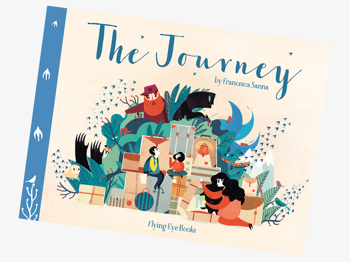
The Journey, Francesca Sanna

Illustrator: Francesca Sanna

The Journey is so beautiful, haunting, and emotionally compelling that it’s hard to believe it’s Francesca Sanna’s first book. Inspired by stories she had heard of the current refugee crisis Sanna’s stunning illustrated book follows the heartbreakingly unimaginable decisions made a family have to make leave their home and everything they know to escape war. This is very much a book you just need to have a quiet moment with before showing everyone you know so they can experience it too.


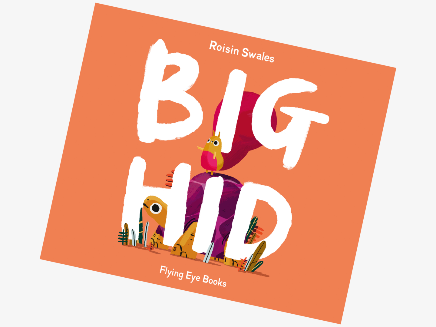
Big Hid, Roisin Swales

Illustrator, Roisin Swales

After reading this article on Creative Review about Roisin Swales and Big Hid I knew I had to get my hands on a copy, and I’m so glad I did. Big Hid discusses mental health, and in particular depression, in a really accessible way. Swales’ charming colourful illustrations make sense of what it means to have a friend with depression so beautifully that it should be required reading for everyone big and little.


What are your favourite picture books? Who are your favourite artists making illustrated stories?

The humble zipper helps most of us get our lives, and our trousers, together every single day. It’s a simple device that revolutionised clothing and has been the fly-est fastening (sorry) around since the 1930s. But how did the zipper come about?

The story of the zipper begins at the same time and with the same man as the sewing machine. In 1851, Elias Howe received the patent for a ‘Automatic, Continuous Clothing Closure’ which resembled quite closely the zipper we use today. However, instead of pursuing his ‘Continuous Clothing Closure’ Howe got swept up in the promotion and success of the sewing machine, without which we probably wouldn’t have the zipper anyhow.

Whitcomb Judson took up Howe’s mantel forty years later with his ‘Clasp Locker’ a device which was very similar to Howe’s ‘Continuous Clothing Closure’ but made specifically for shoes. Judson debuted his invention at the 1893 World’s Fair in Chicago, but it was an unsuccessful trip. Judson couldn’t get his demo ‘Clasp Locker’ to stay closed and thus no one wanted to buy it. Despite this set back, Judson founded the Universal Fastener company and was the first person to take a zipper to market, arguably making him the father of the zipper.

That said, it wasn’t until Gideon Sundback took a stab at the zipper that it got the interlocking teeth we rely on now to keep our trousers up. Sundback’s interlocking teeth didn’t come apart as easily as Judson’s meaning his was a more secure fastening. Not only that but, he also increased the number of fastening elements to 10 per inch to further increase the security and to make the sliding motion smoother. Sundback patented his design in 1917, and we’re still using almost exactly the same design 100 years later.
However, Sundback’s invention was known as a ‘Separable Fastener’ not a zipper. It was B.F. Goodrich’s marketing campaign in 1923 which gave the contraption the name we know now. It was a shortening of his slogan “Zip ‘er up”, with “zip” mimicking the sound the zipper made when it was fastened.

After Goodrich popularised the zipper as a means for securing rubber galoshes, it quickly took off across the clothing industry. Ever the trailblazers, mothers were the first to really buy into the zipper trend, as they made it easier for children to dress themselves. Zippers then spread to adult clothing and bags. The big turning point in the popularity of the zipper came in 1937 when they beat out buttons in the battle of the fly, and became the preferred fastening for trousers over buttons. The zipper eventually became so popular later that decade that everyone who was anyone, from French fashion designers to Esquire magazine were praising the zipper as a revolutionary style staple.

But where does YKK come into it? If you own a piece of clothing with a zipper in, it will, more likely than not, be stamped with the letters YKK. Those letters stand for Yoshida Kogyo Kabushikikaisha who are a Japanese zipper manufacturer who are responsible for the creation of over half of the zips sold in the world*. That’s more than 7 billion zippers every year. They’re so popular with manufacturers because they make every element of the zipper in house using their own custom built machines, right down to smelting their own brass, and have been making zippers since 1934. This all means that they’re trusted for creating consistent quality, which means a lot when the quality of a zipper can make or break a garment’s usability.

So, in conclusion, the zipper passed through many hands, in relatively similar forms, just waiting until its moment came. Once again, as in other design stories I’ve written about, marketing played a huge part in making the zipper a design classic. Even though it was a fashion, nay life, changing invention it still needed to be sold at the right time to the right people to really take off.

I think I’d also like to note the fact that the more of these design stories I write, the more I’m noticing the power of mothers and housewives to make a product a true staple – they were the first converts to Dr Martens, they championed the t-shirt because it was cheaper and easier to clean for children, and they bought clothes with zippers on to encourage kids to dress themselves. This might have to be something I do some more digging into.

As ever if there’s anything you want to see a design story of in the future do let me know!

Key Sources

*Ironically the majority of their zippers are now manufactured in Qiaotou, south of Shanghai, which is known as the button capital of the world as it claims to make almost two-thirds of the buttons produced globally.