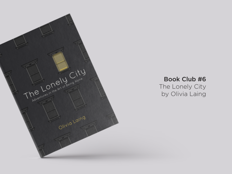
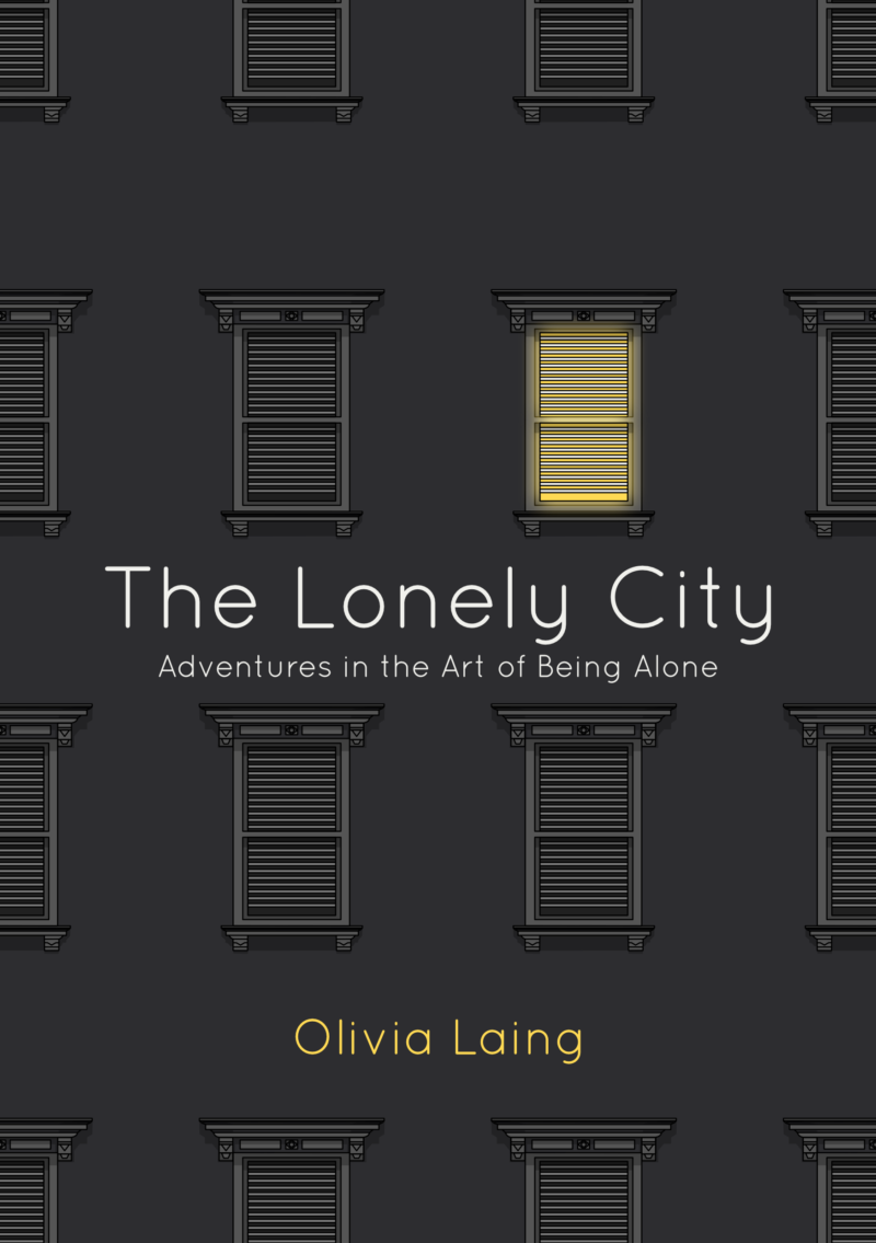
I would never have thought to have described myself as a fan of non-fiction, but here I am recommending my second work of non-fiction to you in the book club. That book is The Lonely City by Olivia Laing. It’s part memoir, part art history investigation, and part philosophical investigation into loneliness. As someone who moved to a big, lonely city not that long ago it was a wonderful introspective companion.

In her mid-30s Laing moved to New York for a relationship, which fell apart just as she crossed the ocean. In a new city, half away across the world from friends and loved ones and feeling the acute space left behind by losing a partner, this moment of intense loneliness sparks Laing’s investigation into the feeling. She documents her own experience of loneliness and her growing understanding of works of art she had seen a million times before.

This investigation into art and loneliness begins when Laing realises she could cast herself as a figure in a Hopper painting. The Lonely City is broken up into four artist studies: Edward Hopper, Andy Warhol, David Wojnarowicz, and Henry Darger. Each study really delves into the life of each artist and touches on how their loneliness is present in their works. Laing doesn’t limit herself to simply discussing the artist in question, in each section she investigates parallels in other works and the characters who surrounded them.

I learned so much in these sections. Like Laing, I had never really paid much attention to Warhol or Hopper despite, or perhaps because of, their popularity. But when I heard more about their lives and their loneliness images I had seen time and time again took on a new depth and humanity. While I feel like that happens whenever you learn more about an artist, there’s something so private about a person’s loneliness that Laing’s depictions really cut to the bone in a way that was at once beautiful, fascinating, and a little intrusive.
The only thing I would have wished of this book is that Laing’s personal moments of loneliness were given greater weight and better interwoven into the artist’s stories she tells. The art history moments feel at once like interludes where you wait for the author to return and also Laing’s focus. Laing investigates the stories of other artists’ but seems to forget at moments that perhaps the most compelling story she could tell is her own. But then again, maybe Laing is simply distancing herself in the same way that she describes Warhol and others doing.

That imbalance didn’t detract from my fascination with gaining a greater understanding of the people behind some of the most famous names in art. There is something wonderful about realising, and re-realising, you aren’t alone in feeling alone. However, fleeting that comfort might be it is the true power of literature.

Laing’s dedication to The Lonely City reads: “If you’re lonely, this one’s for you.” I think that’s my recommendation if you’ve ever felt lonely or lost in a city, isolated in a sea of people, then this book is for you. You’ll see and understand yourself in some of its pages but you’ll also feel a little less lonely whether that’s in comparison or companionship with the lonely characters she describes.

SOME QUESTIONS TO PONDER AS YOU READ

  • Try looking up the artworks for one chapter as you go. Or, if you’re naturally a look-er up-per, try just imagining for a chapter. How does having the images, or not, in front of you change the reading experience?
  • What would you say the tone of the book is?
  • Did you end up mapping your own experiences onto the book? If so where?
  • Are there any other artworks, or images, which conjure loneliness for you?
  • How does knowing the story of an artist change how you view their works? Does it make them more personal? Less lonely? More lonely?
  • After reading it, do you see the feeling of being lonely as a positive or a negative one, or something else?

IF YOU WANT SOME FURTHER READING TRY…

IF YOU WANT MORE BOOKS LIKE THIS HAVE A LOOK AT…

Why not use The Lonely City themed bookmark I designed to keep your place as you read? You can print and download it for free here.

As ever, let me know if you’ve read The Lonely City, or if you have any recommendations for what I should be reading next.

As the last post in this little trio about learning graphic design, I wanted to share some of the best advice I’ve received and pass it on to you guys. I’m constantly learning and constantly finding new mentors, whether that’s through work, friendships, or just finding new guides online. I’ve received so much advice and help and inspiration, far more than I could chronicle here and far more than I can probably actively remember. But these are some of the pieces of advice that have stuck and I keep with me to this day.

PUSH STRAIGHT LINES AND PULL CURVES

This one’s something quite practical I learned at school but I say it to myself before I draw up any plans and it has never failed me.

DON’T SKIP PEN AND PAPER

It’s easy to just jump into designing on the computer, but someone at work recently reminded me that the best way to start is sketching it out with pen and paper. There’s something about physically drawing out your ideas that frees up your ideas and I’m all for anything that gets me away from a screen.

START WITH THE USER

This is particularly true of service design, but it applies to anything you’re making. You should start with the person you’re designing for, and working out what they actually want and need. It’s the only way to ensure you’re making something that’s going to have an impact on other people’s lives. Real people often behave quite differently to how you imagine them.

YOU’RE ALWAYS 3 YEARS BEHIND WHERE YOUR TASTE IS AT

This one keeps me going when I feel like whatever I’m producing is awful. There’s always a skill gap between your taste and your hands, so don’t worry if what you’re producing isn’t as good as the best thing you can imagine just yet it shows you’re reaching and you have good taste. Plus in 3 years you’ll be able to do it easily.

EVERY DECISION NEEDS TO HAVE A PURPOSE

You should be able to go back through everything you decided in a project from colour palettes to layouts to paper choices and be able to explain why you chose to do what you did well, because sometimes you’ll have to.

DON’T DESIGN IT TOO MUCH, KEEP IT SIMPLE

A design project isn’t an excuse to show off every new skill you’ve learned, no matter how shiny. Keep your work as simple as you can, and make the design do the work behind the scenes it doesn’t need to be doing jazz hands on the page.

ASK YOURSELF “DOES IT WORK?”

I was told this at an internship regarding advertising, but I think it applies to pretty much anything you make. Make things that work. That means you need to know what you’re making is supposed to do: is it meant to make someone buy a car? To feel happy? Sad? To make a process easier? To convey some information? Make sure whatever you’re doing has a purpose and it fulfils that purpose.

A CLIENT ISN’T JUST PAYING FOR YOUR HANDS THEY’RE PAYING FOR YOUR BRAIN

I love this one because it reminds me to give my opinion when working with clients and to push back when I think I need to. A client isn’t just paying for a photoshop monkey, they’re paying for a designer so make sure you are one and use your experience and knowledge to inform everything you do and recommend.

CHARGE BASED ON THE AMOUNT OF VALUE YOU’RE ADDING

If someone is going to make more money because of your work, you should be paid according to this added value. If you’re designing a poster for a concert and them having a good poster is going to make them an extra £500 of profit they can afford to pay you more than £25. Just bear that in mind. This also came from a client so it resonated even more with me.

DON’T LOSE WHY YOU LOVE IT

This final piece of advice is from me to you (and to me). Whatever you love about what you’re doing right now don’t forget it, keep that thing close and keep doing it. Don’t let a passion become passive.


What’s the best piece of advice you’re received? Who has inspired you or taught you something that’s helped shape your practice?

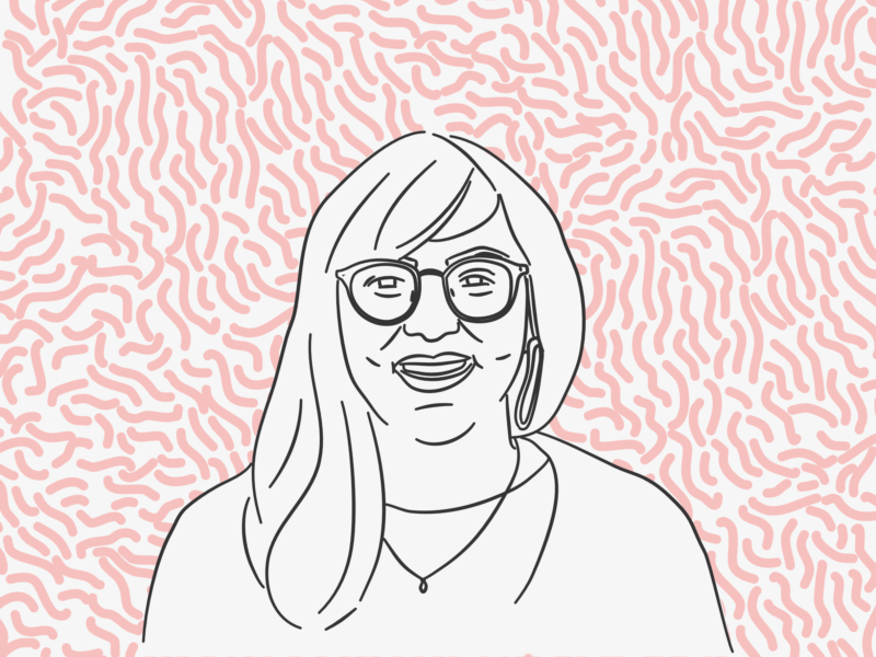
I’ve spoken a bit about my own design learning story over the past couple of days, but as I’m mainly self-taught I thought it was important that I got the opinion of someone who actually went to design school in part to give you guys a balanced picture and in part because I’ve always want to know what it’s really like. So, I reached out to the talented and lovely Hollie Arnett and asked if she wouldn’t mind chatting all things design school with me.

If you don’t know Hollie you really should because she’s ace. I stumbled across her on YouTube where she shares her design knowledge and does design challenges, which are just so fun to watch. As well as being a YouTube star in the making she’s also a creative director at her own design studio, an amazing hand-letterer and an all-round wonderful human. Also, if you enjoyed this little interview I’d highly recommend checking out the archives of her blog where she’s written in depth about many of her uni experiences.

Hey Hollie, could you introduce yourself for those who haven’t heard of you yet?

I’m Hollie Arnett and I’m a 22 year old designer, typographer, letterer, creative director, freelancer, founder, videographer, YouTuber, writer and the list goes on. I’m originally from Bradford in England but I’ve spent the last 12 years of my life on the other side of the world in New Zealand, currently in the capital, Wellington. I’ve been creative all my life, and eventually discovered design in high school. After that, I went on to study a four year long Bachelor of Design with Honours at Massey University Wellington, majoring in Visual Communication Design, which I finished last year. I’ve also been working freelance or for in-house design agencies since I was 18, working on a range of branding, marketing, UX/UI, editorial and lettering design. These days I can be found co-running my own design agency with my business partner, and I recently founded my own hand-lettering & typography studio too! 

You say you discovered design in high school, what was it that really struck you and how did you know that was what you wanted to study further?

A huge part of it was thanks to having a really great teacher. She saw that I was quite good at design and was enjoying it, so she helped me to learn and grow and encouraged me to pursue it further and I am forever grateful to her for that. I always knew I wanted to do something creative and she helped me to narrow it down to design. I loved the collision of creativity and problem solving that design offered. Painting and photography which I also studied were creative, but design felt like it had more thought behind it and could serve more of a practical purpose. I never really understood what a designer did or what types of jobs they got or anything like that, I just knew that it made me happy and I wanted to learn more about it.

How was your experience at Massey? Did it live up to your high school expectations?

I honestly loved Massey so much and I’m so glad I went there. I looked at a few different universities in New Zealand but Massey was the only one that felt like it really focused on the visual communication design I wanted to learn. I also walked into the printmaking room and instantly fell in love! I learnt so many different things at Massey, and I enjoyed that you had the option to have a really varied learning experience, or super focused on one aspect – it just depended on what you wanted to learn and how specific you wanted to be. I ended up taking a lot of print and typography papers because that’s what interested me the most. I wasn’t really sure what to expect when I left high school and the first semester was a big adjustment period, especially moving cities and out of home for the first time at the same time, but once I got into the swing of things it exceeded my expectations in so many ways.

What would you say the key things you learned at uni were?

I learnt so much about the fundamentals of design which I still use in everything I do today, and I don’t think my work would be as successful if it wasn’t for that foundation. I also learnt a lot about myself, particularly about my design process and working style which helps me to get better results by working in a way that is best for me. Another key thing I learnt is the importance of feedback in creative practice and I know now that I will always push my work so much further if I’m surrounded by people willing to give that constructive feedback. I encourage everyone to be engaging in creative feedback because I experienced its benefits every day at uni and I’m so thankful for it!

You said you’ve been freelancing and working in agencies since you were 18, are there anything you’ve learned on the job that you didn’t at school? 

Throughout university, it was always expected that the end result would be working in a design agency. There were never really discussions about any other options but as I started working in the real world, I quickly figured out that there are more pathways as a designer. I now know that I don’t enjoy working for someone else, and I hate working on the same thing for too long, I just get bored, so I now work for myself, doing a variety of different projects, and that’s just the way I like it! 

I also learnt so much about engaging with clients, writing contracts, creating invoices, managing other creatives and all the other practical, logistical things about being a designer, especially running your own design business. School was really conceptual and more about actually designing, which was great, but there wasn’t a lot of teaching around the other stuff. I learnt that on the job and from teaching myself!

You’re now freelancing and running your own agency (along with a super cool youtube channel), is there anything you wish you’d learned at uni that you’re working out now?

Oh thank you! I think overall, I wouldn’t change a thing about what I learnt. I guess I wish that there had been a bit more career guidance or people to help you learn more about where you want to go. For most of the time, I felt a bit lost, not knowing whether I should niche down and just do papers on one aspect of design, or just do all sorts. I didn’t know what I should be aiming towards, or what my options might be at the end. I think if I’d been taught more from the beginning about the different jobs in design and the different ways to get there, I would’ve had a better sense of direction and maybe figured out where I wanted to be a lot faster. But in some ways, maybe it’s good to just go with the flow while you’re learning and not worry about the outcome! I’m just a super future-focussed person so I like to have a plan!

Teachers are so important as you say, what’s the best piece of advice you received on your design journey so far?

My favourite tutor always says that you have to understand the rules before you can break them and she is so right. It’s totally fine and fun to break the rules, use colours that shouldn’t work together, combine “ugly typefaces,” put stuff upside down, do things that go against the “rules,” but you there has to be a reason behind it and you have to understand why you’re doing it and why it works first. Those colours have that effect because there’s colour theory behind it. Those typefaces weirdly work together because their typographic history is so rich. Things upside down can be great sometimes because it makes the viewer feel a certain way. There are tried and true fundamentals of design, and if you have a solid foundational understanding of them, where they came from and how to wrangle them, you can then use them in powerful, sometimes unconventional ways to make a statement. 

What knowledge would you want to pass on to someone thinking about or just starting a design course at university?

It really is what you make of it. If you work hard and soak up everything that you can, you’ll learn so much and set yourself up for success. Make the most of your time at uni because you have access to some of the smartest people in the industry, you’ll learn so much that will form the foundation of your career, and there are so many opportunities for students to excel. Talk to your tutors, learn from your peers, go to events, pay attention in class, give it your all and get your money’s worth! 

Also, it will probably be super tempting sometimes, especially when assignments are nearly due, to stay up all night to get more work done. It is much, much better to get some sleep and come back the next day refreshed and ready to go so please get at least a few good hours every night, and look after yourself! You’ll do much better work if you’re well rested, well fed and well hydrated!  Believe me, I learnt my lesson! 

Find and follow Hollie in all of the places:

I thought this was an important post to make as a part of this little series on learning design, but it’s also been something I’ve been thinking about a lot recently as I try to work out what it is I want to spend my days doing.

I’ve loved drawing and making things pretty much my entire life. I used to set myself a “big project” every Christmas, whether that was making gifts or a motorised spinning snowman decoration where I repurposed some k-nex, and it was my favourite part of the holiday. I loved incorporating something creative into everything I did. I once made an A2 size 3D model of the Amazon river for a geography project, and one of my final English projects was animating a Lorca play.

It’s safe to say nothing makes me as happy as making things.

Yet, I did an English degree. And one of the most traditional English degrees around by all accounts. I spent 3 years at Oxford University reading hundreds of books, mainly by dead white men, and writing two essays a week. Without a creative project on the syllabus in sight.

So how did I end up there?

Well, the first thing to note is that my entire identity growing up was based around being clever. I was a relatively smart fish in a pretty small pond, and that’s how everyone saw me and that’s how I saw me. I was quiet. I was smart. I was destined to go to a good uni and do something academic.

When it came to deciding which university course I was going to apply to I was torn. I loved art. I spent almost all of my time working on my sketchbook or just being in the art room. But I also loved English, and I was told I was good at it too. I wasn’t a natural writer but I was a natural reader, and I loved taking a book apart and finding something hidden away inside of the words.

I think for everyone else who had some sway around me, my parents and my teachers, there wasn’t really much of a decision to be made. Even my art teacher told me it would be a waste not to follow the academic path I had worked so hard for because I would “always have art”. And while no one said it, there was an air of my not going to Oxford being a waste.

Now, I’m not saying I was pushed into it. Of course, I wasn’t. I had worked my butt off to get the grades I did, and I really did love books. I wanted to go just as bad as anyone when it came down to it. Something I didn’t realise until I almost didn’t get to go. But I do think I would have been fighting against a whole tide of factors if I’d chosen to follow a creative path.

I knew I would need a job in the future, and I thought I knew that the best way to get there was with a non-creative degree. I knew that going to Oxford was prestigious, and I knew I wanted that shiny gold star of recognition. I knew it was what I was expected to do, and I knew I didn’t like conflict. I distinctly remember suggesting that perhaps Oxford wasn’t the creative environment that would nurture the talents I held dearest and being told flat out that I was wrong and that how could all of these fantastic creative people have come out of the Oxbridge system if that were true?

So when the IB Art examiner interviewed me about my exhibition and asked me where I was going to art school, I said I wasn’t.

And do you know what, a huge part of me is glad I didn’t.

I loved my time at Oxford, and I can’t imagine having gone to uni anywhere else now. I met the most incredible people. I laughed. I loved. I learned so much, about English, about people, about myself. I pushed myself harder than I thought I could.

I also found out how much I really do love making. Even when I was up against deadlines after deadlines after deadlines, I still wanted to take on more work.

I learnt so much about my love of design through doing, through working with musicals and newspapers and entrepreneurs and anything and everything I could get my hands on.

That was so invaluable.

I left university a much better version of myself, and I wouldn’t be the same person I am now if I didn’t go.

As much as a little bit of me will always wish I pursued a creative degree, a much greater part knows that I learned so many other skills in not doing one. I also found so much inspiration and learned so much that feeds into my work that I might not have had access to otherwise.

Not doing a creative degree hasn’t held me back from being a creative person either, as I hope you would agree. I still create every single day. I’ve even managed to make it a little bit of a job.

If anything it has made me better, hungrier, more eager to prove myself.

So, I didn’t go to art school for some of the wrong reasons and some of the right reasons. But I did make it into the right decision.

If there’s anything I want to convey here it’s that you don’t have to follow any set path to getting where you want in life, and even if you feel you’ve taken a wrong turn you wouldn’t be where you are now without it so make the most of every decision you make.

This week I’m going to be sharing a series of posts all about learning how to design, starting with a few words on how I taught myself design and how you can too.

Whilst I classify myself as self-taught, I did receive some design teaching while I was at school. I did GCSE Graphics from the age of 15 to 16 and I studied Art all the way up until I went to uni. This tuition definitely helped me gain confidence and develop a set of basic drawing skills. I learned the basics of colour theory and of composition, I was given a vocabulary for talking about art, and design and branding. I designed my first logo when I was at school. I did a lot, and I am so so grateful that I did.

I think having that base was personally invaluable, but also not completely indispensable – you could definitely start learning to design from scratch, it might be harder, but you could do it without a doubt.

Because I didn’t learn half of the skills I use now. I also gained a few bad habits, like being afraid of a sketch book because everything had to be gradable as I’ve discussed before.

Everything beyond those basics I had to teach myself. I taught myself how to use photoshop, using a series of ill-gotten free trials, initially in order to do embarrassing fan edits. I taught myself how to use affinity designer and a Wacom tablet too. I taught myself all of the tech stuff. I taught myself about vectors. I taught myself how to run a small business, how to be a freelancer. I taught myself how to work with a client. I taught myself how to make infographics, and card games, and book covers. I’ve taught myself so much, and so much more, and I’m so proud of those skills I’ve found and developed from feeling my way in the dark.

But how did I do it? And how can you do it?

JUST DO IT

I think this is the most important thing on the list. Just make stuff and you’ll learn. It’s that simple. I wrote a post last year all about getting started as a designer and it includes some of my top tips for what you’ll need in terms of tools, where to invest your time and money, and what to expect.

GET SOME PROJECTS

Quite a lot of the new things I’ve learned, I’ve learned because I had to. When you’re working on a project either for yourself or especially for a client you’re going to come across things you don’t know how to do, and you either have to give up or figure them out. I always choose figure them out. When I was working for the Oxford Student I produced a graduate guide. There were loads of stats and we agreed that the best way to present them was in an infographic, the only snag was I had never made an infographic before. So, I had a google and I had a try, and then another, then another until I made something I was proud of. I’ve had to improve my hand lettering for invitations and learn photo editing skills for posters. You never know how much you can learn and do until you find out you have to do it.

DEVELOP YOUR OWN TASTE

Knowing what works and what doesn’t and why is such an important skill, and it can really help your work improve because you have a sense of where you’re going. I like to pick apart posters I see on the tube and menus most frequently, but I try and have an opinion on everything I see. When I say I try and have an opinion I don’t just mean “this is good” or “this is bad” I mean “I think the colour palette on that poster is really engaging, but I would have chosen a more readable typeface because it’s hard to read when you’re moving past at speed in the underground”. So, get opinionated, and apply the same logic to your own work. What works? What doesn’t? How can you improve it? But don’t get too disheartened when it doesn’t always looks as magical as your favourite works in its first draft, you’ll get there in your own way in your own time (I’m still getting there).

READ

The first thing I do when I don’t know how to do something, like pretty much everyone else, is google it. 90% of the time there’s an article on it and while the first time is pretty slow you can normally follow the instructions and work out how to do it. For wider background reader and improving general design skills and knowledge, some of the best books I’ve read include: Thinking with Type by Ellen Lupton, Graphic Design Rules: 365 Essential Design Dos and Don’ts by Peter Dawson, How to Use Graphic Design to Sell Things, Explain Things, Make Things Look Better, Make People Laugh, Make People Cry, and (Every Once in a While) Change the World by Michael Beirut, and The Design of Everyday Things by Donald Norman

YOUTUBE AND SKILLSHARE

As well as reading, there’s a wealth of video tutorials on the web you can watch and follow. I’m only just starting using Skillshare but I wish I’d caught on to it sooner, there’s so much useful stuff on there. In terms of Youtube tutorials, I would highly recommend checking out Plearn, Tutvid, and Photoshop Tutorials if you’re new to photoshop – those videos have taught me so much.

GET OUT

The difference between art and design is that design has to work, it has a practical purpose. The best way to make sure your work is, well, going to work in the real world is to get out and experience it. I’m a better designer now than I was 3 years ago, in part because I just know more about people and about how life works so I can design with that knowledge in mind.

TALK TO PEOPLE

There are so many people out there designing go and say hi. I’m very fortunate to work in an environment where there are loads of people doing creative jobs around me (even if I’m not one of them) so I try and take the time to ask them about what they’re doing, how, and why, whenever I can. But even if you don’t work in a creative office, reach out on social media. There are so many nice people out there, who are willing to share their knowledge. Just make sure you’re respectful and what you’re asking isn’t something you’re too lazy to google.

There are plenty of pros and cons to teaching yourself design, just as there are for so many things, which I’ll be going into in an upcoming post. Some days I wish I’d gone to design school. But if you’re willing to put the work in, you can definitely teach yourself many of the skills you need to design.