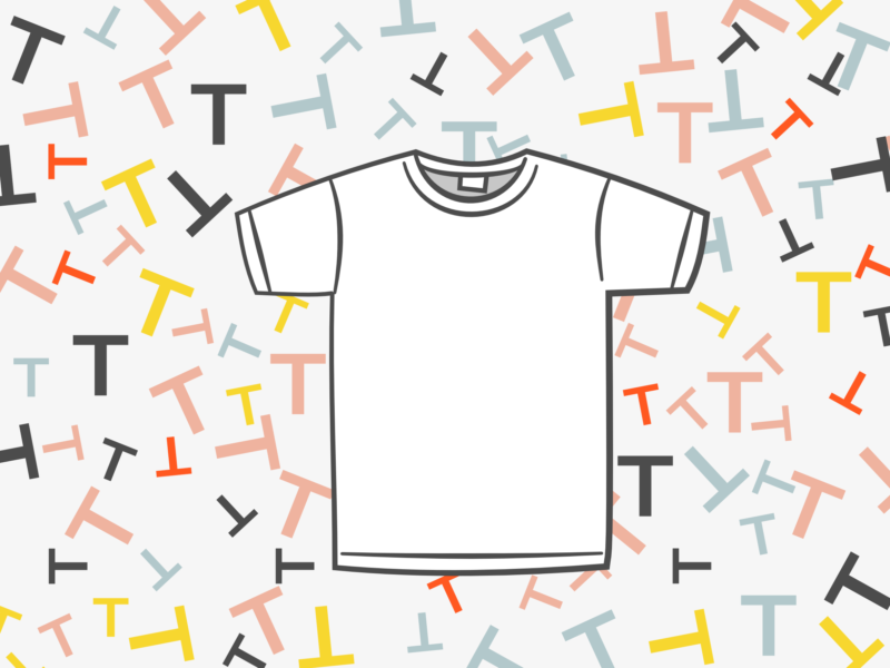
The t-shirt is an undeniable design classic and wardrobe staple. It is an unquestionable design classic, that comes in every size, colour, and pattern imaginable whilst remaining identifiable. It’s an everyday essential that’s such a common sight now, that it seems crazy that it only really became a garment in its own right around 70 years ago.

Today’s story beings with, the butt of many a joke, the union suit. If you don’t know what a union suit is, it was a kind of onesie that buttoned from the neck to the crotch and had a very attractive bottom flap. It usually came in red. The union suit was worn under clothes and was really good at keeping people warm, which was great in the winter months but when summer rolled around it was a different story. So, people cut their union suits in half creating long johns and a collarless undershirt.

At the same time as people started customising and DIYing their own undergarments (I am sorry for how much I use that word in this post), manufacturers also started experimenting with fabrics. Eventually, they succeeded in creating a fabric that could stretch and still maintain their shape. Not only would this make clothing more comfortable it also meant that they could make a shirt that was pulled over the head without breaking the collar.

No one is sure quite who developed this fabric or turned it into a t-shirt first, but the Cooper Underwear Company were the most successful in marketing them. They marketed their t-shirts to bachelors with the idea that they required less maintenance than a button-down undershirt “No safety pins — no buttons — no needle — no thread“.

A year later, in 1905, the US Navy made a bulk order of these shirts and made them an official part of their regulation uniform. It was intended that these shirts would mainly be worn under uniforms, but they could also be worn on their own for training, in engine rooms, or in warm weather at a commanding officer’s discretion on their own. These t-shirts were so popular amongst the men that they brought them home with them and spread the word about their comfort and hardwearing nature.

Now might be a good time to go into the origins of the name of the t-shirt, or rather the question of the origins of the name of the t-shirt. I think the most common story behind the name that I’ve heard suggests that it comes from the T shape of the garment. However, there are also people who claim that the t in t-shirt might stand for training as t-shirts were sometimes worn alone for training sessions in the army. There are even those who think the t might be short for amputee, as the sleeves on the shirt are a cut down version of their predecessors. Whatever the reason behind the name, it stuck and was first recorded in popular literature in 1920 in F. Scott Fitzgerald’s This Side of Paradise.

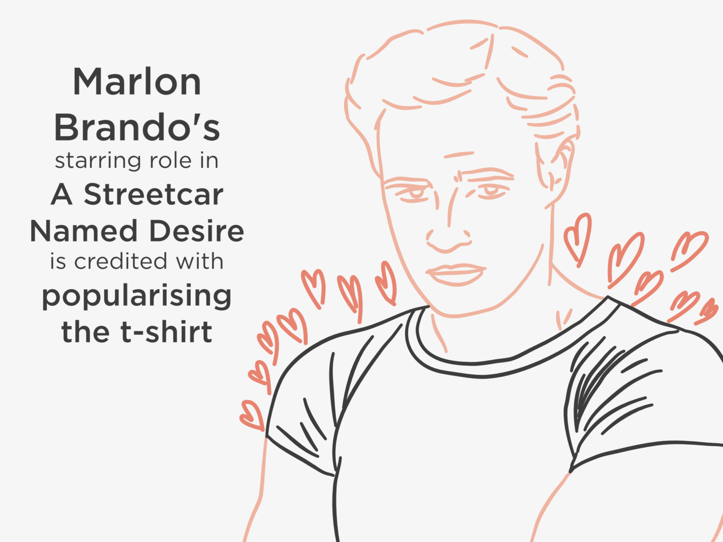
At this stage in its development, however, the t-shirt was still mainly an undergarment. But the t-shirt grew slowly in popularity over the next 30 years. This growth mainly happened in American high schools where, by 1940, “newspaper columnist named Nancy Pepper wrote that teenagers owned closets full of T-shirts and customised them with sew-on patches and fringe”. These customised tees were even used to advertise for make out sessions. But it wasn’t until 1951, that the t-shirt would be labelled a “sexy, stand-alone, outer-wear garment” after being worn by Marlon Brando* in A Street Car Named Desire. His appearance throughout the movie in a tight fitting white t-shirt on its own lead to a surge in sales of the garment. James Dean later solidified the t-shirt’s status, sporting on in A Rebel Without a Cause.

After this cinematic turning point, the t-shirt became worn more widely as a standalone piece rather than an undergarment. Not only were they cool they were also cheap and easy to clean. A fact that made them popular for mothers with young children to dress.

While it was the plain white t-shirt that had soared to fame in the 1950s, in the 60s there was a new kid on the block, the printed t-shirt.  Warren Dayton pioneered art t-shirts featuring images of Cesár Chavez, the Statue of Liberty, polluted lungs, and other political and comic images. T-shirts were no longer just symbols of being cool but political statements used to advertise whatever the wearer believed in. This advertising potential was quickly pounced on by the likes of Disney, who began making t-shirts adorned with Mickey Mouse to sell as souvenirs. By 1977, perhaps the most famous of all printed t-shirts, the I heart NY shirt, was created by Milton Glaser.

That pretty much takes up to the t-shirt we know now which is printed with anything and everything, and is as much a beloved wardrobe staple as it was in the 1950s. This design story really speaks to the power of cultural change to make a classic as much as the design itself. Without the Marlon Brandos and James Deans of the world, we might still only be wearing t-shirts under our button downs.

Key Sources

*Marlon Brando is also credited with being the man who popularised jeans

London is expensive. There is no escaping it. Rent, even if you’re living in shoe box, is ridiculous. Pretty much everything is ridiculous.

These are the things I’ve been doing over the last few months to try and take the edge off, and avoid having to sell a vital organ to stay in the city.

MEAL PREP

This one is obvious but huge. You can save so much money by making your own food, in bulk where possible, ahead of time. I usually end up spending less than the price of one meal our work canteen for a whole weeks’ worth of lunches. If you’re just cooking for yourself, you should still cook more than one meals worth of food at once. I have the same dinner two days in a row and then normally freeze another 2 portions, as a little gift to my future self. It doesn’t have to take long I spend about 2 hours on a Sunday evening and I cook all of my food for the rest of the week, and honestly, it is such a fun 2 hours.

OPTIMISE YOUR TRAVEL COSTS

This one sounds quite vague but it kind of is because it depends on how you travel. The cheapest option is obviously to get everywhere under your own steam. While I’d love to be someone who cycles to work every day I’m just not brave enough, kudos to you if you are! If there’s a good bus route near you and you’re willing to have a relatively slow commute, taking the bus is way cheaper than the tube, especially if you have to travel in rush hour. Plus, it means you get to see daylight! Then, up on the price scale again, you have the tube. This is where it’s really down to how you travel. If you travel at peak times 5 days a week, every week then you’re probably better off getting a monthly pass, or a yearly one if you’re always in the city. But if you don’t you really have to weigh up exactly how much you’re travelling. Give a few options a test run and see which is actually cheapest. Oh and just don’t get taxis – there is almost no need and they are so pricey.

BE AN EARLY BIRD

Almost all London events have early bird tickets, so try and plan ahead and buy tickets early to save money.

BUT BUY DAY TICKETS

This one is the exact opposite of being an early bird, but it works just as well, if not better, if you want to go to the theatre. Most shows have tickets to sell on the day of the show at a reduced price, I’ve sat front row at a show for £15. Plus, a few even do super cheap tickets for under 25s, like MatildaThe Book of Mormon holds a ticket lottery every day for the opportunity to buy £20 tickets, and a weekly draw via Twitter.

EMAIL SUBSCRIPTIONS

Signing up to mailing lists either for brands you shop with or services like BookaTable or OpenTable which often send you discount codes. I would suggest signing up with a new email address just for subscriptions that way you keep them all together, they don’t clog up your inbox, and you avoid the temptation of seeing them all the time, which normally just leads to you buying more. It’s also worth checking sites like Time Out Offers and Style Barista which lists all of London’s sample sales every month.

BUY CONSCIOUSLY

I feel like we should just buy consciously regardless of money, but it’s definitely something that should be a part of your money saving plan too. It’s about not just buying for the sake of buying, but only making a purchase when you actually need something and it will add value to your life. I’ve personally found the method of writing anything I think about purchasing down and then coming back to it a month later (unless it’s an emergency) to see if I still think it will add something to my life. There have been so many things I’ve forgotten about after 2 weeks, it’s been so eye opening. This guide to shopping like a minimalist from The Private Life of a Girl is really great and super simple – it’s just 5 questions to ask yourself before you buy something.

FREE STUFF

Just as there’s loads of super expensive things you can do in London, there might be just as many free things. There are so many free museums, galleries, and sights that I wouldn’t even attempt to list them here. There are also free workouts like the Park Run, or Sweaty Betty’s free yoga classes. You can also see loads of live music in bars, comedy and TV recordings (TV Recordings / BBC TV and radio / Applause Store / SRO Audiences) for free. You just need to have a good google. I’d recommend checking out Curious London’s guide to the city for some inspiration. That said I think my absolute favourite free thing to do in the city is just to go for a walk and explore.

The brain processes visual content 60,000 times faster than text so it’s no surprise that infographics have been proven to be a highly effective way of engaging people with information. Infographics are in fact 30 times more likely to be clicked on than a blog post. Brands, companies, and bloggers have all caught onto that effectiveness, and infographics have been booming.

This popularity has meant that more people want to give making them a go. So, building on my last workplace design tips post, I thought it might be useful to share some of my top tips and some helpful layout ideas for anyone wanting to give it a go either for work or just for fun.

So how should you go about creating an infographic? The first thing you always need to do is to choose your content. There’s no point deciding you want to create an infographic if you don’t have anything to say with it. Once you have a compelling story to tell, work out what kind of infographic is going to convey that story best. The seven most common types of infographic are: visual articles (make a story more visual), data viz (best for stats based stories), maps (for geographical content), versus (for illustrating 2 opposing ideas), timelines (for historical content), lists (used to support a claim through a series of information), and processes (used to show logic, or give readers personalised choices). Then you need to plan. I’ve put 3 really basic layouts you can follow below to help you get to grips with organising your information.

As you start to populate your infographic, there are a few things you should bear in mind. First, make sure you tell a story with your infographic. I like to gather up all of my information on separate cards and just move it around to see what works best, layout and hierarchy are so important when you’re making such a big graphic. Once I’ve got the flow sorted I either add in the graphs or ideas of how I can visualise the information. I do this stage digitally because it’s easier to produce graphs and to manipulate sizing without having to redraw elements. I play around with scale, to make the graphic interesting and also to keep the reader’s attention where I want it to be. Normally, I do all of this in black and white because I’m just creating the structure, so the next stage is to add the colour. All that’s left to do then is a final review of the flow and also the shareability of the graphic I’ve created because you need to get the most out of what you’re making.

Keep the story you’re telling, and the rest of your infographic, really simple. People like infographics because they’re easy top digest so don’t overcomplicate it. To create that simplicity, make sure you stick to a basic colour palette, a short title, maintain some white space, and don’t overwhelm it with text. Also, please, don’t make it 20ft long!

If you need some inspiration these are just a few of my favourites:

One of the most obvious yet overlooked aspects of productivity is file organisation. If you can’t find your work, how on earth are you going to get on with it? If you wouldn’t have a pile of unlabelled, unfiled papers spread out over your desk, why would you have all your files saved willy-nilly to your desktop?

Organising your files isn’t as simple as creating a couple of random folders and being done with it though. It takes a bit of thought, and some conscious effort. So, I thought I would share all the things I’ve learned through the years and a big recent audit of my digital files.

WORK IT OUT ON PAPER

I think I say this in absolutely every organisation/how to post I write, but you need to have a plan. I recently decided to have a reorganise of my filing system. Now that I’ve been working and blogging for over 6 months, and not writing essays for over a year, I felt like it was well overdue. Instead of rushing in an just creating folders I sat down and worked out the kinds of files I create most and how best to divide them. I created the hierarchy you can see above based on how I actually work and live. The main things I do on my laptop are blog work and design work, so they along with a life admin folder, are my top-level folders. When it comes to blogging I work by time rather than by topic, so I went with monthly folders as well as a folder for things that I use all the time. With design work, I think of my projects in terms of clients rather than projects so that’s how I subdivided those folders. I also created shortcuts to the documents I use the most, for example my blog plan and my budget doc so they’re always on hand.

LABEL PROPERLY

While you should be able to find everything you need without searching for it, give files the name you would search if you were looking for it. No body searches for ‘Untitled 6 FINAL’, and no one remembers what it refers to in 6 weeks.  Folders and files should have clear short titles. Working as a designer there’s absolutely no way to avoid doing multiple versions of the same design, because you know clients have opinions. Personally, the system I use for client files is their name, then the name of what I’m working on, then letters for options, and v1 etc. for redesigns and edits. I only label something as “Final” when it’s got client approval and has been sent off.

ARCHIVE

If you’re creating a lot of material, you need archive folders. I write 3 blog posts a week, each of which has 2-3 graphics to go with it as well as extra social media images, if I didn’t archive my work there is no way I would ever find anything. I archive each month of blog posts as it passes. I don’t archive individual posts as I found it took too much time and I didn’t stay on top of it, instead I rely on my blog schedule document where I tick off all the posts which I’ve queued. I also archive all my design projects after 3 months. I leave a little bit of a gap after finishing a project before archiving it in case I’m needed to do any tweaks, and I don’t really delete any design projects because I’ve had to dig up old design elements for future projects or for portfolio type stuff so often.

BACK IT UP

I’m a firm believer in “it doesn’t exist unless it’s saved in 3 places”. Whether you like saving to cloud services, duplicating manually to external hard drives or using something like Time Capsule, just make sure you remember to back up everything!

USE A CLOUD

Cloud services are so useful, and they’re something you should really take advantage of. First, shared folders are so useful for client work. They allow you to have one central repository of files, and it means things don’t get lost in email chains. Pretty much every client I work with gets their own folder which is roughly divided into projects, then ongoing, archive, briefs/research. This is the drive I have synced to my laptop because it’s the one I use most. Secondly, co-working/creating is so easy with them. Finally, they’re so useful for having an extra back up. For example, I have a separate Google Drive just for backups of photos. I’m mainly a Google Drive person, but I feel like the same rules apply if you prefer Dropbox or even iCloud.

HAVE REGULAR CLEAR OUTS

This reorganisation was a really great excuse for me to have a clear out of my folders, and who doesn’t love a good clear out. It’s so easy to hoard digitally, because you don’t notice the files piling up. Make sure you archive stuff relatively frequently so that you don’t have to wade through files you aren’t using or don’t need anymore. I’ve set a monthly reminder to go through my laptop to, hopefully, get me to keep on top of it all.


THINGS TO REMEMBER:

KEEP IT SIMPLE

You don’t need loads of folders, just enough to separate your files into manageable chunks.

DON’T SAVIT IT TO THE DESKTOP

Unless you really, truly have to (and you probably don’t have to), don’t save things to your desktop. It’s messy, it slows your computer down and it’s just plain silly.


How do you organise your files? Do you have any organisation top tips?

I am a very cautious road crosser. I’m not sure I would get anywhere without the assistance of the green man if I’m honest with you. So, as I was crossing the road the other day I realised I had no idea why pedestrian crossings are designed the way they are. They seem completely natural now, but they had to be designed and thought out at some point, right? Well, it turns out that the crossings we know now were a long time in the making and came about in the least organised way you could imagine.

The story of the pedestrian crossing begins in 1934, when, then Minister for Transport, Leslie Hore-Belisha instated range beacons on top of striped poles at crossing points in London to signal to drivers that they should slow down. A year later those orange lights were rolled out across the country under the title of ‘Belisha Beacons’.

It wasn’t until almost 20 years later that those crossings would become the zebra crossings we know now. In 1951, the Ministry for Transport were forced to add markings on the road to make the crossings clearer after several complaints that the beacons alone weren’t visible enough to motorists. These markings came in the form of thick white stripes, that matched the striped poles of the Belisha Beacons. This decision would pave the way for 2 trends you’ll see in the development of the pedestrian crossing, development only coming after complaints and the naming of crossings after animals.

Over the next decade there were a series of signalled crossings, including a renegade set of lights in Leeds, but nothing official until 1962 when the need for something more robust than the Zebra crossing became urgent. The government came into this next phase with a long list of requirements which centred on the idea of a signalled crossing that wouldn’t hold traffic up for too long. By all purposes, the design they were given as a solution ticked all the boxes. It featured a button for pedestrians to press to cross, and lights opposite them that read ‘Wait’ and ‘Go’, which any modern user would recognise. The Panda crossing, seemingly named for no other reason than it was the first black and white animal someone could think of, was opened in London in April.

Even though the Panda crossing seemed to check all the boxes and was opened by a very cute toy panda bear, it was far too complicated to use. Motorists were bombarded by an intricate pattern of flashing lights that didn’t seem to have a clear signal of when they could proceed. Perhaps the best summation of the scheme comes from an old lady interviewed by the BBC at the time who declared “that man Marples [the Minister for Transport] is up to too many tricks. It’s a hairbrained scheme and most dangerous!” They made the most critical of design errors, they forgot the user. 

Unsurprisingly, the Panda crossing was replaced. In its place came the X-Way. The X-Way took the same principles of the signalled crossing but simplified the lights for motorists. Instead of the complex flashing light system of the Panda crossing, the X-Way had just 3 lights that functioned like normal traffic lights. The only difference being that the green light was replaced with a white X light, which is where the crossing got its name, and the amber light flashed when the crossing period was almost over. The X-Way also saw the birth of the green man (and his red counterpart).

They were really close with the X-Way, the only issue was that an X is generally used to signal a stop rather than go. So, in 1969 the white X was finally replaced with a green light and the Pelican crossing was born, a system we still use today. Interestingly, the name Pelican wasn’t just chosen because it was another monochrome animal, instead it came from the abbreviation of PEdestrian LIght CONtrolled crossing.

The most recent incarnation of the pedestrian crossing is the Puffin. The major difference between the Pelican and the Puffin crossings is that the Puffin crossing sees the lights on the same side as the user rather than opposite. Puffin crossings also have sensors, either in the ground or the traffic lights above, that can detect when there is a pedestrian waiting to cross or crossing the road. This means that the traffic lights shouldn’t change if there is someone in the middle of the road. Despite some initial concerns, the Puffin crossing has been proven to be safer than its predecessor.

Other modern animal crossings include the Toucan for pedestrians and cyclists and the Pegasus (which is also in Peru) for horses.

As you can see, the design process of the modern pedestrian crossing was a long and complex one that involved iterations on iterations.  If you found this interesting, I would highly recommend having a read of the story of Ampelmann who is the German green man and is the coolest little fella.

Are there any more design stories you’d like to hear about?

Key Sources