I love greeting cards. I love sending them. I love receiving them. I love hoarding them. I may or may not have a whole box full of them.

I love it when a card just speaks to you, and you know you have to send it to that one specific person, and I like to think the people on the other end enjoy them too. Nothing says I saw this and thought of you in the way that a great greetings card can. There are loads of incredible designers creating greetings cards, so I thought I would share a list of some, by no means all, of my favourites to help you fulfil all your stationery desires.
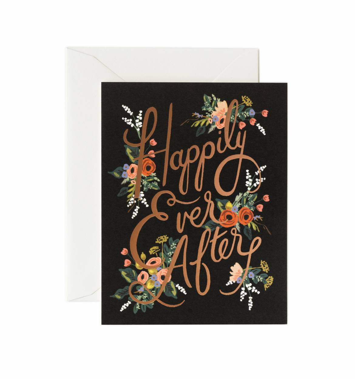
Rifle Paper Co.

THE BIG GUNS

Rifle Paper

Founded and owned by husband and wife team, Anna and Nathan Bond, Rifle Paper might just make some of the most stunning cards you can buy. They have a mix of beautifully illustrated and quite simple designs. Personally, I usually end up gravitating towards their more illustrated styles, especially when there’s a bit of gold foil involved. Even though they’re based in Florida, their postage to the UK isn’t too steep but does give you an excuse to add an extra couple of cards to your basket.

Gemma Correll

I think I have, at some point, bought every card Gemma Correll has made, in some cases I’ve bought them more than once. All of her cards feature her easily recognisable illustration style, and they’re the perfect mix of funny, true and a little bit uplifting.

Kikki.K

Kikki.K are known for their simple Swedish designs and their mindful journals, but they also make some beautiful greeting cards, for all occasions. Their cards embrace many of the same minimal design principles as their other stationery, so if you’re a fan of anything else they’ve made I’d highly recommend their cards. They have a store in Covent Garden, but their greeting card selection is way better online.

Ohh Deer

Ohh Deer stock a lot of the designers I’m mentioning in this list, as well as so so so many more. If you’re looking for a card that’s a bit quirky, and also to accidentally pick up more stationery than you will every use, Ohh Deer is the one for you.
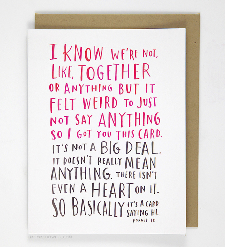
Emily McDowell


THE WORDY ONES

Emily McDowell

Emily McDowell makes cards for the relationships people really have and for the times when there isn’t really anything you can say. If you scroll through her website I guarantee you’ll find a card that speaks to you in the that’s so us, or even that’s so me, kind of way. She’s even written a book about the times when there’s no good card for what you’re looking to say.

Dorkfeatures

In a similar vein, Lauren Goodland, AKA Dorkfeatures, makes cards that are relatable and funny and so so lovely. They’re so great for friends, which I think is kind of hard to come by. Plus, her relationship cards are just great, if someone could sign up to protect me from giant spiders (mainly just the ones with big bodies) I’d be very appreciative. I will also say that if you like her cards, I would highly recommend following her on social media to watch them come together and just have some chuckles.

Adam JK

I’m a huge fan of Adam JK in all situations, but he recently released a set of postcards that are just brilliant. They’re perfect for when the high street just doesn’t have a card that says just what you want it to, or for when you want something a little shorter and less formal than a card (and by that I mean a postcard).

Katie Leamon


THE SIMPLE ONES

Katie Leamon

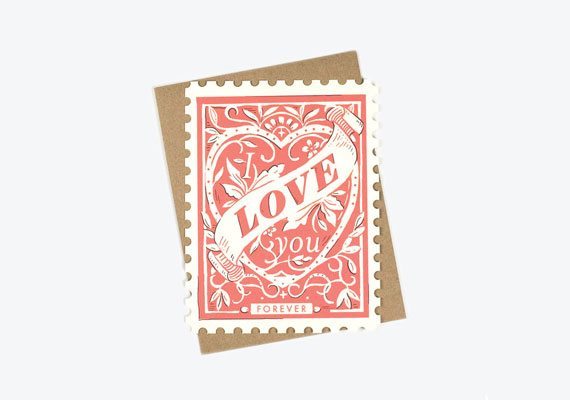
Katie Leamon makes some lovely handwritten cards, as well as some very special foiled numbers (I have a thing for foil on cards okay?!). I particularly love the unique cut edges of her cards that are inspired by vintage postage stamps, such a wonderful idea and a really special touch to a simple, does the job beautifully card.

My Dear Fellow

I’ve included My Dear Fellow in the “simple” category even though their cards are bright, colourful, and illustrated because their style is quite graphic. These are the perfect cards for when you want something beautiful but not to specific, ie. the ideal store-cupboard cards.

Jordan Carter


THE FUNNY ONES

Katie Abey

Katie Abey’s cards are happy, bright and just a wee bit sarcastic. I love all of her animal based designs, but her happy birthday llama has got to be one of my favourites – if any of your friends loved ‘Llamas with hats’ as much as I did you really need to check this furry fella out.

Jordan Carter

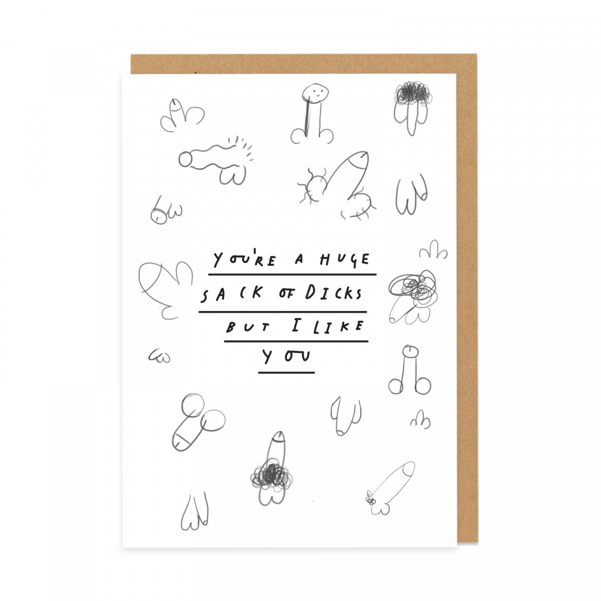
‘You’re a huge sack of dicks but I like you’* sums up Jordan Carter’s style. They’re a little bit rude and a little bit mean, and perfect for that friend/loved one you’re so close to that you just rag on each other lovingly. *I’m not being unkind it’s one of my favourite cards of his.

Amy Heitman


THE DAMN THAT’S PRETTY ONES

Present & Correct

When they’re not curating the most perfect Instagram feed, Present & Correct’s day job is making gorgeous stationery.

Wrap

You would expect nothing less than beautifully designed from Wrap Magazine’s card selection, and they do not disappoint. They sell cards from a range of designers but their selection is so well curated that there isn’t a card on their site that I don’t like.

Amy Heitman

Amy Heitman’s cards are hand illustrated objects of love, they are stunning. If you like Rifle Paper’s style I would highly recommend having a look at her stuff and drooling a little bit.

Jon Klassen

I love everything Jon Klassen does. His picture books are absolutely tremendous if you haven’t read We Found a Hat you really truly need to. His cards are just as lovely and heart-warming as his books are, they’re beautifully illustrated and really small pieces of art that you can put your own feelings in and share.

 Annie Dornan Smith

Annie’s cards are bee-autiful (check out her website to get that pun), she has quite a small range but I love all of her cards and stationery. Plus, her packaging is gorgeous so if you order online it’s like you get a gift as well as the person you’re sending the card to later.

Carrying on from the Hamish and Andy poster I created last week, I wanted to design some more alternative posters for my favourite podcasts. This week I’m sharing two, for a couple of my favourite design themed podcasts. They’re both very different, but they both provide me with a lot of creative inspiration.

The Raise Your Hand Say Yes podcast sees Tiffany Han discuss all things creative living and working with some of the most interesting artists, makers and doers around. All of Tiffany’s interviews really get to the heart of what a living a creative life means for her subject. She doesn’t shy away from showing the tough side of pursuit a creative job, instead, the podcast is designed to be something of a companion for those tough moments that offers advice and encouragement to her listeners. This poster focuses on that spirit of finding beauty and growth when you say yes.

The best pieces of design are the ones you don’t notice. 99 Percent Invisible “is about all the thought that goes into the things we don’t think about”. The podcast covers the design everything from cities and architecture to objects, to sounds, but the episodes are all held together by an overarching sense of curiosity and wonder. I wanted my poster design to highlight the way that the podcast really changes the way you look at the world and shines a light on the incredible stories of the designs behind so much of what surrounds us. So I took a bit of inspiration from their logo and decided to show a visible 1% of the city.

London Underground Font Design History

Originally, this post was going to be a history of the roundel. But as I started researching them, I became fascinated by the typeface on them and its history. That typeface is a huge part of the London, not just the Underground’s identity, and yet I had walked past it so many times without giving any thought as to the designer behind it.

That designer was Edward Johnston. Johnston was commissioned by Frank Pick, one of the Underground’s driving forces, to create a typeface that unified all of London Underground’s lines, which at that point in 1912 were run by different companies with different branding. Pick had already rejected the W.H. Smith typeface, a serif typeface which was inspired by the fashionable calligraphy at the time because it would be too hard for travellers to read on the go. So, Pick asked Johnston for “a strong and unmistakable symbol” with “the bold simplicity of the authentic lettering of the finest periods”. 

In 1915, Johnston answered with what would be known as Johnston Sans, a block letter typeface. A sans serif typeface might not seem all that revolutionary today, but in the early 1900s, the fashion was for more elaborate styles inspired by Victorian calligraphy. Johnston’s interest in earned him a lot of criticism from his teachers. Despite its being unfashionable, Johnston took his inspiration from the block lettering on tradesmen’s waggons and created a sans serif typeface. The result was a typeface that was easy to read at speed, and appealed to the people who were actually using the underground. The diamond shaped tittles (dots above the i) which Johnston Sans is perhaps most easily identified by, was, in fact, a nod to the popular styles of the time mimicking the angular mark made by a calligrapher’s pen.

Those touches were retained when Eiichi Kono was tasked with revitalising the typeface in 1979 in order to make it fit to be used as London Underground’s house typeface. Johnston’s original design was made for signs. At first, he didn’t even make any lower-case letters. So, when it came to updating Johnston Sans for wider print usage Kono had to edit some of Johnston’s original design, and add in some missing characters, to make it fit for purpose and to stop it being replaced by fonts like Helvetica.

Johnston New, Kono’s version of the typeface, then had to be updated again for the typeface’s 100th birthday. Kono, and certainly Johnston, could not have predicted the importance of the hashtag or the @ symbol when they were designing the font. In fact, @ was used in email addresses precisely because it was one of the least used symbols on a keyboard. Nonetheless, in today’s digital world, if Johnston was to be useful it needed to be able to accommodate both characters as well as several weights for digital use. That’s where Monotype stepped in.  Not only did Monotype add in the missing pieces of Johnston’s font, they also took it back to its original width, at once making it more and less like Johnston’s first design. In the process of its updates over the past century, being taken from wooden blocks to metal, then to a digital form it had become narrower and narrower. So the Johnston100 you see on TfL documents and signage today is as close to the original as it can be in the modern day.

Johnston’s typeface hasn’t just been updated and adapted to suit a changing rail network, it was also the basis of another typeface which has shaped reading far more widely. One of Johnston’s former pupils, Eric Gill, further developed Johnston Sans. Gill, who is famous for both his design work and awful abuse of his daughters and dog, simplified Johnston’s typeface to create Gill Sans. The original design Gill Sans, a hand drawn sign above a bookshop, caught the eye of Monotype (yes, the same design house that recently created Johnston100), who commissioned Gill to create a full typeface. Since then, Gill Sans has become one of the most famous typefaces in the world as the choice for the covers of the classic Penguin book covers.

Just as Johnston’s typeface has been adapted and used far more widely than he may have ever anticipated, so has the roundel it is famously featured on. In 1908, the first roundel was simply a platform name board at the station we know today as St. James’s Park. Around 3 years later, the roundel became the official logo for the underground network. But it is not until 1917 when the new typeface is put on the roundel that it becomes a registered trademark. In the following years it undergoes a number of tweaks, but remains much the same and a symbol of London itself rather than just the underground.

This synonymy with London, is why, in 2000, when TfL was founded and became responsible for all of the transport networks for London rather than commissioning a new logo they stuck with the roundel, and just commissioned more variations. Today, the roundel has been edited to accommodate airports (Heathrow’s roundel features a little aeroplane symbol), clocks such as the ones at Bethnal Green and Redbridge, and coffee art as seen in the Transport Museum’s café.

As someone who is, often quite vocally, not a huge fan of the tube, learning more about its design history has definitely changed the way I approach my commute. Finding out more about the design thinking in the details in the environment around you can really shift the way you look at the world.

As someone who works full time, blogs and works as a freelance designer, I’m always juggling different tasks and trying to eek as many hours out of the day as I can. In the process of trying to maximise my time I’ve made a lot of mistakes that led to unnecessary stress and really long nights, and I’ve learned a lot from those mistakes. These are the things I wish I knew about time management 5 years ago.


TIME BLOCK YOUR DAY

As someone who used to just write a to do list and hope it happened, time blocking has honestly been such a revelation. I schedule my days, particularly weekends, by marking out blocks of time to work on certain tasks, that’s one task per time block. Since starting a more schedule based approach I’ve achieved so much more and worked a lot more efficiently. Time blocking helps you know what you should be doing next, how long something should take you and also how much you can achieve in the day (quite often I transfer my to-do list into my schedule and realise there’s just not enough time to do everything).


SCHEDULE IN BUFFER-TIME

When you time block the temptation to plan work for every minute from dawn until dusk is so real, especially when you have a to-do list that’s longer than your arm. You have to stay strong and plan in buffer time. As much as it might feel wrong not to fill your schedule right to the top, leaving some extra space for things to go wrong or take longer than you think is absolutely essential because it will happen. Having that extra space means you can be realistic about what you can actually achieve and it means that if/when things go wrong you don’t feel bad about it. Plus, there’s the added bonus that if everything goes smoothly you get to tick off your to-do list early!


YOU CAN’T ALWAYS BE PRODUCTIVE

Some days you’re just not going to work very well. I used to beat myself up quite a lot over those days because so much of my idea of my value is caught up in how productive I am. But remembering that you’re only human and allowing yourself to have slow days and rest makes you more productive in the long run.


YOU CAN’T WORK ALL DAY

Tagging onto that last point, you need to take breaks. You should be taking breaks between tasks so that you can stay focused as well as longer rests at the end of the day to unwind. Breaks are good for your health, both mental and physical, and they’re good for your productivity. I’m still working on getting better at taking full days off every once in a while, but all of these tips are works in progress for me.


MULTITASKING DOESN’T WORK

As much as it might seem like it, multitasking doesn’t make you more productive. I have tried it many times and always come to the same conclusion that doing one thing at a time, and really focusing on that one thing, is the most efficient way to work.


SET DEADLINES

I work fastest when there’s a deadline coming up because that piece of work always gets bumped up to being my top priority. I’m definitely not suggesting that you leave everything until the last minute, please don’t do that. But because you’re more focused when time is limited, set deadlines for everything. I found that the tasks that I didn’t have proper deadlines for, usually my own projects, dragged on and on and on and constantly got deprioritised. Set realistic deadlines for everything you want to achieve to make sure it actually gets done when you want it to be done.


SET UP A ROUTINE AND STICK TO IT

I love having a routine, it gives my days structure and it helps me stay focused. I know a lot of people find routines scary, but I would highly recommend giving a work routine a go because you can really make it whatever you want to and it doesn’t have to be super rigid. That might mean anything from I do all of my admin tasks on a Friday, or I finish work at 9:30 every day, or I do my jobs in this order every day.


JUST GET GOING

Sometimes the easiest way to start working is just to start working. That might sound so obvious it’s stupid but it’s easy to forget and decide you’re going to start when it’s just the right moment or when the rain stops or when you’ve scrolled through every Buzzfeed article you can find. You just have to start. If I’m feeling particularly apprehensive about work, or particularly procrastinate-y, I like to start with something small. Ticking off the littlest thing on your to-do list is the quickest way to get you feeling productive.


PRIORITISE PRIORITISE PRIORITISE

There will never be enough hours in the day so you have to prioritise what you’re working on. “Is it due soon?” and “is it essential?” are always the two questions I start with when I’m deciding my work priorities. But it’s also important to ask “is it a priority to my well-being?”. You shouldn’t have to prioritise work over your health and happiness.


GROUP MEETINGS INTO BLOCKS

There’s a weird period of time before you have a meeting where you just don’t really do anything because you’re doing a bit of a pre-meeting procrastinate. Group all of your meetings together where you can to try and minimise the amount of time you’re psyching yourself up to sit through another presentation or meeting that could have been an email. I also try and do this with phone calls, emails, and all other similar types of work communication for the same reasons.


WORK IN SPRINTS

I used to try and work for hours and hours in one go, and it just didn’t work. I’d lose focus and become unproductive before I was even halfway done with whatever I was working on. Instead, I now work in sprints which are normally about 45 minutes long (sometimes a bit more sometimes a bit less, I’m not as strict as the Pomodoro method) and then take a quick breather. The amount of time I work for depends on the kind of task I’m doing. Figure out how long you can actually focus on a task for and then work in sprints of that amount of time to keep focused and engaged.


BREAK DOWN TASKS

I talked in my goal setting post about breaking down goals into manageable chunks, the same goes for tasks. Break everything on your to-do list down into chunks that you can do in one go. You’re more likely to do them that way, and you feel a lot more accomplished, and that sense of accomplishment puts you in a positive mindset for doing more.


ALWAYS TAKE NOTES

The number of times I’ve been in a meeting at work or having a conversation with a colleague and then an hour later needed to refer back to what was said and just can’t remember is way too high. Take notes of everything, that includes, but is not limited to: things you need to do, how to spell the names of important people, phone numbers, email addresses, words you don’t know, deadlines, and anything interesting you hear about because that way you can ask about it in conversation later.


FILE THINGS IN A WAY YOU WILL FIND THEM LATER

Following on from taking notes, make sure you file those notes and everything else you do in a way that you can find them again later. There is nothing more frustrating than knowing you’ve got a document that could be really useful but having no idea where it is. I’m not going to suggest a system here because I think a lot of it is down to personal preference but I will say it’s worth putting a little bit of time into designing a system that works for you and reviewing it as you go.


AUTOMATE WHAT YOU CAN, BATCH WHAT YOU CAN’T

If there are any tasks you find yourself doing a lot whether that’s scheduling social media posts, converting files or chasing up on invoices find out what you can automate and do it. Automating tasks can take a bit of time at first, but it is honestly so satisfying. I can’t explain to you the joy of creating a photoshop droplet and watching it edit 200 images for you – it is honestly just so magical. If there are things you can’t automate do them in batches. Working in batches can reduce setup time and makes small tasks a lot more efficient. I now take my blog/Instagram photos in batches unless they’re taken out and about, and I do all of my meal prep on a Sunday and it saves me so much time.


BLOCK OUT DISTRACTIONS, DON’T RELY ON WILL POWER

I’ve spoken about Freedom before in a run down of top apps for designers but I want to bring it up here again. Unless you’re a superhuman you probably can’t resist the temptation of all of the distractions the internet and your notifications have to offer. So use something like Freedom to block them so that you can focus on the task at hand rather than battling desire to keep hitting refresh.


Getting ready for school was so easy. You never had to think about what you were wearing, you never had to dress up or down you just wore what you wore and it was the same as everyone else. When I started work I realised quite how much I missed that simplicity. So, inspired by that nostalgia, and my desire to embrace a little bit more minimalism in my life I created a work uniform. While I’ve not quite gone as far as Matilda Kahl, who wears the exact same outfit to work every day, I do follow the same template and I’ve really curated what’s in my wardrobe.

I’m honestly so glad I’ve created a work uniform. Because I wear things from the same template every day, I don’t have to spend time picking out an outfit. I’m also a lot happier and more comfortable in what I’m wearing. I know that my uniform suits me and that all of the pieces I own go together because I invested some time in working out what I wear the most and what made me feel the most confident. Having a relatively set work uniform is a great way to feel like you have your own sense of style, in part because you do, or at least I think I do a bit more now.

Putting a work uniform together is kind of like putting together a capsule, or minimal, wardrobe. To find mine I used the coat hanger method, which is where you hang all your coat hangers the wrong way around, then turn them back when you’ve worn a piece. It’s a super simple way of working out what you do and don’t wear. I realised I wore trousers every day, but ignored the dresses and skirt I had taking up space. Once you know what you wear the most, refine that list down to 2 or 3 key outfit templates.

My work uniform is pretty basic. I wear the same black trousers (I own 2 pairs don’t worry) every day. They’re from Finery and are a mid-rise slightly cropped style. I’d like them to be a little wider on the calf, but they’ve been through a lot and worn well so I’m not going to complain. I wear the same pair of mono 1461 Doc Martens, unless I have a client meeting then I’ll wear a slightly less beaten pair of dual Monkton strap Docs. I do change up my choice of top, though. If it’s warm outside I’ll wear a collarless shirt, normally in white, although I do have one in dark grey I really like too. Sometimes I’ll wear a plain white shirt instead, but that’s only if it’s a casual day in the office. If it’s chillier I’ll wear a high neck jumper, with a t-shirt underneath. That’s about it, I don’t really wear many accessories other than my watch, Datter rings, and OMCH earrings, which I wear every day, and a plain black suede belt.

My uniform has seen me through placements in consulting, PR, and advertising and I’ve never felt out of place. I’d advise anyone starting a waiting a few weeks before you start the process so you know the kind of level of formality that’s expected. If, like me, you’re in a position where you’re moving offices and environments I’d suggest going somewhere non-committally smart casual, like a nice shirt and trousers or a simple dress that way you should be somewhere in the spectrum of what’s acceptable wherever you are and you can easily dress it up, or down, a little bit.

If you’re interested in minimal wardrobes more widely, which if you’ve gotten to the bottom of this you just might be, I’d highly recommend checking out Sophie’s blog The Life of a Private Girl, because it’s been a huge help/inspiration to me on my journey to becoming a bit more of a minimalist.