A common way for designers to hone (and often show off) their skills is to redesign their favourite movie posters. People like Peter Majarich have created some incredible alternative designs, that really capture something about the film that’s at the heart of their work. Inspired by those posters, I decided I wanted to do something similar.

However, instead of redesigning movie posters, I wanted to create posters for some of my favourite podcasts. I love podcasts, but because they’re solely audio (and often don’t have the huge budgets of films) they don’t always have snazzy design work to accompany their downloads. So, I thought creating podcast posters would be the perfect project for me.

I thought I would start with the first podcast I ever listened to, the Hamish and Andy show. I’ve been a loyal person of the people’s show for almost a decade. I’ve followed them on gap years, on long ships, on quests for the perfect crisp and to bring Fred Bassett alive via the airwaves. This year will be their final year on the radio. I wanted these poster designs to try and capture the fun and friendship their show has provided over the last decade and the way that the people of the people’s show are half of what makes it great. So this is my celebration of their radio victory lap before moving on to TV.

Mondaine swiss railway clock design history

The Swiss, and in particular their railways, are known for being on time. Back in the 1940s, Swiss Federal Railways (SBB) wanted to highlight that part of their identity in a very visible way on their platforms. So, they asked Hans Hilfiker, one of their engineers, to come up with a clock design that could be seen across the station, incorporated into their brand identity, and most importantly help ensure that all Swiss trains left exactly on the minute. In 1944, Hilfiker came up with the solution, the Swiss Railway Clock.

He designed the now iconic clock face so that it was both practical and aesthetically pleasing. It featured a simple round white face which used lines to mark the time rather than characters, giving it a utilitarian and universal appeal. The thick black hour and minute hands make the time easy to read. But the most distinctive feature of the Swiss Railway Clock is its thin red second hand with a disk at the end. That red marker was nicknamed the “rote Kelle” or “red signal” because of the way that it resembled a station manager’s signal, which was used to mark a train’s departure. That little red disk became a symbol of Swiss punctuality.

Not only did the clock have a beautifully designed face, it also featured a tailor-made movement. All Swiss trains aim to leave exactly on the minute, as no seconds are listed on the departures board. This means all the clocks in a station need to run at the same time, to the second and their approach to the full minute needs to be clear. Hilfiker’s movement, which he created with clock manufacturer Mobatime in 1955, was designed so that the second hand on the clock could finish a full rotation in 58 and a half seconds before pausing at the full minute. The clock only starts its next minute after receiving a master electrical signal, which is sent out to all the clocks on the station floor at once. This movement was labelled ‘stop-to-go’ in reference to its pause at the minute.

In 1986, the iconic Swiss Railway Clock left the railway for the first time in the form of a wristwatch, sold by swiss watch manufacturer Mondaine. These watches are not only highly awarded, they’re displayed in design museums across the world, but also highly popular. In recent years Mondaine have brought out watches which mimic that original stop-to-go movement as well as collaborations with the Helvetica that move away from the classic Swiss Railway Clock Face.

That face had become so popular that Apple in its 2012 release of iO6 updated its clock face to one that was cannily similar to that of Hilfiker’s 1944 design. Later that year, Apple were forced to pay $21million for the use of the design, after being accused of plagiarism. While the origins of Apple’s use of the Swiss Railway Clock design were far less than ideal, there is something quite special in the merging of two great design classics and the idea that Hilfiker’s rote Keller is still helping people keep time.

Key Sources:

Time is Precious, Jan Hudal

Remarkable clocks and watches: the Swiss railway clock, Discover Switzerland

History of Mondaine Watches, Ezine Articles

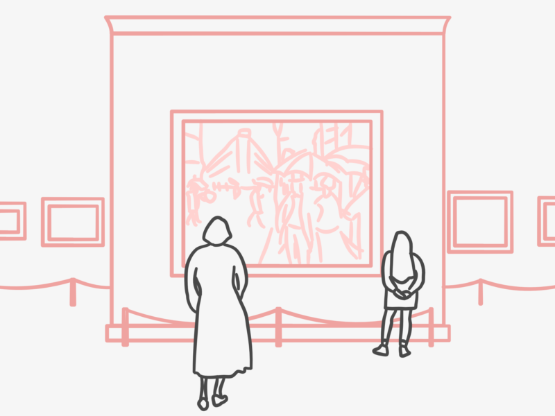
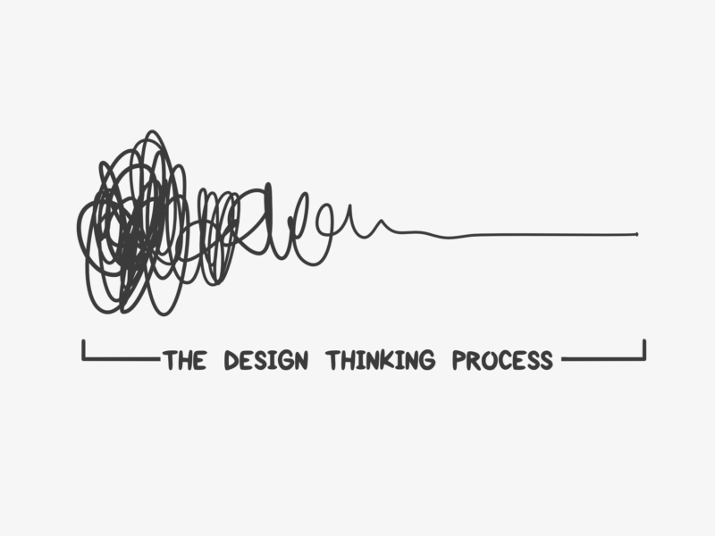
Design thinking is a concept that I hear bounced around a lot at work and in a lot of the articles I read. It seems to be the buzz word du jour, to go along with a growing interest in Service Design. This interest isn’t about aesthetics or logos. It’s about embracing the principles of design as a process in the way people work.

So, what is design thinking? First off, it’s more than just buzz. Design thinking is all about taking a user-centric approach to a problem and then solving it in a hands-on iterative way. By focusing on the real user, and empathising with them, you are able to build something they actually need, rather than what you think they need. Taking this insight and working with it iteratively, prototyping and testing means you fail small and often as part of a process rather than dedicating a huge amount of time and resources to a project that might have an underlying flaw you hadn’t noticed. This process can take slightly longer at first, but it becomes more time and energy efficient overall because you work out more of the kinks at the start.

Design thinking isn’t just for designers or businesses. It can be used by everyone and anyone who’s creating something or grappling with a big question because its process is so simple and can be flexible around whatever you’re working on.

“But how?” you ask.

Well, the design process goes a roughly a little something like this:
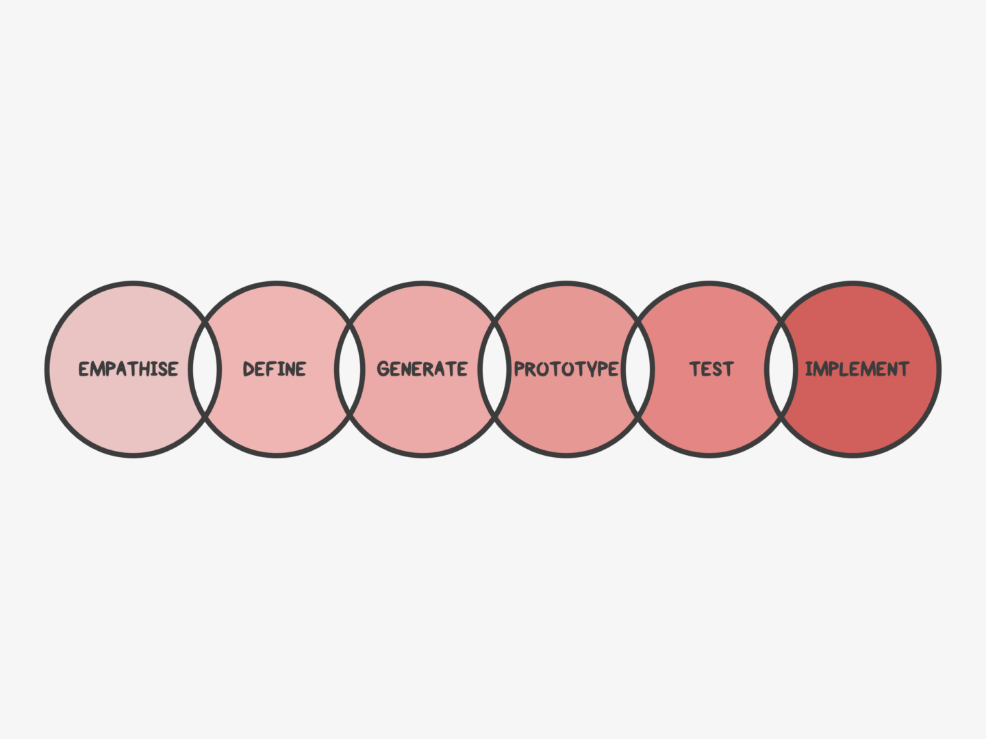
EMPATHISE

Step one is all about understanding your audience or your user. This involves actually speaking to them, rather than just imagining what they think, or feel, or do. Where possible observe what they do in the space you’re looking to get into, so you can find the problems they face and the motivations that drive them. In order to be able to empathise with them and build for them, you need to understand them,

DEFINE

Researching and observing your target audience normally leaves you with a lot of information, so the next step is to hone that information into just a few golden nuggets of insight. You can do this by, once again, empathising with your audience to find out what they care about the most and what experiences or pain points they share.

GENERATE

Once you’ve focused your research on a couple of key points, you need to start coming up with solutions the problems you’ve identified, lots of them. At this stage, you need to generate as many ideas as you can, no matter how wild or unfeasible because you might be able to take something from them. Where possible do this in a team, so you can bounce ideas around and build on each other’s thoughts.

PROTOTYPE

Then you want to build rough models of your favourite ideas. You want these prototypes to be as tangible as you can make them. If you’re building a website, put together some wireframes. If you’re making a board game, build a mini version out of card. If you’re developing a menu, get cooking. This is where you find out which ones are most likely to work or be doable.

TEST

After building your prototypes you need to test them, on your target audience where possible. Get their feedback, you’d be surprised at how often something you think is as simple as ABC is completely indecipherable to a stranger. Take their feedback and then work it back into your prototype. Lather. Rinse. Repeat.

IMPLEMENT

Putting what you’ve built into the world, and into practice, is the last step. Make sure all of your learning comes together in a form that’s accessible to your audience and does actually solve their original problem. There’s no point creating self-cleaning glasses (please someone create these) if they’re not accessible or marketed to glasses wearers.

And that’s it. Apply these principles as you will!

If you’re interested in reading more about design thinking, I’d recommend having a read of some of the articles from The Harvard Business Review’s edition all about it or checking out This is Service Design Thinking which is at once thorough and accessible.

I picked up a copy of The Shepherd’s Life as an impulse purchase. I liked the cover. I’ve spent my summer, and often winter, holidays in the Lake District since I was very small and the image of a green fellside conjured up some of that nostalgia as I walked past a table in Waterstones.

I’m so glad that cover spoke to me. Sometimes you can judge a book by its cover. The Shepherd’s Life: A Tale of the Lake District, by James Rebanks, is a truly glorious book. A memoir of both Rebanks life and fells he has spent that life farming is a captivating read about a captivating landscape, that’s at once personal and pastoral.

The Shepherd’s Life isn’t told chronologically. Instead, Rebanks shares his memories in fragments that are loosely sorted into seasons. These fragments jump between his childhood, adolescence and present-day adulthood and cover everything from his memories of his grandfather to the ins and outs of shearing a sheep.

As someone who has walked many of the fells mentioned in its pages, it was so interesting to read about them from the perspective of someone who has worked them for a lifetime. Rebanks’ is a story I had only ever briefly considered when asking my mum as a child how the dry-stone walls were built, when counting all of the different markings on the sheep we spotted, when marvelling at the intelligence of the dogs I saw working the hills. Getting to read such an in-depth account of a way of life I had only ever glimpsed at by proxy was such a treat.

That said, I don’t think The Shepherd’s Life is only for those who already love the Lakes. You don’t need to have visited the Lakes to imagine them, or to imagine Rebanks rural life because he puts it all on the page. One of the major reasons people say they read is to get an insight into someone else’s way of life, their way of thinking, and that’s exactly what The Shepherd’s Life offers. I think what struck me the most about The Shepherd’s Life is the way that it made me reflect on my own life, and how my own environment had shaped me. Not to over-egg this review but I genuinely think this book changed my life a little bit, or at least how I think about it.

SOME QUESTIONS TO PONDER AS YOU READ

  • What do you think about how the book flows? How do you feel about its fragmentary structure?
  • Rebanks’ account of his understanding of his home and his work is inextricably tied to his understanding of his family. Reflecting on those unbreakable links, how has your own environment and family shaped you?
  • The book almost starts off in opposition to the reader, how do you find the constant distinctions of ‘them and us’ affect your reading experience?
  • If you’ve ever been to the Lake District, or anywhere similar, as a tourist, how does reading the account of someone who works the land change your opinion on the place you visited?
  • The Shepherd’s Life tells a story that isn’t often heard, as Rebanks often reminds us, what lives and stories have gone unnoticed in your own environment? Is there any way you can find out more about them?

IF YOU WANT SOME FURTHER READING TRY…

  • There’s a lovely review in the FT by Melissa Harrison
  • Author of On The Crofter’s Trail, David Craig has also penned a great review if you want a better sense of the book, this one for The Guardian
  • I really enjoyed reading The Durham Book Group’s thoughts on the memoir
  • But I think the best piece of further reading I’ve found is the interview Stephen Moss of The Guardian did with James Rebanks, it really gives you an extra insight into the author and his way of life from an alternative perspective.

IF YOU WANT MORE BOOKS LIKE THIS HAVE A LOOK AT…


Why not use the Shepherd’s Life bookmark I designed to keep your place as you read? It even features the topology of a section of the Lakes Rebanks discusses. You can print and download it for free here.

As ever, let me know if you’ve read The Shepherd’s Life, or if you have any recommendations for what I should be reading next.

How long should we look at art? It’s a question I come back to every now and again.  I recently read a great article on artsy about it and it got me thinking again. When was the last time I made an effort to look at art for longer, not to hurry through a museum passing an extra cursory glance to the artists I recognise or I find appealing before shuffling through to the gift shop.

There have been several studies which have tried to analyse how long we spend looking at works in galleries, all of which have come up with slightly different answers. One study concluded that we look at paintings and photographs for an average of 17 seconds, another decided on 10 seconds, which broke down to 2 seconds looking at the piece, 8 reading the wall text, and then a final cursory glance. Those figures aren’t low because of the quality of the art, apparently, people spend just 15 seconds looking at the Mona Lisa. The most optimistic survey comes from the Metropolitan Museum of Art, where the visitors look at each work for 32.5 seconds.

Surely part of the reason for the speed of our viewings is that we’ve been trained not to spend too long looking at anything. When it comes to moving images, TV cameras cut on average every seven seconds, to hold out attention and tell us where to look. We don’t even have the patience for video clips anymore. We’ve become pros at scrolling through news feeds, flicking through channels and Snapchatting. All of which have combined to create an ability, that is both a blessing and a curse, as whilst we can take in visual stimuli at record speeds, we also often struggle to slow down.

But just because it’s hard doesn’t mean we shouldn’t try. We need to retrain ourselves to spend time looking, and I mean really looking.

That’s what I’ve been trying to do recently. I’m lucky to work near some of London’s best art galleries, so when I can I take a trip out on a lunch time and just sit with one painting for as long as I can. There are 2 main things I’ve learnt from that experience. The first is that just sitting and looking and feeling is magical, it’s somewhere between meditating and being engrossed in a book. The second is that it’s really hard to sit and look at an image if you have no idea of things to look for. It’s boring just to stare blankly at a picture, and you don’t get much out of it.

So, I thought I would share some of the things I’ve been doing when I’m looking at paintings in the hopes that it might help you see things a little differently:

  • Work out what’s going on before reading the information
  • If it’s a portrait, or includes people, I try and work out what they’re thinking
  • Then I like to follow their eyes and see what they’re looking at
  • I squint my eyes a little and try and see the shapes that make up the composition – I like to see the lines that hold a piece together
  • I divide the image up into thirds, or quarters, and look at each section on its own
  • I work out their relationships and their relationships to the surroundings
  • I try and work out why any objects have been placed with them and what they mean
  • I try and find the smallest detail
  • I look at the quality of the brush strokes
  • I find everywhere the same colour appears
  • Then I try and work out the colour spectrum
  • I look from the edges of the picture into the middle or vice versa
  • I like to read the information card after I’ve looked at it for a while and see what that adds to my understanding of the piece
  • I trace where the light is coming from in the image
  • I like to imagine how the image came together by looking for any bits that have been erased or looking for layers and textures
  • I look for dogs (that should be at the top of the list, but I wanted to seem serious)


If you’re interested in learning more about experiencing art a little more slowly, or you’d like a bit of company on your next trip around a museum, it’s Slow Art Day on the 8th April. Slow Art Day is a global event where people all over the world visit local museums and galleries to look at art slowly. Participants look at five works of art for 10 minutes each and then meet together over lunch to talk about their experience. That’s it. Simple by design, the goal is to focus on the art and the art of seeing.