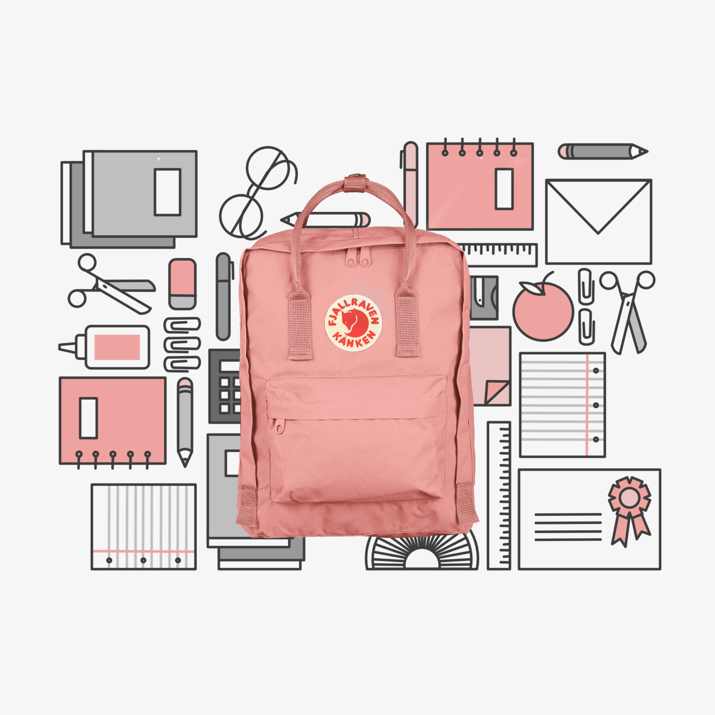
The story of the Fjällräven Kånken, is as classic a design story as they come. Åke Nordin saw a problem and he designed a simple solution. In the late 1970s, 80% of Swedes were suffering from back pain, and those suffering were getting younger and younger. As shoulder bags were in fashion at the time they were blamed by school medical officers for causing this discomfort, because of how they distributed weight unevenly over the body. So Åke Nordin decided to design a solution.

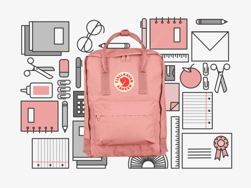
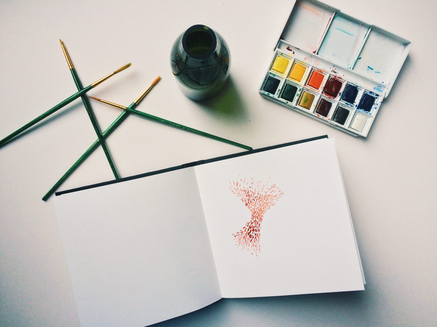
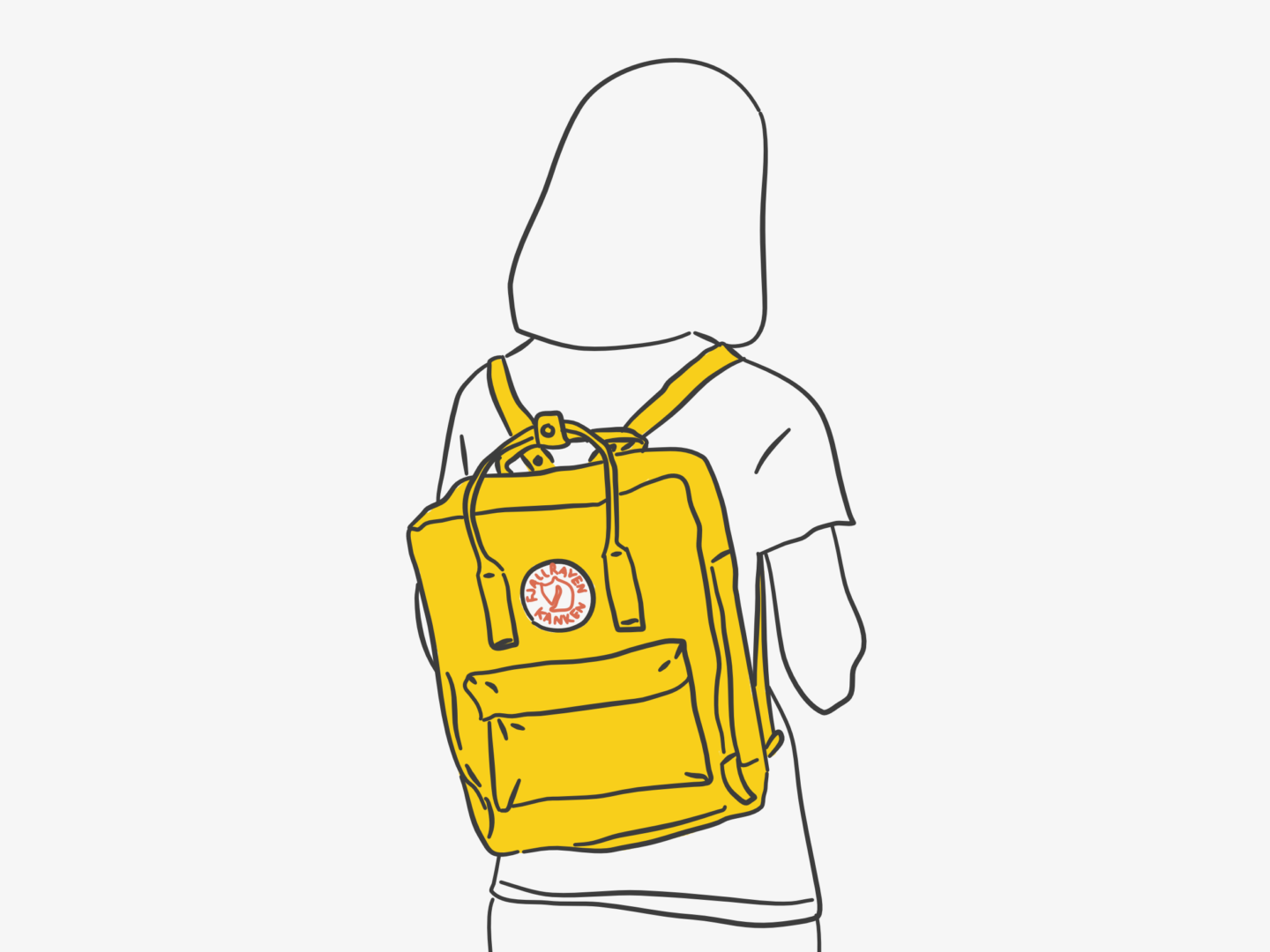
His solution was a backpack which would distribute the weight of school books and packed lunches across both shoulders, instead of just one. With this idea in mind, Nordin began his work by taking 2 A4 ring binders, the most commonly carried item in a school child’s bag, and designing around it. Once he had the basis of the shape, Nordin created his bags out of the durable Vinylon F fabric. He chose Vinylon F not only because it is hard wearing but because the fibres swell when wet, like many natural fibres do, meaning that when it rains that the Kånken is so waterproof that you can often see a small puddle forming on the top of its flat top. Other additions to the bag included a foam insert that acted as padding for the back and could be removed to be used as a picnic seat, a newspaper pocket to organise papers, a zippable front pocket, short top handles that can be poppered together to hold a rolled jacket on top of the bag, and the now iconic round reflective patch with the company’s logo.

With the help of the Swedish Guide and Scout Association, Nordin launched the Kånken right on time for the beginning of the school year in 1978. Nordin had hoped to sell 200 bags in that first year, he quickly sold double that figure as it did exactly what it was designed to do and reduced back pain and improved posture in its wearers. As well as school children, the elderly were also big fans of the Kånken, as they soon realised that the backpack’s design allowed them to carry their shopping whilst keeping their hands free to hold a walking cane.

Today, over 200,000 Kånkens are made a year, following that original design almost identically. After a lull in sales in the 90s, their rectangular shape and bright colours came back into fashion a few years ago. Their fans cite their Mary Poppins-like ability to hold everything they need without ever being heavy as the main reason for their enduring popularity. The backpacks are also popular with travellers who appreciate the bags waterproofness, added features, and the fact that, even when full, it can be slide underneath an aeroplane seat meaning it’s ideal for travelling light. Nordin’s initial decision to base the size of his bag around his customers’ actual needs, to carry an A4 file, has stood his design in good stead and means it has remained just right almost 40 years on.

Today I’m going to create my very first font, and I thought it would be interesting to document the process and share anything I learn along the way and from all the bits and pieces I’ve read.

I’m making a hand-written typeface based on my own handwriting, because it seems to be the recommended starter and it’s something that will be immediately useful to me, as I currently hand write a lot. I think it’s probably a great start for a beginner because you’re working with a style that you know really well and can draw naturally without having to think about it.

STEP 1

The first step I took was to pick a programme to use to create my font. I went with Paint Font, which is free and online, both of which are always good things. I decided to go with Paint Font rather than My Script Font which is very similar because it allowed me more options when it came to the characters I could design. Both of these programmes allow you to hand draw your font and then scan it which makes them very accessible. If you’re looking for a more digital option, FontStruct seems to be completely computer based, which would perhaps be better if you’re looking to build more standardised fonts.

STEP 2

This was the fun bit: drawing out my letters. I decided to start out by hand drawing my letters because it felt the most natural and the easiest for quick drafting. I kept playing around until I was happy with the set of characters I had. In the end, I settled on an all caps font, with slightly smaller caps as lowercase letters, as this is the way I normally write in my design work and in my planner which is where I like my handwriting the best.

STEP 3

You could just draw your letters onto the template by hand, scan it and upload it. But I wanted to put my letters on digitally as it allowed me more control and the ability to refine my letters more in regards to weight and also mitigated the inevitable “oh no my hand slipped!” moment. I scanned all of my letter forms, and then made them vectors by tracing over them in Affinity Designer. I refined the points, curves, and line quality, then added them into the template. If you’re just going in by hand, make sure you use a relatively thick (a fine felt perhaps) very black pen, so that your letters show up clearly when you scan them.

STEP 4

Then it was time to upload my doc to Paint Font and wait for the magic to happen. This process was pretty simple and painless, and in no time I had a .TTF file of my very first font. The finished product was a relatively good quality font, that I think I’m going to get a lot of use out of.

STEP 5

Then I tried out my font, typing out the customary “quick brown fox…” and just having a bit of a play really, and then printed it out for assessment. There were a couple of letters I wasn’t completely happy with so I changed them and repeated step 4. Once I was happy with that base font I also made a light version, a bold version, and an italic version. Those alternative styles were made infinitely easier by the fact I’d vectorised my font before uploading it, because I could easily edit the letters without having to redraw them all.

TOP TIPS

  • If you want to make a font, do it! It is SO easy.
  • If you can vectorise your font, I would highly recommend it. It makes editing and creating alternative versions so much easier.
  • Sketch out your ideas, and try out a few variations of everything. It’s just good practice.
  • Start with a font you know to get used to the process, plus it’s just fun to make your computer write like you do.
  • On that note, do your own thing, don’t just add serifs to Helvetica it’s a rip off and it’s just boring. The reason I really liked my font was because it was new and something I would use.
  • Go beyond just A-Z. If you’re working in English, and your font is for personal use, you probably don’t need the entire Russian alphabet but you will need numbers and punctuation for your font to be truly useful.
  • Print your test type. It makes it easier to see how your font will look in situ and sometimes it’s easier to work using pen and paper.
  • Have fun!

All that’s left to say is I’ve officially caught the homemade font bug, and will be making some more of my own typefaces in the very near future!

Meditation is the new black. In particular, using meditation to help unlock your creativity is getting a lot of hype at the minute. David Lynch has been a huge proponent of Transcendental Meditation ™, even starting a foundation to give more people access to what is a costly style of meditation. But he’s not alone, famous creative meditators include: the Beach Boys, Sting, Stevie Wonder, Steve Vai, Tom Petty, John Denver, Sheryl Crow, Katy Perry, the co-founders of Def Jam Recordings, Rick Rubin and Russell Simmons, Martin Scorsese, George Lucas, Clint Eastwood, and lest us not forget Oprah.

Meditation is also something I’ve heard a lot about on some of my favourite creative podcasts, for example Tiffany Han’s Raise Your Hand Say Yes with Lacy Young. Everyone seems to be talking about the power of meditation and it’s no surprise because supposedly it can help:

“You become more you – you get more ideas and more energy to fulfil them […] It’s fuel for the artist, you grow faster between films or paintings. It speeds things up. You start making the subconscious conscious; meditators have an edge over artists that don’t meditate.”*

As someone who’s always trying to be more creative, and also, in the least Eat Pray Love way possible, find myself, that sounded pretty attractive. So, I’ve been trying out a few different kinds of meditation (unfortunately not TM) over the last few months (so I’m by no means an expert) and these have been my experiences and take-aways.

HEADSPACE

Headspace is (I think) the biggest mediation app available right now, “We all need to get a little head space” – it’s a catchphrase that has become ingrained into the psyches of more than 6 million people worldwide. The app, led by Andy, leads you through easy to follow guided meditations and mindfulness training. The meditation sessions on Headspace are divided up into levels, and you can try the first level of ten sessions for free, which I would highly recommend you do if you’re interested in trying meditation but aren’t sure where to start. I definitely enjoyed working my way through different levels of headspace, and it gave me a lot of food for thought. The little explanation videos at the beginning of the sessions were really helpful in giving me some perspective on meditation and also just generally being more mindful. If you’re someone who gets a lot out of gamification, you’ll love headspace. The app is really good at reminding you to take ten and encouraging sustained mediation, and was a great starter for me personally. But it’s not something I’ve stuck with for that reason. After really trying to get on with Headspace, I decided that it’s not something I want to use every day. I’m not a big fan of everyday tasks turned into games (for some reason it irks me) and the guided meditations began to feel a bit redundant after I’d tried Zazen. However, I’ve kept the app on my phone so I can dip in and out of their specific meditations like commuting and sport. 

ZAZEN

Zazen is what you probably imagine when someone says mediation to you. It’s sitting quietly, quiet often cross-legged, breathing and thinking. This self-guided meditation focuses on your breathing and getting in touch with your body in many of the same ways as the Headspace guided meditations but without anything else in the way. I normally follow something a little like this method, and I like to have some rain sounds (there are loads on spotify) in the background, in part because my house is never really all that quiet. I know that some people might find this a little boring, or hard to get into, but this is the kind of meditation that I have gotten the most out of. Not only has it helped me feel calm and at peace in the way that a warm bath does, I’ve also had a number of almost magical experiences while doing it. When I’m practising zazen, I feel both hyper aware of my body and somehow external to it, I don’t quite know how to describe it. Has practising this kind of meditation helped my creativity? I’m not sure. It hasn’t in any obvious way but I think being able to enjoy those warm moments of calm has helped me feel more content in myself, which I think can’t have done anything but to affect my creativity.

MEDITATIVE PAINTING

I’m including this even though I’m not sure how much it counts as a “meditation” because it’s been something I’ve gotten a lot out in many of the same ways as Zazen. Every day I take some time just to paint. I don’t go in with a plan or an image I just move the colours and forms around wherever they lead me. It’s been a great way for me to visualise whatever I’m feeling as well as starting to gain confidence in painting. This is the meditation that has helped my creativity the most because of that confidence. When making feels as easy as breathing, and can bring you a greater sense of calm, you just end up with so much more trust in yourself and also a better sense of your own internal source of creativity. I realise that sounded quite strange and new-agey but I didn’t have a better way to put it.

Those have been my experiences with meditation and creativity so far. Do I think it’s worth trying if you’re looking to be more creative? Definitely, there’s absolutely nothing to lose and quite a lot to gain, not just a boost in creativity. Do I think it’s worth the hype? I’m not sure just yet, there’s a lot more to meditation than the bits I’ve tried and I’m keen to investigate it further, either through classes or through just more research.

What are your thoughts on meditation? Have you tried it? What has worked for you or what hasn’t? Should I be trying classes?

*I really enjoyed this article from Emily Gosling on It’s Nice That.


One of the questions I get asked the most (meaning perhaps twice) is how I find the time to do all of the bits and pieces I do. So, I thought I would answer that question in the form of one of my favourite kinds of posts to read, a week in the life. But, because most of my weekdays are the same, I’m going with a long weekend in the life Friday-Sunday.


FRIDAY

7:00

Aaaand we’re off. I wish I could bring myself to be more of a morning person and get up earlier than 7, but I’m just really not. I work my way through most of the things on my 8 things to do before 8am list I: have a glass of water, attempt to have a quick stretch, get dressed, wash my face, check my plan for the day, and then attempt to get excited about the day ahead. I don’t meditate on a morning anymore, I’m just not in the right mood on a morning and now prefer to do it on an evening.

7:48

I head to the tube to practice my contortion skills on the Victoria Line.

8:39

I arrive at work, slightly worse for wear but in one piece. I grab some breakfast, which consists of a very exciting bowl of Weetabix, banana and a cup of tea. Then I get down to business doing all of those workish things you do at work, aka answering loads of emails.

12:33

It’s lunch time! I normally eat my lunch (this week a homemade savoury muffin, some crudites and an apple) at my desk because it means I can read whatever looking interesting on my Bloglovin as I munch. Then I head out to a nearby park to read my book, this week I’m working on NW by Zadie Smith which is pretty good – we’ll see if it makes it as a future book club pick.

13:30

Back to work – more emails.

17:35

Time to get back on the tube and head home.

18:26

As soon as I get home 3 nights a week, as I did on Friday, I go for a run. Most nights I’ll do 4-5km depending on how much time I have and how lively I’m feeling – I managed just over 4 that night. When I get back I reheat some dinner, vegetarian chilli, which is one of my favourites.

19:40

This is the hour and a bit where I do blog, or other creative work. I put some music on (Little Comet’s new album) and get down to business.

21:01

When the clock strikes 9, it means it’s time for me to unwind. I wrote out my relaxation routine in a lot of depth in my post about unwinding, so I won’t write it out here. Basically, it involves a shower, my pjs and some trashy TV.

23:00

My favourite time of the day – bed time!


SATURDAY

8:05

Weekends I try to get up at around the same time, but quite often succumb to a lie in, as I did this weekend. But 8am isn’t too bad, right? Saturday mornings are my time for doing chores which means cleaning, laundry (lots of it), and going out to buy groceries.

11:36

I don’t really stick to proper meal times on a weekend in the way I do during the week. So this Saturday I stopped for a mid-morning soreen based snack, before doing a bit of blog work including some social media queueing and post designing.

15:45

It’s running time again! I went for a longer run on Saturday, which for me means 5km.

17:43

After showering and all pottering around, I head out for a dinner and a movie kind of evening.


SUNDAY

8:30

Sundays mornings are my lazy mornings which can mean anything from breakfast in bed, to just staying in my pjs or this week it meant getting to read my book on a morning.

10:11

This doesn’t happen every week but this Sunday was a brunch with friends kind of day. I can highly recommend the French toast at Nanna’s in Islington – sooooo good.

12:33

This is when I get down to business and do the most creative work, whether that’s for the blog, a client or myself. I always try and have some time on a Sunday to do it. This Sunday I managed to crank out 4 pieces of design a couple for the blog, one personal, and one draft for a client.

16:31

Time for another run, this time back to the same 4km route I did on Friday.

17:26

Sunday evenings are one of my favourite times because it’s when I get to meal prep. I love cooking. But I don’t have much time to do it during the week, so I like to make as much food for the week ahead, both lunches and dinners, on a weekend. My food prep usually contains a soup, a main meal (without the carbs if it’s pasta or rice because I like them fresh) and whatever I’m having for lunches, plus usually some kind of baking. This week I made a tomato soup, some thai green curry, a salad for lunches, and made some of my favourite pb energy bites.

20:34

Once all my work and the week is done I have a big pamper evening, which is just a longer version of my relaxation routine and normally includes a no work TV and biscuits binge.


And that’s my week! All of this can change depending on the week, but this is probably a pretty good overview. As you can probably see I don’t do that much and rely quite heavily on routine to give my week some structure because that’s just how I function best.

To circle right back round to the start of this post and the question “how do I fit everything in?” by making time for it, having a plan, and not doing much else aside from the things that I feel I want/need to do. It’s all about prioritisation I guess.

Design history of Dr Martens

Everything around us has a design story, a history of how it came into being. So, I wanted to start a little series documenting those stories, starting with the things I use everyday. And what could be a better personal everyday design classic to start it off than Dr Martens?

Dr Martens have found their place in every generation since the 1940s. They began their life as a medical remedy and a housewife’s favourite before becoming a subculture staple, all while being known for their comfort and durability. I’ve worn my trusty pair of 1461s almost every single day for the last 3 years and still love them dearly. 

The idea for Dr Martens, similarly to that of Converse, came from their creator taking a slip and fall. Dr Klaus Märtens, a 25-year-old German doctor in World War 2, sprained his ankle while on the ski slopes of the Alps. Unhappy with the idea of being inactive for months, because his injury was made worse by his poor-fitting army issue boots, he decided to take matters into his own hands. He gathered materials from a cobbler. Then used an old tyre for the sole, creating the now famous air pockets which gave his feet a cushioned bed on which to walk.

As soon as he realised he might have made something special, Märtens decided to try and sell his creation. However, there wasn’t much interest at first. In fact, it wasn’t until Märtens teamed up with a friend with more production knowledge, Dr Herbert Funck, that he had any success. With Funck’s help, Märtens upgraded the rubber soles of his boots using rubber from airfields. Thanks to this upgrade and some clever marketing, their boots soon became a housewife’s staple because the boots’ comfort and practicality meant that long days on their feet were a bit more bearable.

Once they had this first loyal fan base Märtens’ boots quickly grew in popularity. By the late 1950s, he was ready to expand internationally. This is where Märtens’ boots became the Dr Martens we know and love now. Märtens teamed up with the R. Griggs Group, a family run operation in Wollaston, Northamptonshire, who had been making boots for over half a century. As soon as they got the rights to Märtens’ innovative bouncing soles they trademarked the soles, added a bulbous but simple upper, a distinctive yellow welt stitch, a two-tone grooved sole edge and a unique sole pattern as well as Anglicising the boots’ name to Dr Martens to make them easier to sell in the UK. Those first boots were branded as ‘Airwair’ and came complete with a black and yellow heel loop, which tied in with the yellow stitching, and featured the brand name and the slogan “With Bouncing Soles” the typography of which was based on Bill Grigg’s handwriting. With these changes in place, the first pair of cherry red Dr Martens boots rolled off the production line on the 1st April 1960. That date is where that first style’s name, 1460, comes from.

At first, these boots were mainly popular with those who spent a lot of time on their feet, namely postmen and police officers. That was until 1967 when they were first worn by Pete Townshed, guitarist for The Who. Townshed who was “was sick of dressing up as a Christmas tree in flowing robes that got in the way of my guitar playing” decided to move onto “utility wear” in the form of Dr Martens which brought his attire back in line with his working-class roots. This connection between rock music and Dr Martens brought about a change in how they were perceived, they were no longer a workwear staple but a style statement, that has been linked with music ever since from skinheads to pop divas.

After the skinhead craze died down, Dr Martens remained a symbol for subculture and self-expression for the countless splinter groups of glam rockers, punks and goths. The 1990s were the boots most successful period thanks to an era defined by Britpop and Grunge, two opposing cultures both of which loved the heritage, style and comfort of Dr Martens.

Even though their story began with women, Dr Martens had always been made and style for men. That was until 1994 when upon realising that over 50% of their customers were women, the boots and shoes were released in different designs, fits and colours to appeal to a wider audience. But, the boots staged what was labelled the ‘Turnaround of the Year’ by collaborating with high fashion designers like Vivienne Westwood to reinvigorate the brand’s, and specifically the 1460 boot’s, aura of British cool.

Today, Dr Martens are continuing to go from strength to strength appealing to a wider audience than ever, while retaining that original style and sense of brand identity with the same classic yellow thread, the same base boot design, and the same signature pull tab.